Options for more sustainable packaging
Wine producers are looking at different ways to improve their sustainability through organic practices to alternative energy sources. Harrison Davies explores how label design can help to reduce costs and shrink wine businesses’ carbon footprint.
There are thousands of ways to make a wine business more sustainable.
From using fewer chemicals in the vineyard to bottling wine in lighter packaging, it seems that businesses are looking for any ways to reduce their carbon footprint and, in many cases, to also reduce costs.
Labels are now part of the sustainability conversation, as for every lighter wine bottle and every litre of water saved, progress can be stunted when each bottle needs to be covered in paper or plastic in order to be sold.
Label designers are now looking at ways to market wines without the use of extra materials in a label.
As one might expect, this poses a number of challenges, largely because wine has been marketed with paper labels for almost as long as it has been sold in bottles, making it no easy task for designers.
There are, however, a number of ways designers are finding to adorn bottles with marketing whilst using fewer materials.
No Label at all
Some companies are taking sustainable packaging a step further and are marketing without a label at all.
Fourth Wave Wine have released a new line of wines, entitled Crate, that do not have any labelling on the bottle whatsoever, instead only featuring information on the capsule.
In a statement put out by Fourth Wave Wine, the producer attributed the heavy use of materials in wine packaging as unnecessary waste.
“Environmental concerns have led to a decrease in the use of plastic and paper resources are being used to compensate,” it stated.
“This has led to increased pressure on forests, leading to deforestation. In addition, in order to apply a paper label to a bottle, a PET liner needs to be used, adding the use of crude oil to the mix.
“Crate does away with all this, standing out from the crowd with its sleek, pared-back design.”
The design was created by drinks design agency Denomination, which made sure that all the necessary information about the wine could still be found without the use of extra materials.
The capsule contains all mandatory information, brand logotype, varietal, region, vintage, legal claims, barcode, brand messaging and a QR code for further information, using the typography to give the illusion of space.
The brand clearly lays out its position on the carton: “our planet matters more than our packaging”. It informs the consumer that: no label saves energy, no glue saves waste, no paper saves trees.
The bottles are also only sold by the crate, thus the name, which features the branding and provides recyclable cartons that can be done away with by the consumer.
“The biggest challenge was obviously working out how to fit all of the mandatories, barcode and QR code onto a tiny space of the capsule, plus make it feel branded and designed,” Rowena Curlewis, co-founder of Denomination said.
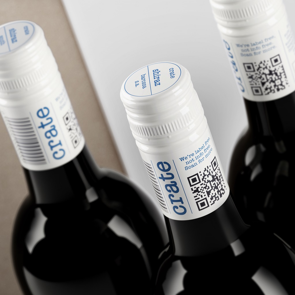
Fourth Wave Wine’s label-free Crate wines
The biggest challenge was obviously working out how to fit all of the mandatories, barcode and QR code onto a tiny space of the capsule, plus make it feel branded and designed.
Rowena Curlewis
“This challenge requires incredible typographic skills to craft each piece of information and – like a Tetris puzzle – make it all work together. It was important that the capsule looked “designed” and not jammed together, in order to project the quality of the wine inside.
“As both brand owners and consumers become more cognisant of the impact of increased paper use on our forests, and the use of non-renewables to create plastic, the use of labels on wines and other drinks prompts an important question that the design industry will need to answer in order to protect all of our futures.”
Curlewis said that sustainability was key to the development of the brand and, as an extension, development of the branding and label design.
She said that the concept of the design was to create more environmentally friendly bottles in every part of the packaging and design.
“We decided to use transition glass, normally regarded as a waste product, in order to utilise the energy required to make these bottles in the first place. Using waste products prevents energy wastage,” Curlewis said.
“Secondly we wanted to make sure that the transition glass bottles were in the lightest-weight possible so this influenced the mould selection.
“Thirdly, we discarded the use of a conventional label. This was for a few reasons: with the declining use of plastic (a great thing), it has meant that we have put more pressure on our forests with the increased use of paper.
“Deciding to not use paper has another tiny impact on the deforestation that is occurring around the globe. No paper label also meant no glue, no varnishes, no inks, no embellishments – all additional processes involving chemicals and man-made materials.
“And then the ultimate challenge of putting all of the required legal and branding information into the tiny area of the capsule.”
Curlewis dispelled any worries that the wine could struggle to stand out without a label, instead suggesting its lack of a label would be more of a selling point.
Given Crate’s place as the first in the market to be sold without a label, she said it could be a choice that other brands may latch on to.
“I believe this will be one of the options that will become more common, but I also think there are other creative solutions to address sustainability that we will see entering the market,” She continued.
“It does help that Crate is the first, and that alone will create standout for its obvious difference on shelf. Once it is joined by competitors, then that competitive advantage will no longer be there, so the capsule design and the carton will become critical.
“Having sustainability at the forefront of every packaging design project is imperative. We need designers around the globe to be thinking creatively and deeply about how we brand differently moving forward.”
From a printing perspective, screen printing offers a high quality, durable print that allows for the bottle to differentiate itself amongst the many bottles with the traditional label.
Louise Poh
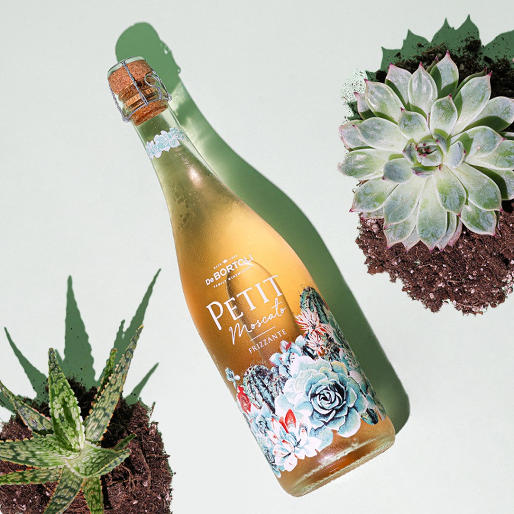
De Bortoli’s Petit Moscato bottle utilises screen printing technology
Screen printing
One way to label a bottle without paper is by screen printing the design onto the bottle itself.
The technique was first created in China in the year 950 AD and it arrived in Europe in the 19th century. By the early 20th century, printers had developed photo-sensitised emulsions, allowing artisans to create complex stencil designs more easily.
The process is essentially to print the designs directly onto the glass itself, creating far less waste and using fewer materials to get the same messaging onto the bottle.
Packaging brands like Cutler Brands have been advertising the benefits of screen printing by showcasing the clean look and notifying buyers of the fact that there are fewer blemishes with screen printed labels when compared to clear plastic.
Screen printing also guarantees the labels will remain stuck to the packaging in any environment, meaning the label won’t float off when submerged in ice.
De Bortoli used screen printing on its award winning labelling for its Petit Moscato. De Bortoli marketing manager Louise Poh said screen printing was not only better for their design but also gives the label greater longevity
“Screen printing can provide many benefits to the brand and the consumer. From a printing perspective, screen printing offers a high quality, durable print that allows for the bottle to differentiate itself amongst the many bottles with the traditional label,” she said.
“From a branding and sustainability perspective, repurposing wine bottles is fast becoming a trend, one that we fully support.
“Often when consumers repurpose their bottles, the label is removed, by utilising screen printing, the consumer has the ability to display the bottle along with a gorgeous image, and also allows brands to remain in the forefront of the consumer’s eye.
“The gorgeous packaging design for Petit Moscato draws inspiration from Boho Cacti, incorporating screen printing with beautiful intricate art design of the desert and succulents with the blushing pink of the Moscato tying it all together to be a truly show stopping bottle.
“This well thought out and executed packaging design with a sense of beauty and free spirit of the vast, hearty and spectacular flora also secured a Silver in the 2021 Harpers Design Award.
“These labels stand out by utilising new technologies from label partners in order to translate the message of the brand to the consumer.”