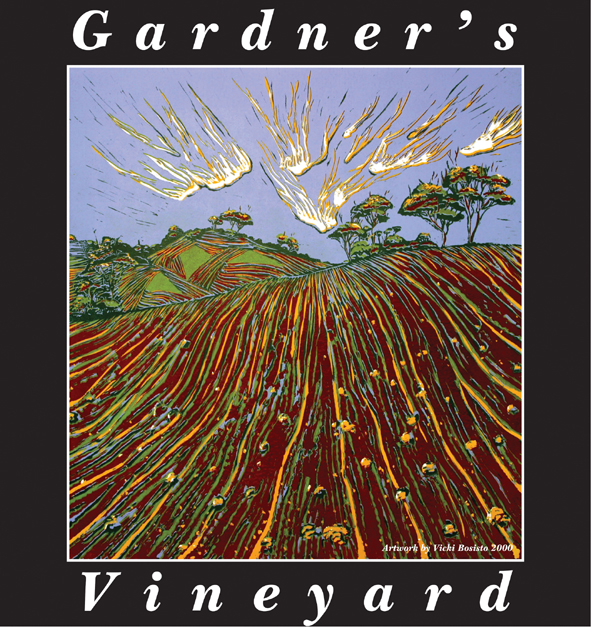
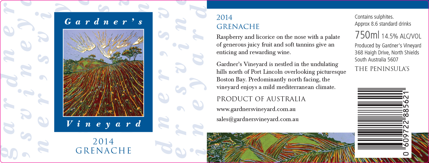
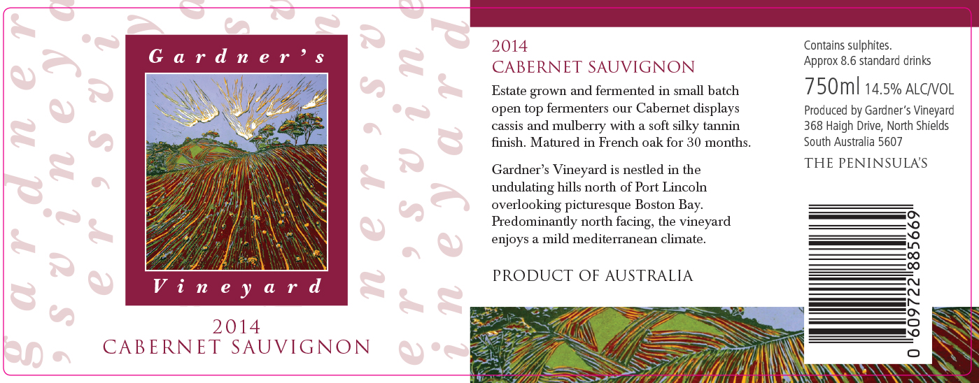
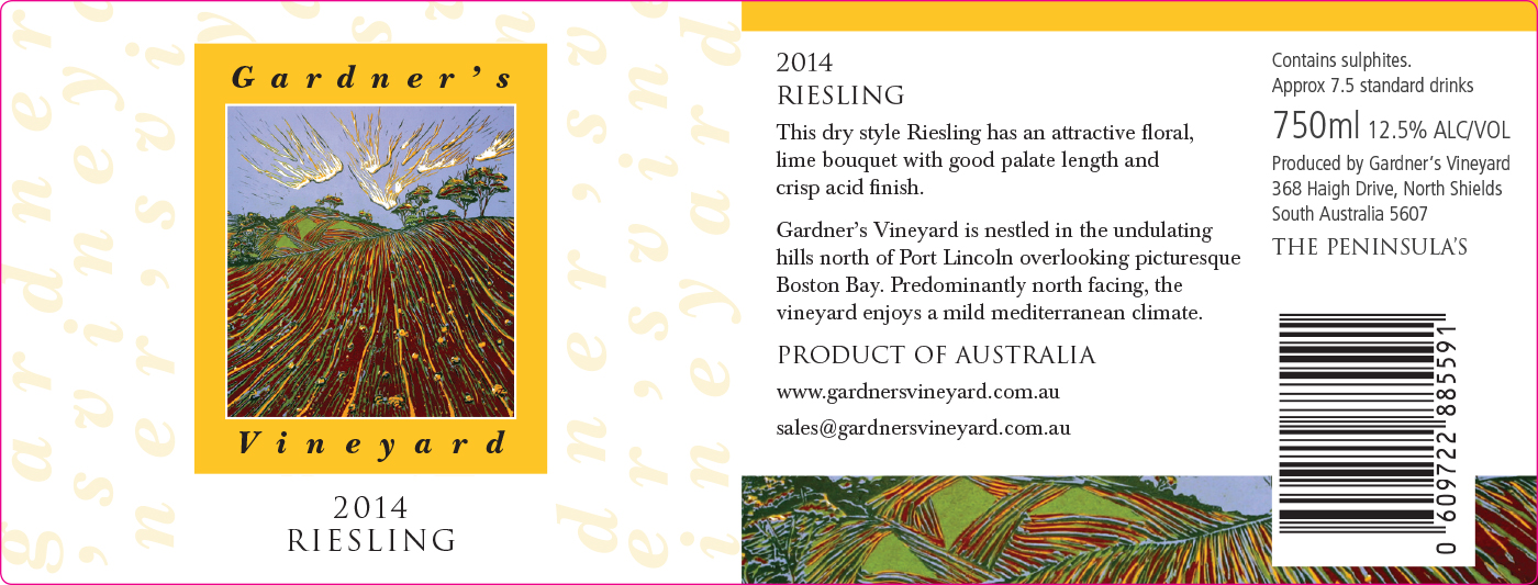
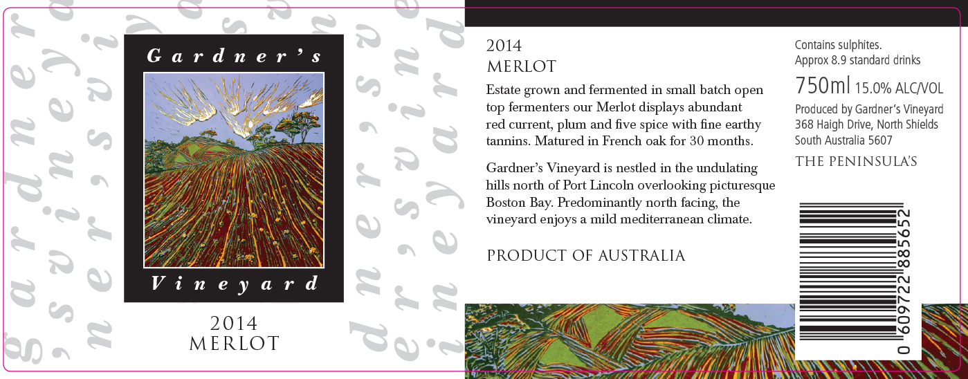
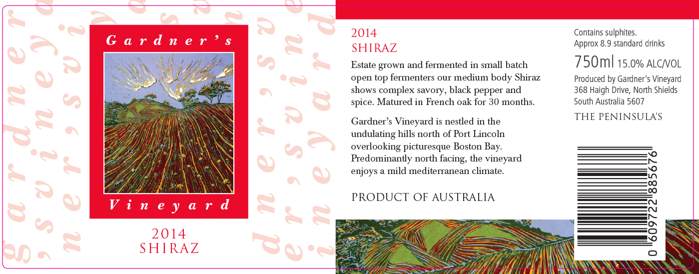
The design on our label was based on a print we purchased from a local artist, Vicki Bosisito, who lives near us. It depicts the undulating nature of the landscape of our area and our vineyard. Vicki was honored when we asked her permission to use her print on our labels.
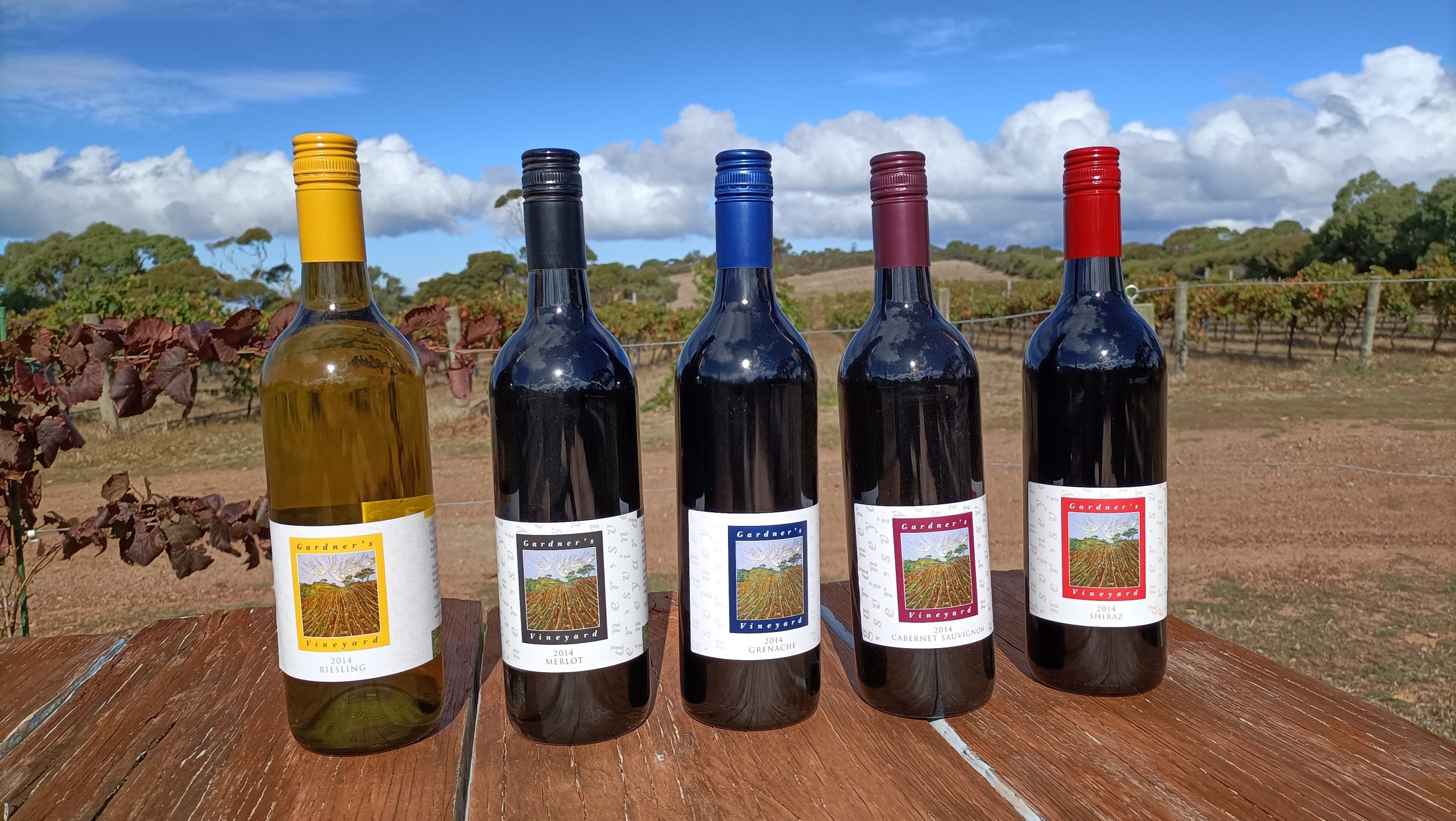
As we wanted to use the same label design on each of our wines, we decided to use a different colour of the same design for each of our wines. We also decided to match the colour of the screw top closure with each of the labels.
Riesling - yellow label and closure
Merlot - black label and closure
Grenache - blue label and closure
Cabernet Sauvignon - burgundy label and closure
Shiraz - red label and closure
The final design and closure on each of the wines, really makes a statement and is a point of interest and part of our story.
It is a talking point with customers who react positively to the concept, and the local contribution to the design.
We use the same concept through all our vintages.