BEST PACKAGE REDESIGN

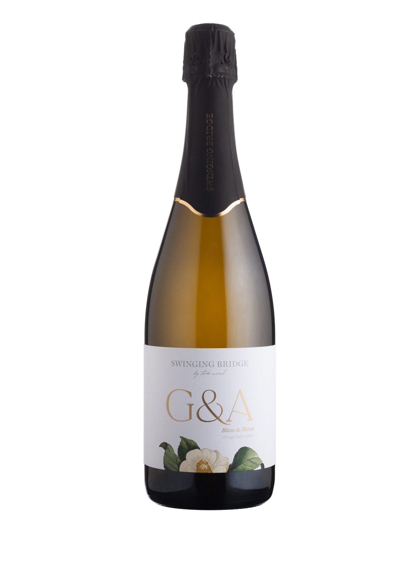
Swinging Bridge G&A Sparkling Blanc de Blancs
Delicate and fresh with the hallmarks of the cool climate of Orange, our Swinging Bridge G&A Blanc de Blancs has spent a number of years maturing on lees prior to release. Made entirely from a small parcel of Chardonnay, it is a wine of superb clarity with classic poise and elegance; a fine bead and dry finish with firm natural acidity. It is named in honour of two supportive and spirited women, Georgie and Anne Ward, wife and mother of winemaker Tom Ward. This sparkling wine is an Orange regional wine that sits at a price point of $45, thus competing in the premium segment of the market, with strong competition from French imports.
- Year wine was released to market: 2021
- Retail Price: $45 AUD
- Designed by: 3blindmice - Ben Manson
- Designed for: Swinging Bridge
The G&A is part of Swinging Bridge's Winemaker Series of wines. They are named to honour members of Tom Ward's family. The range includes two reds, William J Shiraz and M.A.W Pinot Noir as well as the G&A Sparkling, Mrs Payten Chardonnay and Eliza Riesling. I originally designed the packaging for these wines in 2013 and 2015. In 2020 we began the process of reviewing the entire Swinging Bridge range of labels.
The original design had been altered by printers over the years at the request of the winery and included adding more elements to the front label, leading to a label that wasn't working visually.
The challenge with the G&A was to refine the label to work with the new, more unified redesign of the Swinging Bridge ranges and sit comfortably within the brand architecture. They also needed to hold true to the brand proposition and original intent of the design which was to reflect the modern, unique character of the namesakes of this wine in a striking design that presented beautifully on shelf and in a restaurant setting. The design needed to reflect the value proposition of the wine in the sparkling wine segment, competing against the dominant French sparkling wines.
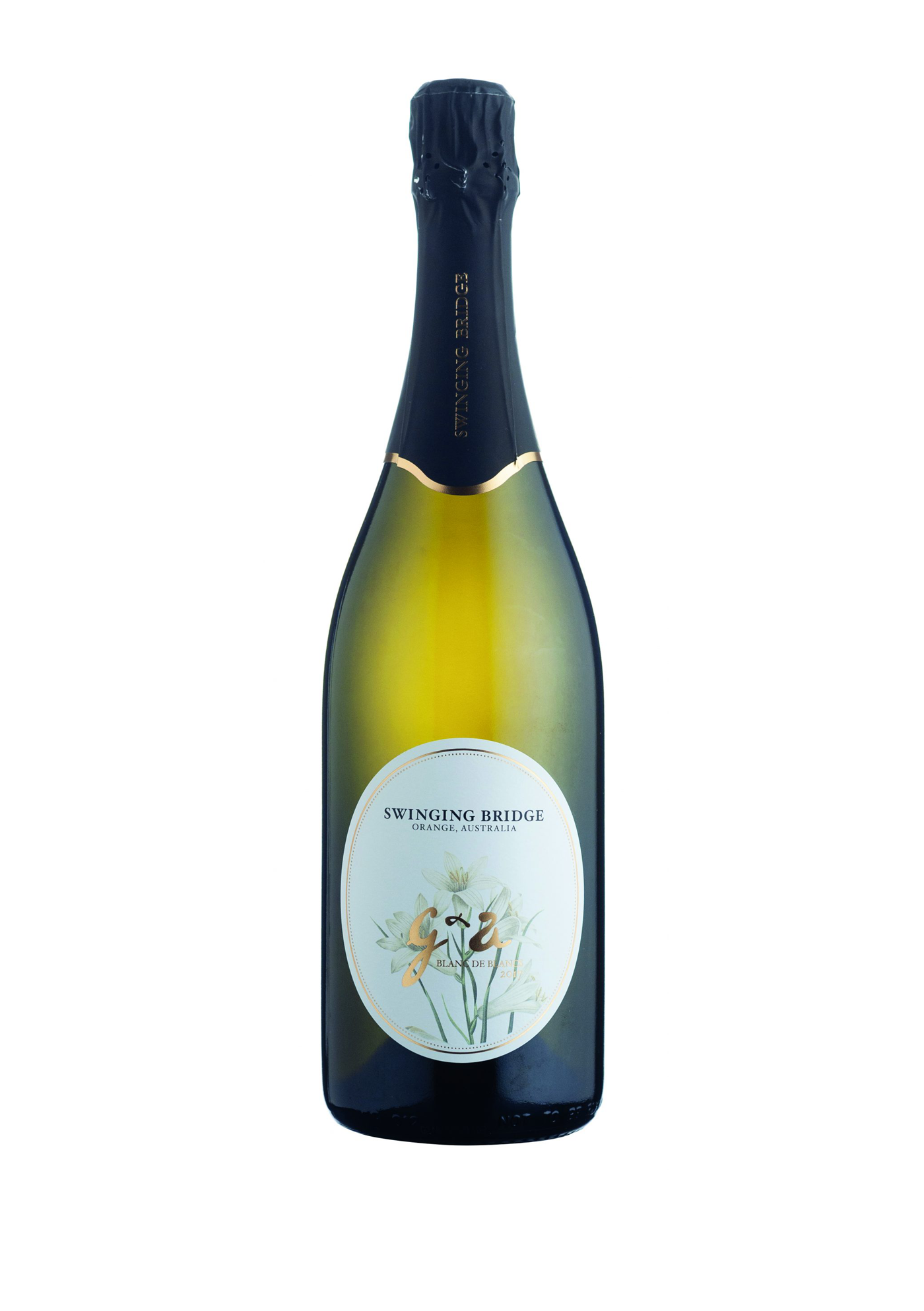
A standout feature of the original 2015 design featured a feminine, striking illustration of lillies in a detailed etched/engraved style with a vintage feel. The client requested the flowers be changed as they felt the flowers were funereal. The G&A font also needed to change due to original 'Vincent' (font) no longer being used in the range. The original design also featured 'G&A' as a bronze foil over the illustration of the lillies. The foil colour was to change to gold, and was too light in tone to stand out over the illustration. The Swinging Bridge logo also needed to have a more obvious presence on the design.
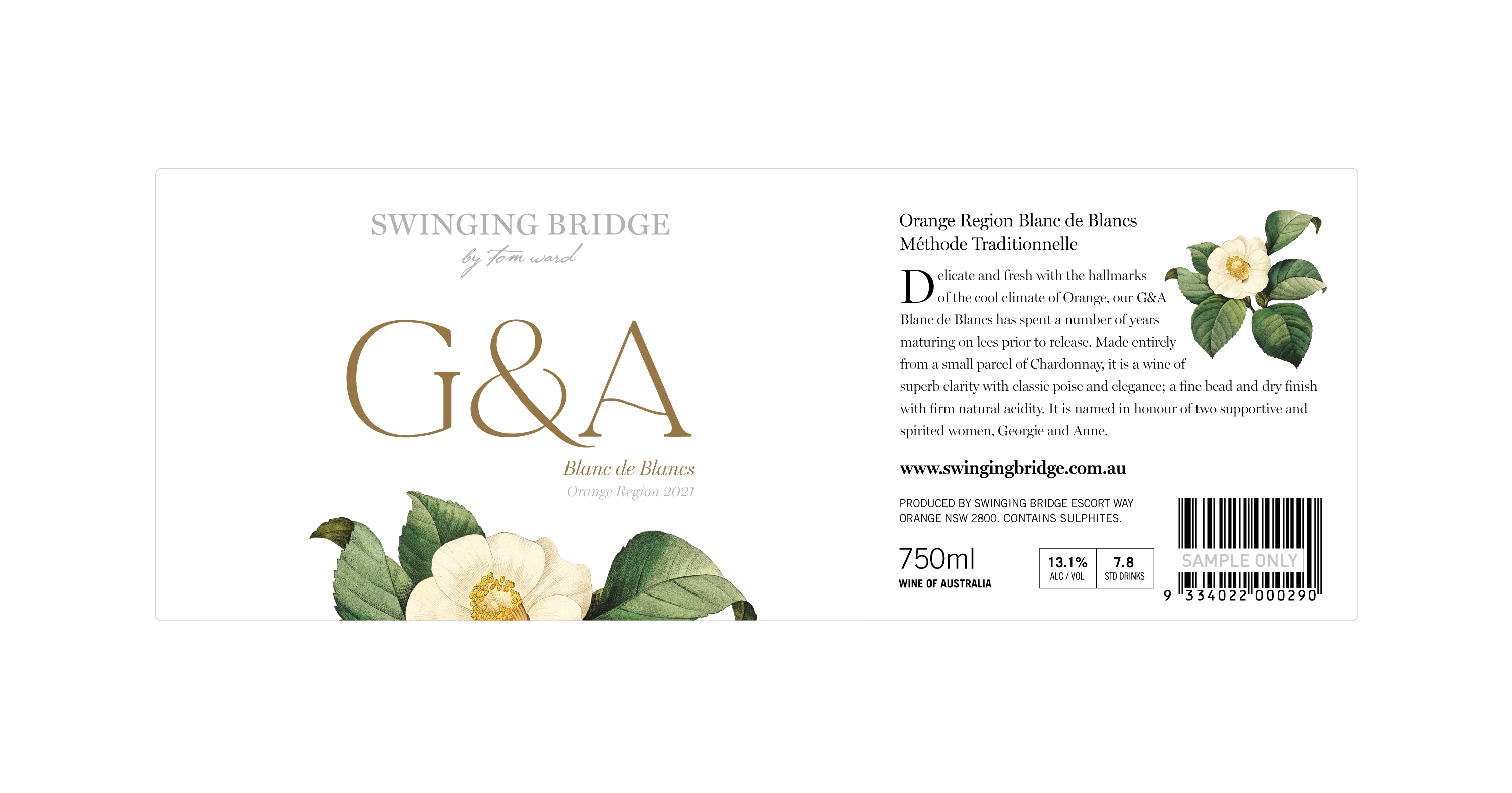
The solution entailed developing a striking, feminine floral illustration in the same vintage etched style. A camellia illustration was used as a strong visual, and the name ‘G&A’ given its own space. A contemporary, sophisticated and elegant font was utilised for 'G&A’. The label evolved to a rectangular style, the same height and position as the other wines in the range to bring unity the brand architecture.
The resulting packaging is sophisticated, elegant and interesting, reflecting the family links as per the brand proposition. The design, visual impact, paper stock and gold foil communicate a premium quality sparkling offering that resonates with the Swinging Bridge consumers. The result is feminine whilst not impacting on the ‘male approval’ factor in the purchasing process.
The Swinging Bridge brand proposition is reinforced through the packaging, showcasing the strong brand commitment to the Orange wine region, the Chardonnay variety and the Ward family personality. Consumers of the Swinging Bridge G&A Sparkling can make an easy transition to other wines within this range, with the common theme, developed through naming, branding, font, paper stock and pricing.
The new packaging has helped substantially increased the sales of the wine at the cellar door, online and within the NSW region. The design development has also allowed a marginal price increase, thus increasing the profitability of the wine. This has been achieved with no advertising.
