BEST PACKAGE REDESIGN


Slow Wine Co Riesling
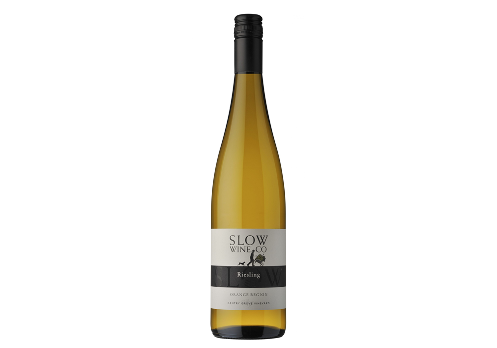
Slow Wine Co are an Orange Region winery. The existing Slow Wine Co labels were looking dated and failing to provide shelf stand out or to reflect the quality of the wines contained within. The project of updating the packaging of this wine was part of a greater project of lifting the brand, from a quality communication perspective, across all wines, website and signage. The brand proposition revolved around the slow process of winemaking; quality achieved through a family, hands-on wines growing, from the vineyard through to the bottle.
- Year wine was released to market: 2021
- Retail Price: $30 AUD
- Designed by: 3blindmice
- Designed for: Slow Wine Co
Slow Wine Co are an Orange Region winery. The existing Slow Wine Co labels were looking dated and failing to provide shelf stand out or to reflect the quality of the wines contained within. The project of updating the packaging of this wine was part of a greater project of lifting the brand, from a quality communication perspective, across all wines, website and signage. The brand proposition revolved around the slow process of winemaking; quality achieved through a family, hands-on wines growing, from the vineyard through to the bottle.
The brief with the Slow Wine Co packaging redesign was to modernise the labels and develop a design that would reflect the wine quality and exceed the price point. The branding needed to be strong but also refined and sophisticated while being an evolution of the existing packaging. The new packaging designs had to sit within the brand hierarchy, and work well across not only a Riesling bottle, but be effectively transferable to both Bordeaux and Burgundy shaped bottles. The evolution of the packaging needed to maintain an strong association with existing work that had been done from a marketing perspective, as the brand’s budget did not stretch to completely new signage at the vineyards and cellar door, nor to replacement of existing marketing collateral.
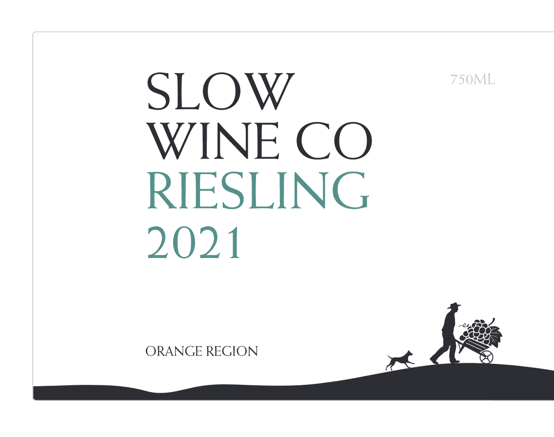
I was attracted to the Slow Wine Co font 'Weiss' but was troubled by the varying font size used in the logo on the existing labels. I started with the Slow Wine Co text being all the same font size, at the same time pulling the silhouette away from the logo and working with the two elements separately.
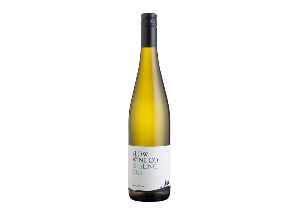
I felt the silhouette needed grounding, so created a simple silhouette of ground and anchored it to the bottom of the label. I then added the varietal and vintage to the logo text, separated with colour and other key elements such as the region, with plenty of space to balance. The visual hierachy starts with the brand, then varietal / vintage, moves down to region and is anchored by the silhouette bottom right. This also helped create a sense of place; the vineyard from where the wine is grown.
The logo of the wheelbarrow was maintained as an important, key element as it communicated the passion and commitment of working with your hands, without machinery, in a slow, step by step process. The crisp, white paper stock was important in the design, expressing the quality proposition, with a black, gloss high build on the brand as a relatively simple touch, but one that adds to the wines quality credentials. The subtle use of colour adds impact and layers to the design.
The resulting design is strong but refined. The text is the hero and is complemented by the simple silhouette, which reinforces the story of the brand; wines crafted slow, methodically, by hand on a family vineyard. The brand is strong and the overall look is classic but modern. The wine’s quality credentials are all reinforced by a quality paper stock with texture. The wine now stands out on shelf and has been very well received at the cellar door and within the local market where sales have grown.


