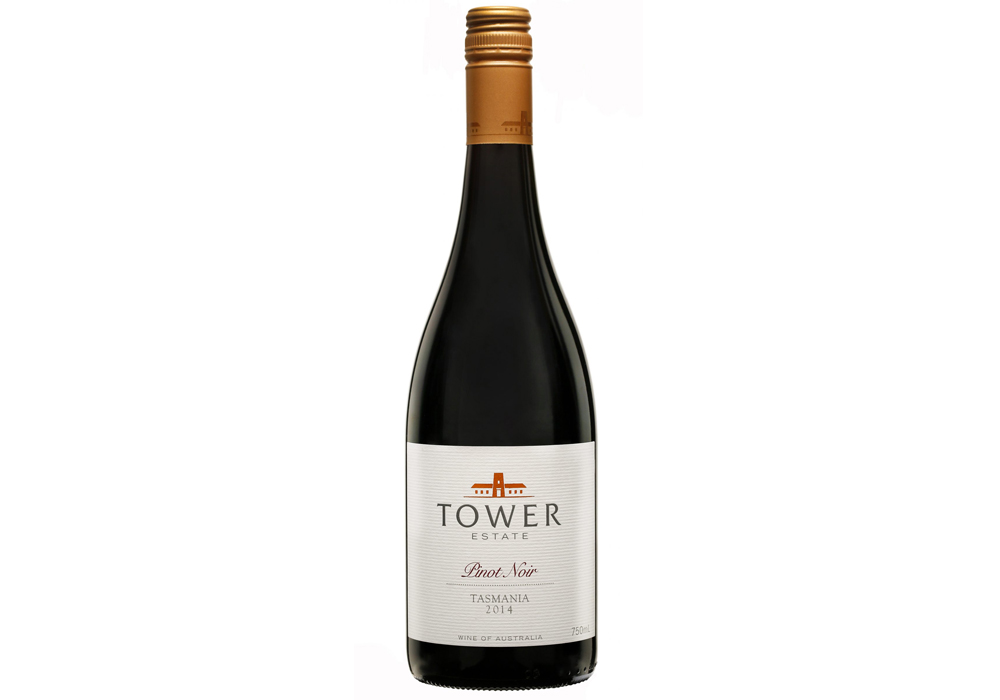
BEST PACKAGE REDESIGN


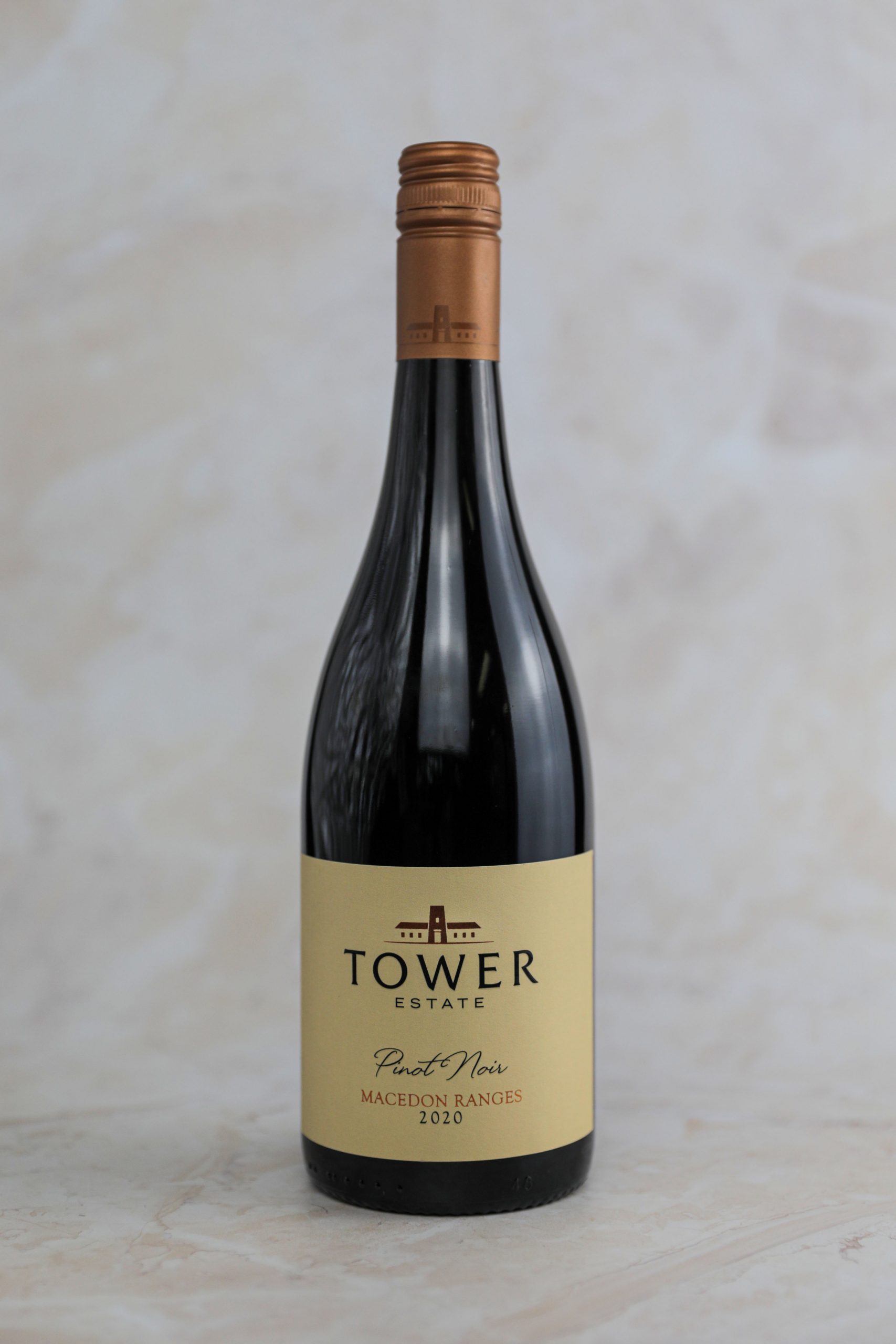
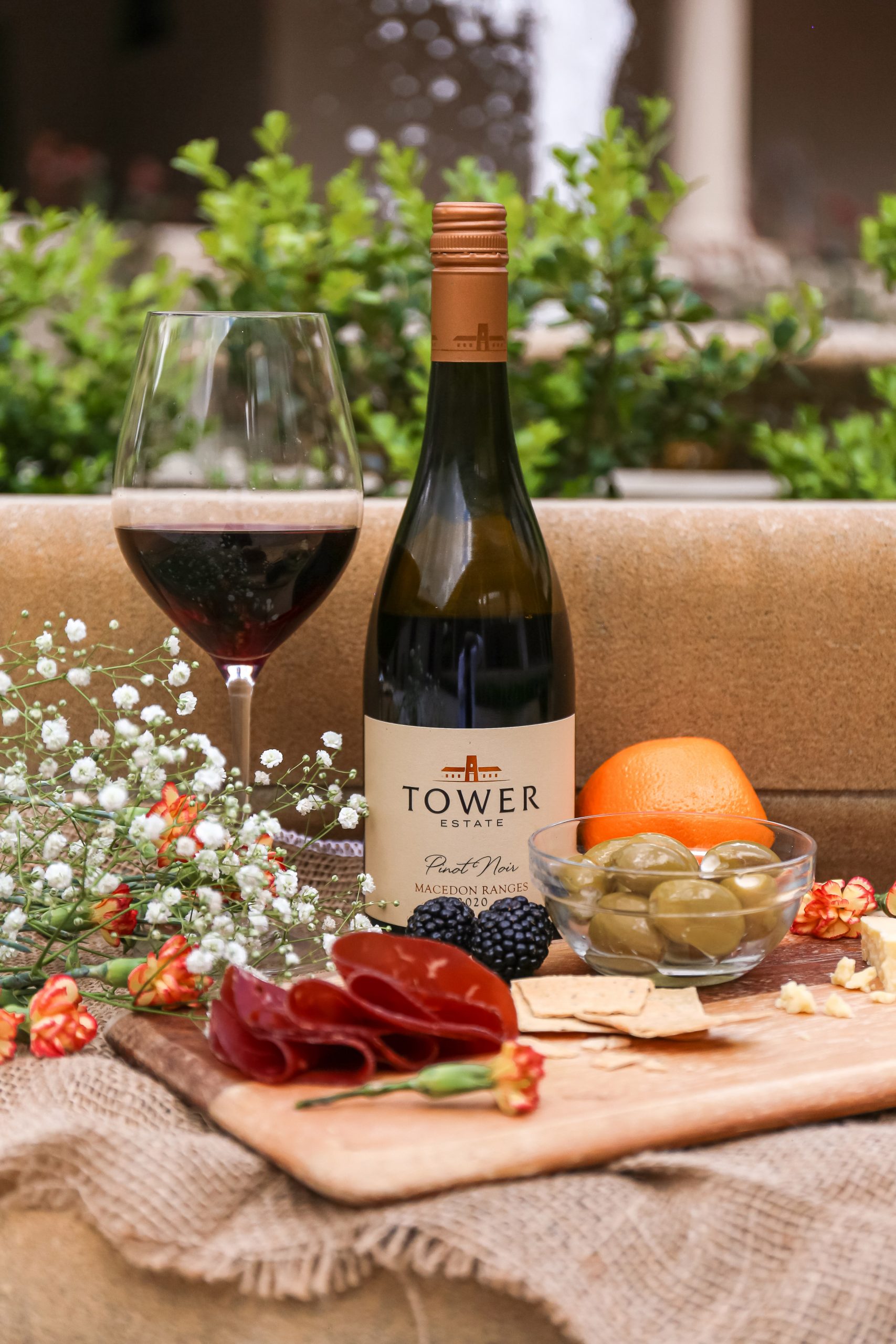
Tower Estate Macedon Ranges Pinot Noir 2020
Exotic dark plums and cherries lead the nose of this cool climate wine with an elegant palate driven by plum characters and hints of spice. The acidity is exceptionally well balanced with velvety soft tannins from ageing in French oak for 18 months.
- Year wine was released to market: 2021
- Retail Price: $60 AUD
- Designed by: Larissa Cluff - Hope Estate in-house designer
- Designed for: Hopeestate
The redesign of the Tower Estate label was inspired by the renovations and resurgence of our Tower Lodge venue in the Hunter Valley, now known as Spicers Tower Lodge. Spicers Tower Lodge is built in a modern Spanish mission style, featuring warm, earthy textures and colours that blend into the landscape, and is also home to a Basque-inspired restaurant, Sebastian. We wanted to refresh the labels to give them a more luxurious and modern feel to reflect the renovated venue and wine itself.
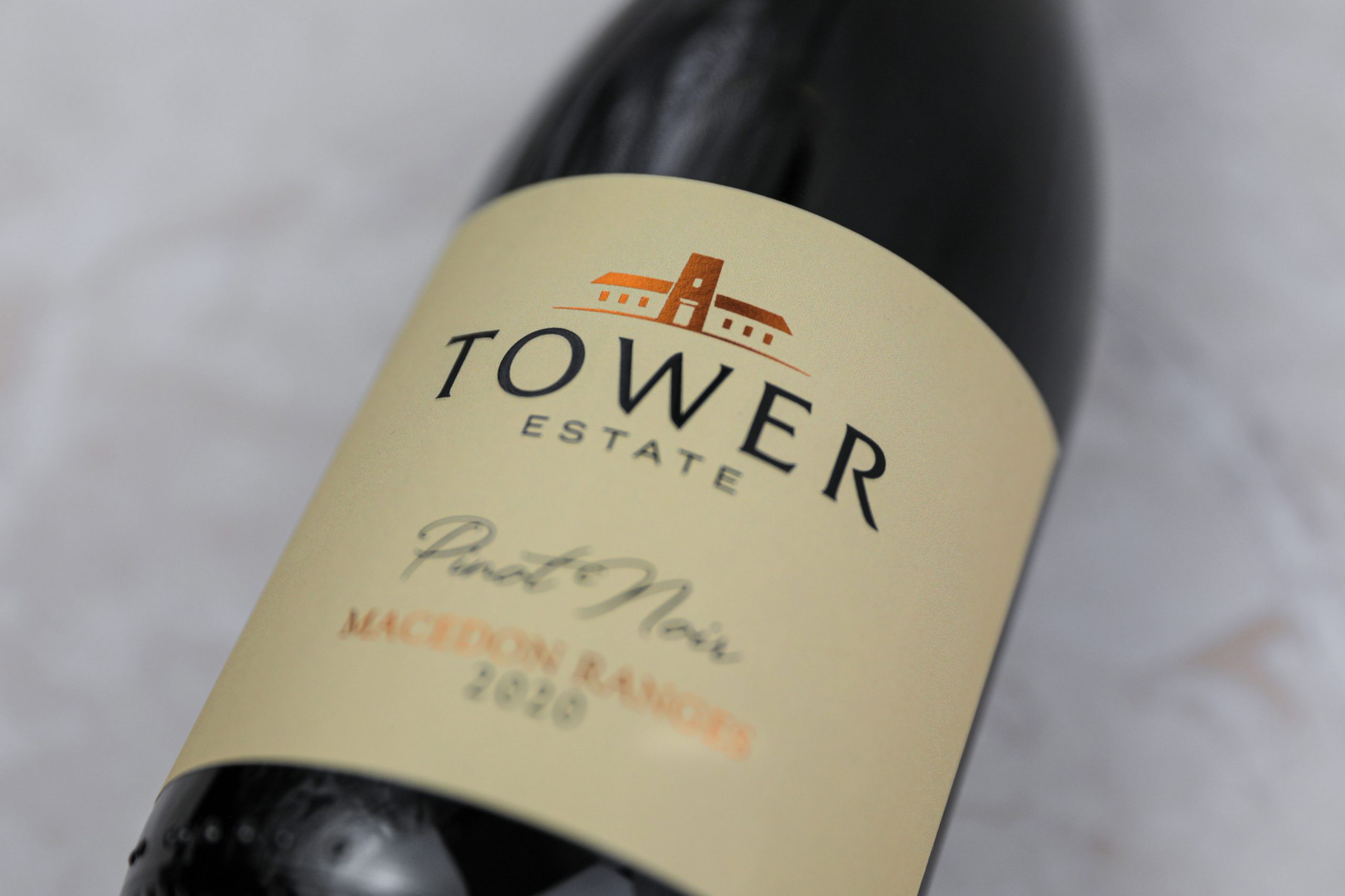
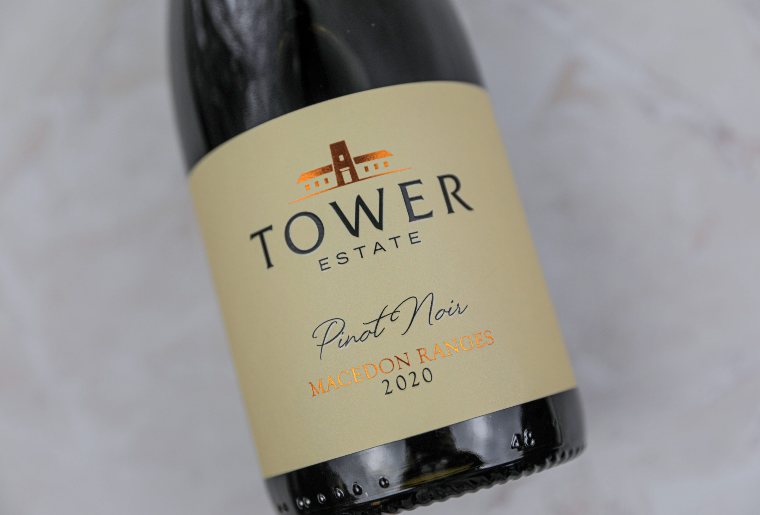
There were many considerations and challenges to overcome with the redesign of this label. The key words we needed to achieve were: Spanish, modern, luxurious, sleek and simplicity. The original label was already quite simple, but it did not reflect the other key points of the brief. The redesign needed to fit and reflect the renovated venue and the new Basque-inspired restaurant. The Spicers Tower Lodge building was originally terracotta in colour, and has now been transformed into a sandstone colour with black accents. We thought this was important to reflect in the label design; paying homage to the building’s history but also its future. The challenge now was to match an exterior paint colour into an uncoated PMS colour.
After working through our challenges, the brief was successfully achieved. The paint colour of the exterior was able to be matched and translated into an uncoated PMS colour, we paired this with black hi-build gloss features, along with copper foil accents to pay homage to the original terracotta colouration. This combination of colour perfectly reflects the modern Spanish mission style building and also the Basque-inspired restaurant. The use of hi-build gloss and foil, along with the velvety uncoated stock, adds to the luxurious feel of the label without needing to include the embossed texture of the original label design. The fonts, although similar to the original design, bring more of a modern and sleek flair to the re-design in combination with the finishes.
We believe the redesign successfully reflects the renovated Spicers Tower Lodge and Sebastian Restaurant holistically, and adds to the immersive Spanish and Basque-inspired experience. The redesign better reflects the positioning of the wine in the market and our target audience. It ticks all key words of the brief - Spanish, modern, luxurious, sleek and simplicity, achieved with the conscious consideration of stock, finishes, typography and colouration.


