Best Classic Format Package Design

The Wayward Girl

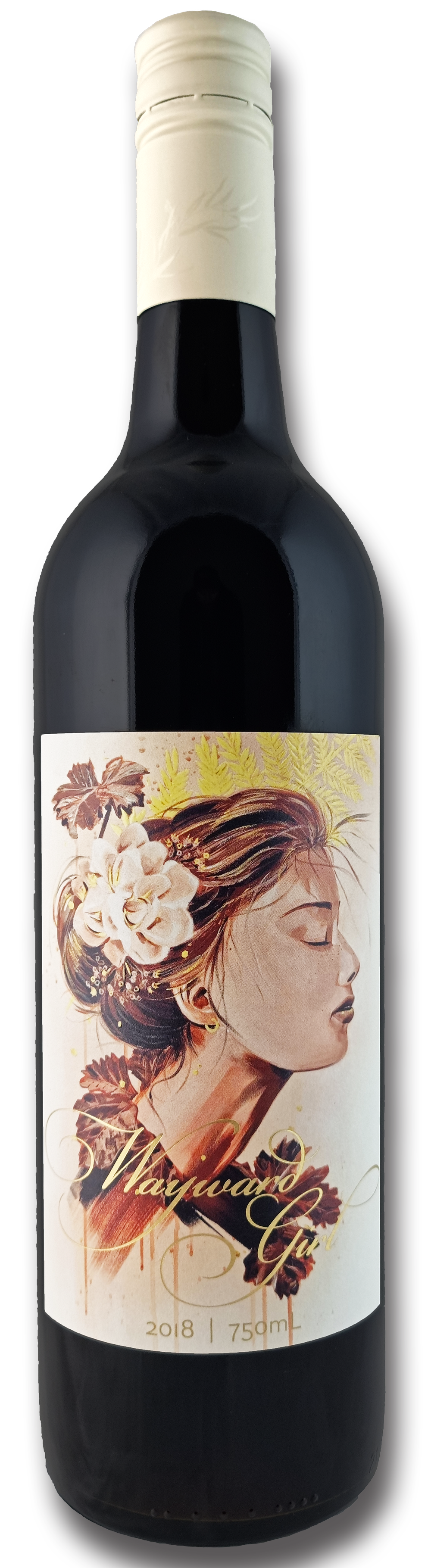
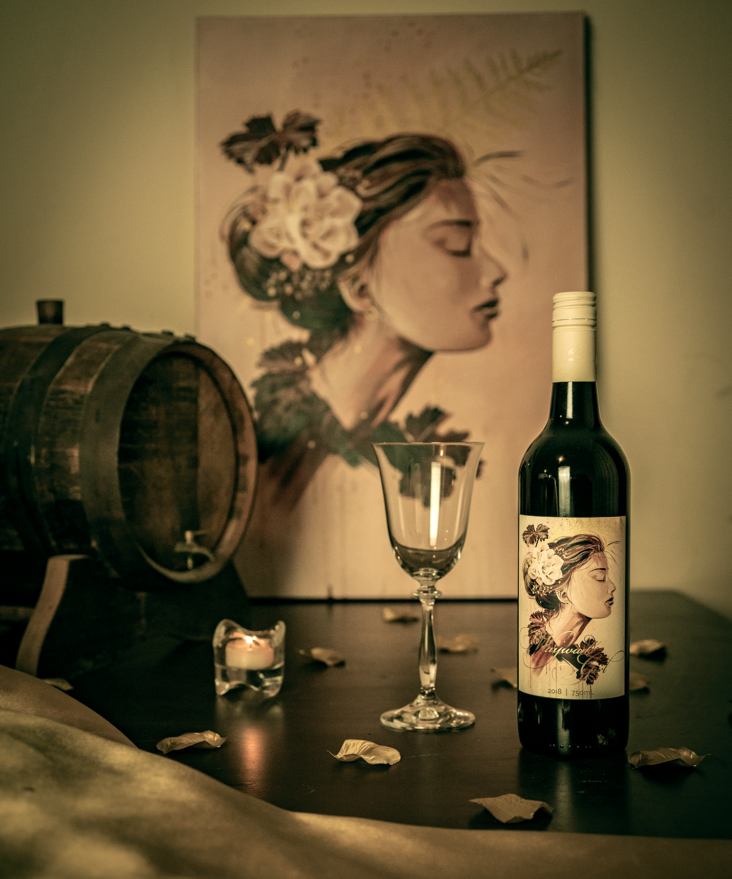
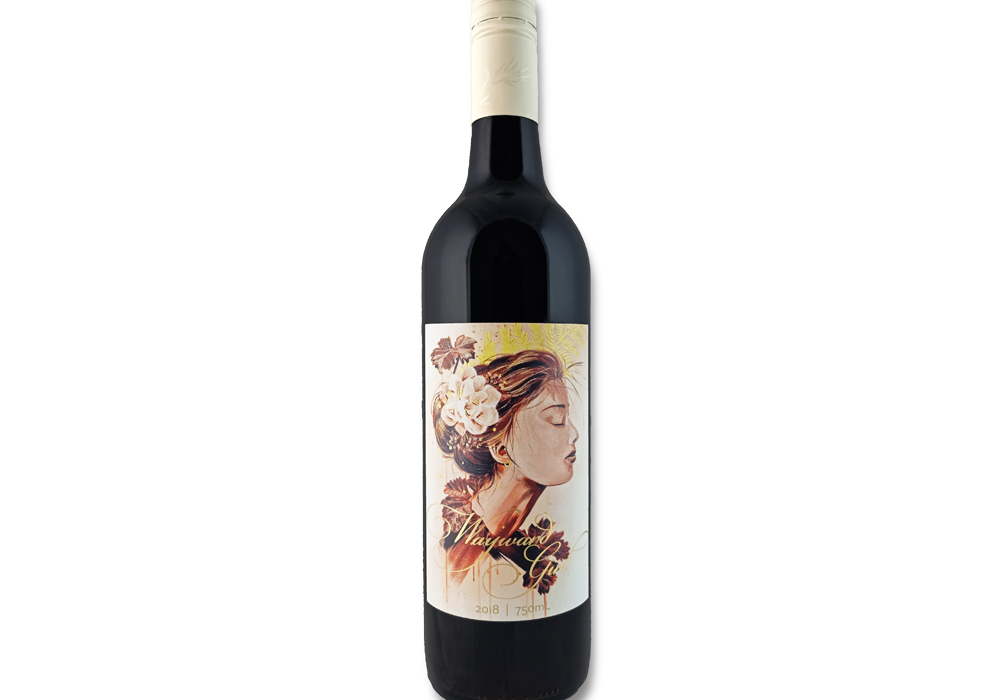
“The Wayward Girl” is a bordeaux-style blend of Cabernet Sauvignon, Cabernet Franc, and Merlot, crafted to offer a smooth and approachable drinking experience.

Entry Introduction
Our cellar door is housed in the first building in Eden Valley, Rushlea Homestead, which was built on what is now our estate in 1856.The Wayward Girl is named after the historic use of the cottage as a home for 'Wayward Girls' in the 1920s. Only produced in select years, each vintage of our wine showcases a unique design that represents the anonymous nature of these girls whose stories have been lost over time. The 2018 vintage, bottled in 2022, features a painting by artist and graphic designer Amy Herman (Splitpants Productions).
Design Challenges
Our goal for The Wayward Girl, our entry-level red wine, was to create packaging that would catch the eye of those who are new to our brand while still honoring the tradition of featuring a new 'wayward girl' with each vintage. We aimed for a design that would convey approachability without compromising the elegance and sophistication of our brand. Since this was a one-time design, we also had to be mindful of the cost of any embellishments, knowing that it would only be used for the 2018 vintage.
Design Solution
Amy Herman, our commissioned artist and graphic designer, created a beautiful painting of the 'Wayward Girl' that included our brand's fern imagery and vine leaves, with a sepia-toned finish to reflect the history of our Rushlea Homestead. She then transformed the painting into a label, paying attention to the delicate details such as the flower in the girl's hair and the fern imagery, by using a hi-build gloss varnish. The wine name was stamped in a striking gold foil, which we designed to be adaptable for future label designs. To complement the label, we selected a background color that matches our new custom Fernfield caps, which feature an ivory cap with a gold fern on top and a gloss gum-leaf pattern along the sides.
Design Impact
We are thrilled with the final product, as the stunning design has been a huge success at our cellar door. It has successfully captured the attention of new customers, thanks to its eye-catching design, which has become the most talked-about label in our range. The thematic fit with our cellar door and the historical story behind it have made it a popular choice for visitors, who often purchase it as a souvenir to take home and remember their visit. The label has successfully conveyed approachability, achieving our goal of creating a wine that is accessible to everyone.

People’s choice voting has now closed