Best Luxury Package Design

‘The W’ – Ultra Premium Wine by Wild Estate

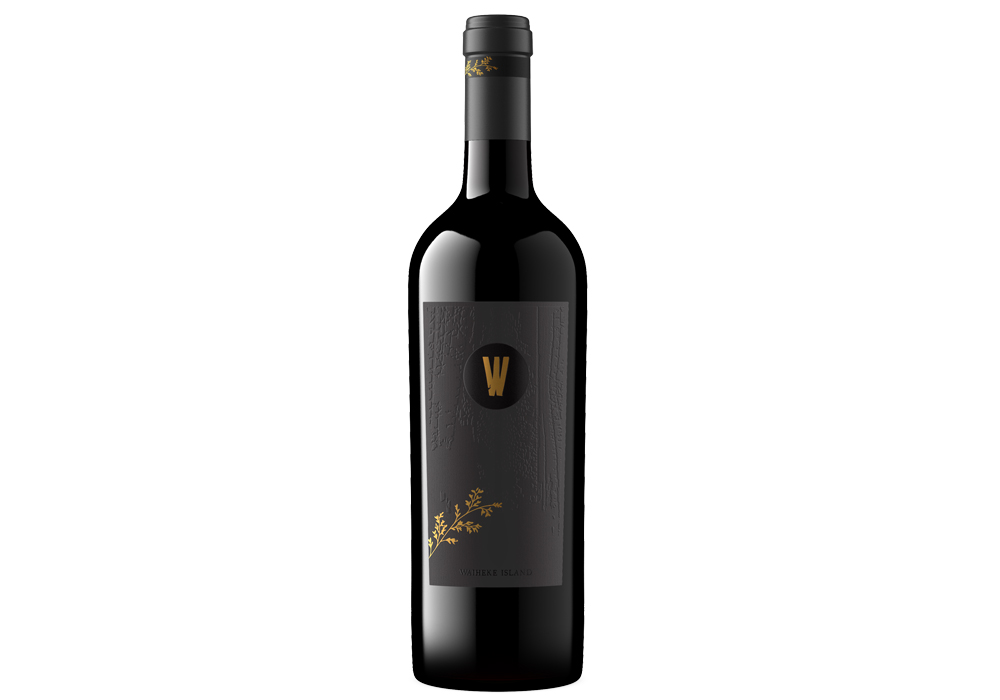
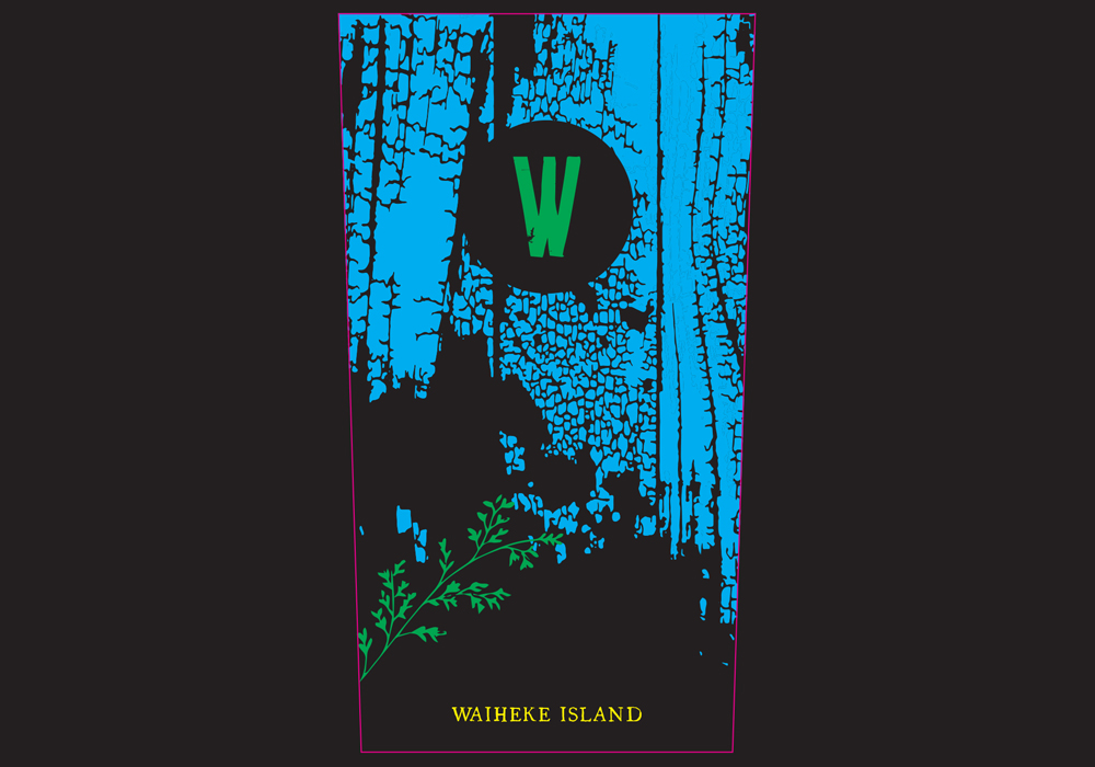
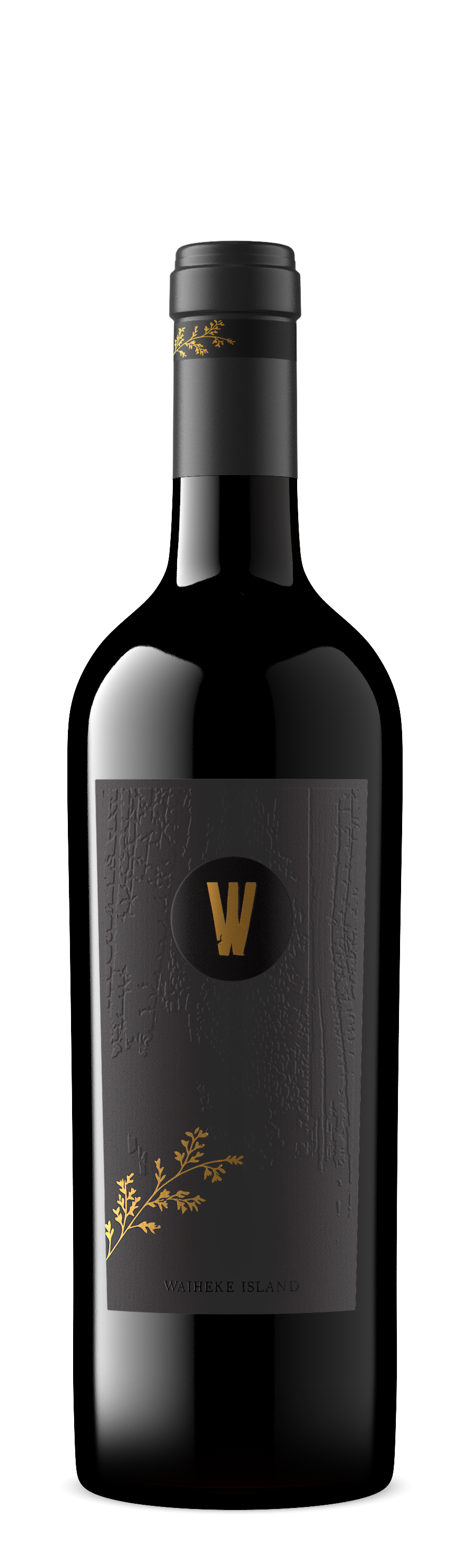
Every few years the weather gods truly align, and we find ourselves with an exceptional vintage. This makes great cause for celebration. This year we bring you our very first vintage of ‘The W’ – a superior wine crafted from the best of the best – hand-picked from our low-yielding vines in the premium Onetangi Valley, these hand selected parcels are matured in French Oak Barriques, to bring you a wine for cellaring and celebrations.

Entry Introduction
We are very proud of our new limited edition ultra premium wine from Wild Estate in the Onetangi Valley. We waited 5 years since purchasing our vineyard for a vintage of such quality that we could make an ultra premium wine, and this one is exceptional. The design had to be outstanding, using the best materials we could find. The design was to replicate our Shigu ban feature we have in our new restaurant, where the wood is burned, creating a dragon skin effect. Michelle's design brief was always to have a vine detail taken from the logo, wrapped around the bottle, and to be replicated on a premium giftbox.
Design Challenges
We used Rapid Label's Tataki premium paper, so the thickness would show a dragonskin design pressed into the front label. When this was printed the dragon skin didn't show up as much as we expected. Label Notes: -Front label and neck label is the same for both vintages due to such small runs, the vintage and grape information is printed onto the back. -Front label measures 65 x 115mm at the top and tapers at the bottom to measure 58mm wide Printed black onto same stock as other labels. Antique Gold foil W and gold foil sprig (in green on artwork). Waiheke Island at base of label printed with Gloss High Build (yellow ion label). H715-001 texture printed on area of label shown in cyan on artwork. Die line is spot colour in pink -Neck label measures 10mm x 110mm - Printed black onto same textured stock and has the sprig printed in antique gold foil (shown as spot colour green on artwork). Die line is spot colour in pink
Design Solution
As the circle wasn't as defined as expected and lacked lustre, there was a last minute update after the Print Press, to add a Gloss overlay to the centre circle. The only reason we were able to do this was the die cut was late, therefore it had to go back through the printer. The gloss was a winner, it added the contrast the label needed to pop, and after all the stress it was worth changing it.
Design Impact
Once the circle of gloss was added, it gave the effect the circle had been cut out of the label, looking straight into the bottle. It looks much more premium, and stands out on the shelf.

People’s choice voting has now closed