Best Luxury Package Design

Squid Ink Shiraz

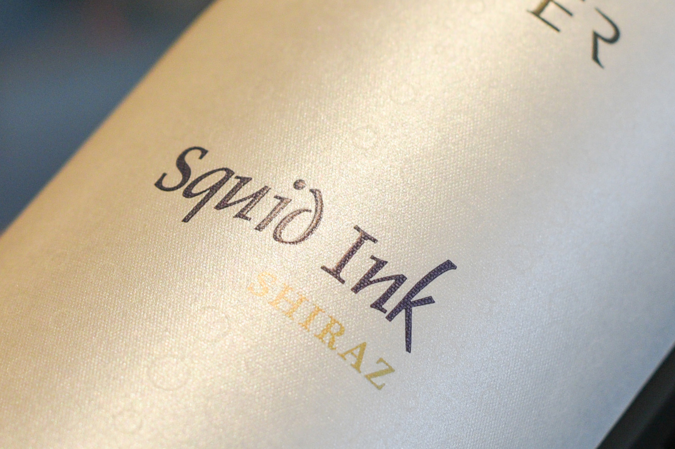
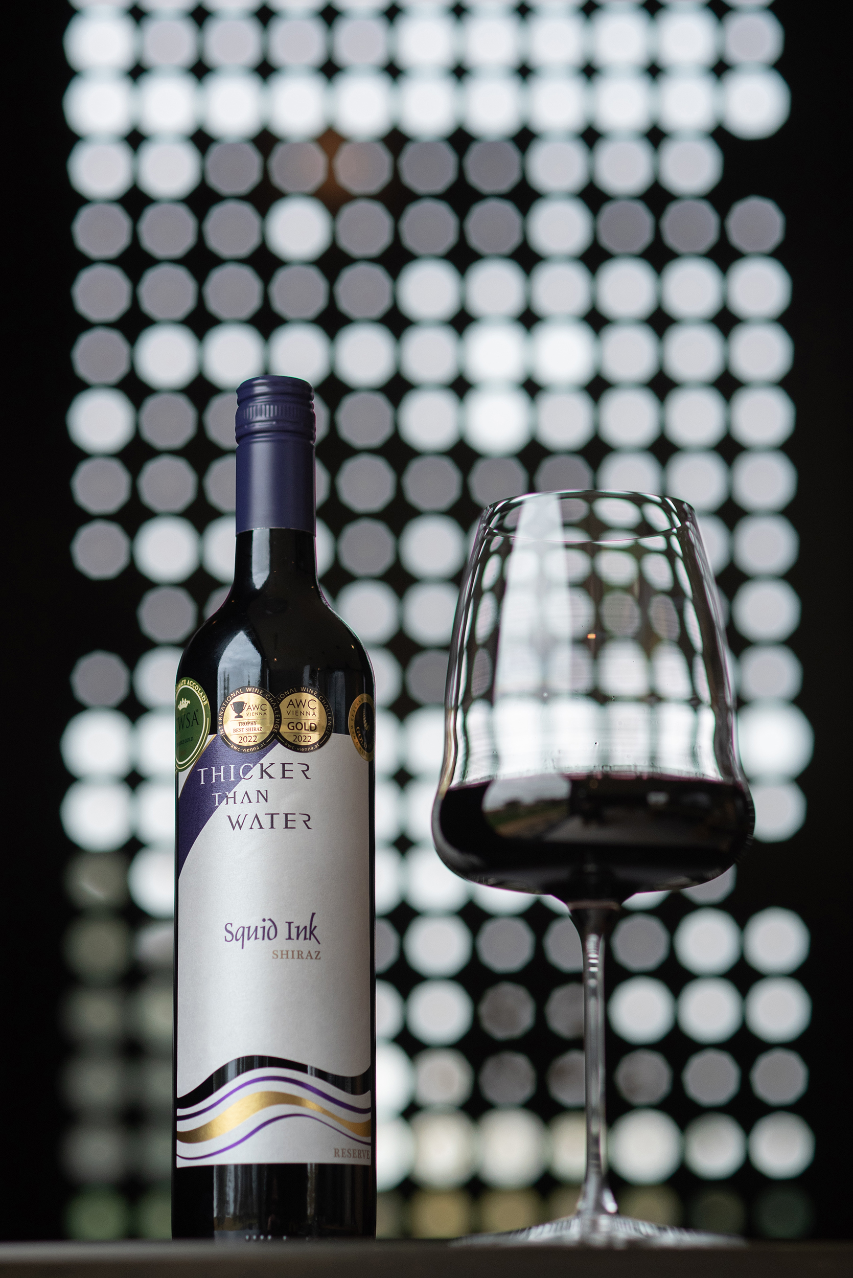
With our love for the ocean and the stunning coastline on the cusp of McLaren Vale being a massive draw card to calling this fantastic little town home it made sense to link the name of our Reserve Shiraz to it. The Squid Ink name originated from the enticing first impression of the black, dye like depth of colour this wine resonates.

Our Squid Ink vineyard is the epitome of what defines one of the greatest vineyards in Australia where the famous Black Bay of Biscay Clay soil ensures fantastic fruit. Referred to by some local friends as ‘Mayfair’ the use of sustainable viticulture and having true respect for the value of our vineyards and the fruit they create.

The 2021 vintage delivered a respectable crop size and exemplary quality in our Shiraz blocks. With near perfect ripening conditions with mild temperature and cool nights the vines thrived.

Maturation:18 Months in American Oak, 55% new oak

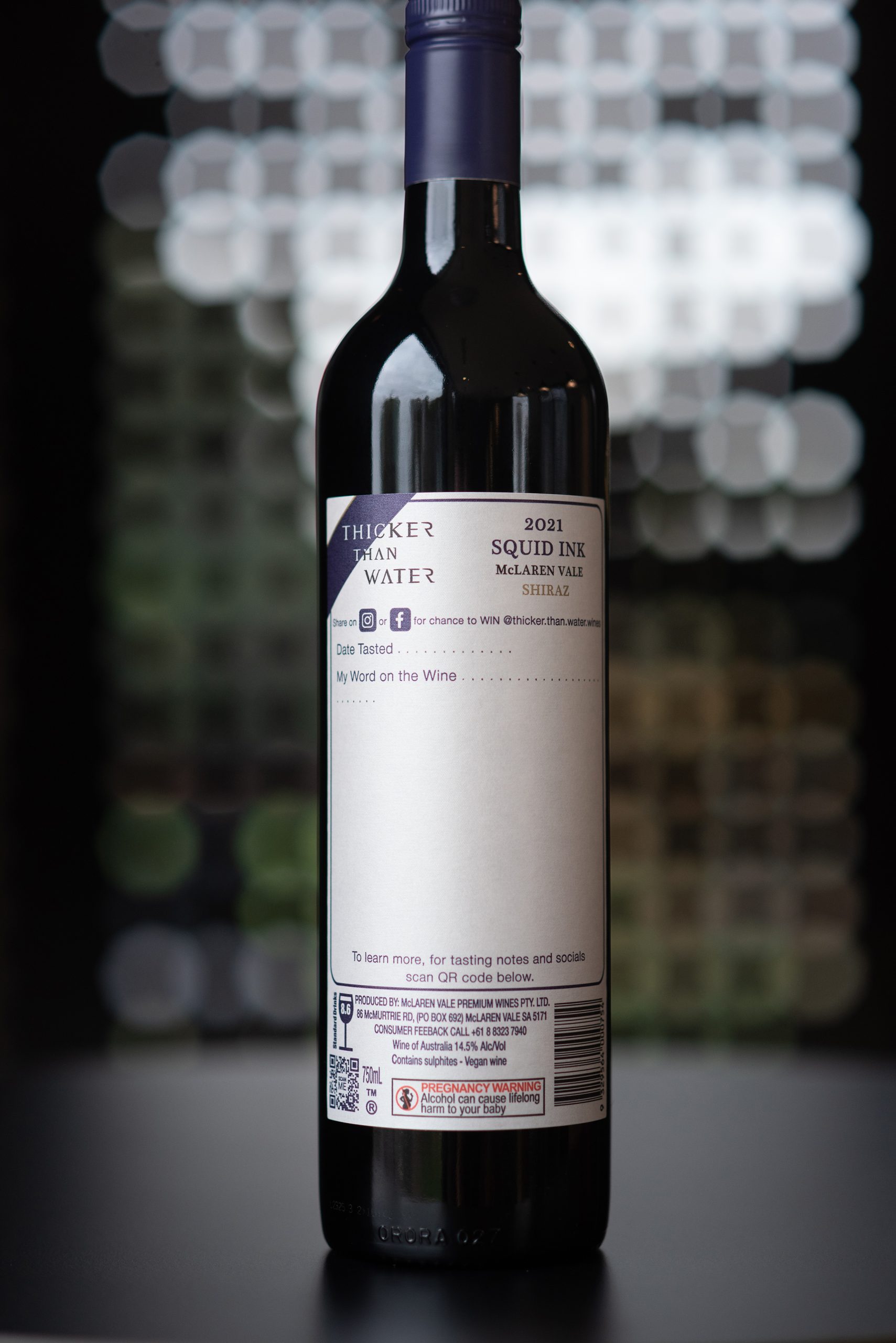
Region: McLaren Vale 100%

Alcohol: 14.5%

Colour: Deep intense dark, almost black with a purple hue.

Nose: Blackberry and blueberry bursts with a dusty oak and savoury character undertone.

Palate: The palate is timeless and stacked with layers of flavour. Firm but grounded tannins lead the march, wrapped in a swath of fruits and spice. Complex and intriguing, expressive and delicious.

This wine is what we believe to be a true representative of Shiraz from our region. As an Estate owned, sustainably grown, single vineyard Shiraz, we have the ability to deliver a world-class wine consistently that is truly at the top of its game. This wine, like our lives, is wonderful in youth, but with patience and development of the wines fruit, along with the integration of the finest of oak this wine will also develop wonderfully.

Potential: 15+ years.

Entry Introduction
‘Capture the essence of a time and place by consistently striving to create the world’s most memorable and desired wines’, this is what we live by. Therefore, in turn our products needed to reflect this. “We believe, the saying ‘if it isn’t broke, don’t fix’ is dated, as it doesn’t speak to growth. In fact, today, the modern companies say, ‘move fast and break things’ or ‘slowness to change, usually means fear of the new’. After over 20 years we decided to make some changes and rebrand. For us, many of our values and beliefs are embodied in family, and the words ‘Thicker than Water’ felt like the perfect reflection of this and in turn the ideal name of our brand. We made the decision to open a new bespoke cellar door and with that rebranding was the perfect timing. To complement our new cellar door, we needed to create a label that not only embodied modern sophistication but spoke to our family and gave the brand and wine a luxury feel.
Design Challenges
With all designs, come challenges. To create a luxury product that spoke to our new brand and bespoke cellar door meant we needed to create a label that looked luxury, sophisticated and overall world-class. Challenges for this label: - Harmonising the label with the cellar door major features which included the colour purple, texture, grandness, refinement and space. - Allowing our signature wine name 'Squid Ink Shiraz' to still feature through the label since we rebranded. - Adding an element of class. - Designing a back label that was different to anything seen before. - Standing out from the pack on a shelf. - Streamlining our range
Design Solution
Once a brand name and logo has been decided, we created the label to emphasise our branding. We felt the need to add one more aspect of purple to carry through to the label. Purple has been associated with royalty, power, and wealth for centuries. In fact, Queen Elizabeth I forbad anyone except close members of the royal family to wear it. This made us think about how we could portray the colour purple in an upmarket exclusive style, therefore dabbled with purple foil to lift the colour on the label and give it a premium look and unique feel. To compliment this, we implemented a touch of gold as well, to embody sophistication. In reflection of the logo, we used the purple and gold foils to create a wave effect (water) and thought that the split label in this wave effect would add another touch of difference, allowing not only the red wines, but the rose` to flow through this section and when the bottle was empty it would be clear. The cap was also chosen to match the purple on the logo and label, as well as a high-end premium claret antique green bottle to reflect finesse. The name 'Squid Ink' has been spot glossed and high built along with the logo to add an element of texture to the label and allow the name to stand out; negative space was also used around this to emphasise the name. The stock used on the label was carefully chosen to give that luxury feel (Frozen Orion) which is a textured pearl stock. This meant it would have a pearl finish to it, creating refinement. We wanted to have a pattern grain on the label stock, but one that was unique to us. We decided we would create our own using the bubble effect from our cellar door sliding doors that, when closed, create an underwater feel when the sun shines through. Although we wanted this to be present on the label, we didn't want it to overtake other elements on the label so we used an invisible high build on the circular pattern in 1mm, which faintly allowed the stock to have a textured pattern grain that stands out in certain lights. Lastly, we thought outside the box with the back label. Something that has never been done before! How often are back labels looked over and a lot of the time never even read? A label where the consumer writes their own tasting notes, messages, etc was our solution. Consumers can still access our tasting notes, socials, reviews and so on by scanning the QR Code on the back label, but for our point of difference we are leaving it up to them to open, taste, date and write their own notes on what they think of the wine. You can then upload the label to our socials and be in the chance to win wine, or simply put the notes away for yourself later! Not only is this different when the consumer already has the wine but, on a shelf, or in a store/restaurant it's an added individual aspect and talking point.
Design Impact
The impact of this luxury design is simply... sophisticated, unique, contemporary and world-class. Reflective of our brand, our premium wine, our bespoke cellar door and overall our family-owned winery.

People’s choice voting has now closed