Best Package Redesign

The Pinocchio Range by Crittenden

The Pinocchio range was established in 2005 by founder Garry Crittenden to explore and share his love for Italian varieties. At the time Garry felt the name Pinocchio was the perfect choice for a wine that would showcase our Italian range. Garry, with his quirky sense of humour, saw himself in the role of Geppetto, with his son Rollo as Pinocchio. Regardless of its origins, almost two decades on and the brand has developed quite the following.

Pinocchio sits amongst other Crittenden brands and is marketed as accessible, fun and novel. Part of our marketing strategy for Pinocchio is to appeal to people who want to try something a bit different – generally a younger wine drinker than those we target for our more traditional wine brands that sit at a higher price point than Pinocchio.

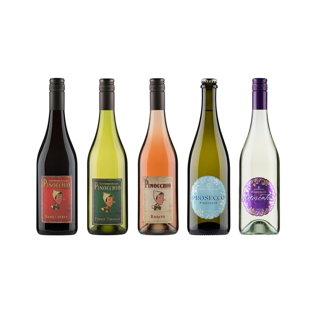
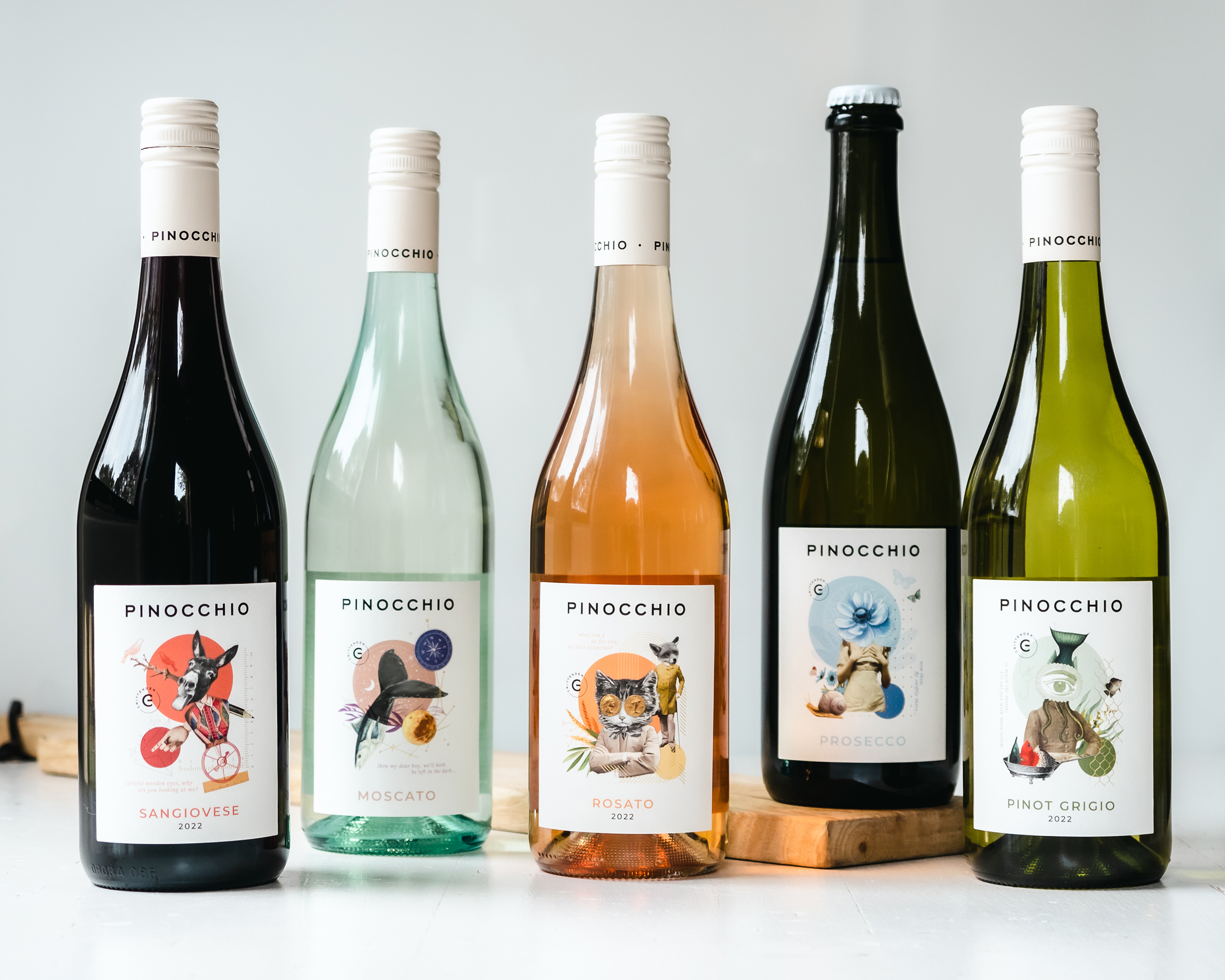
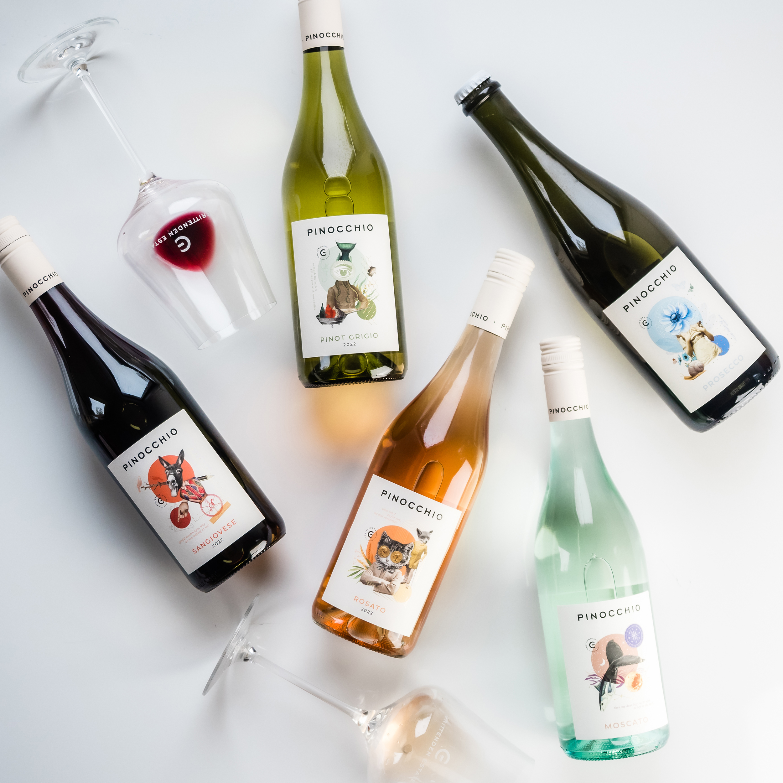
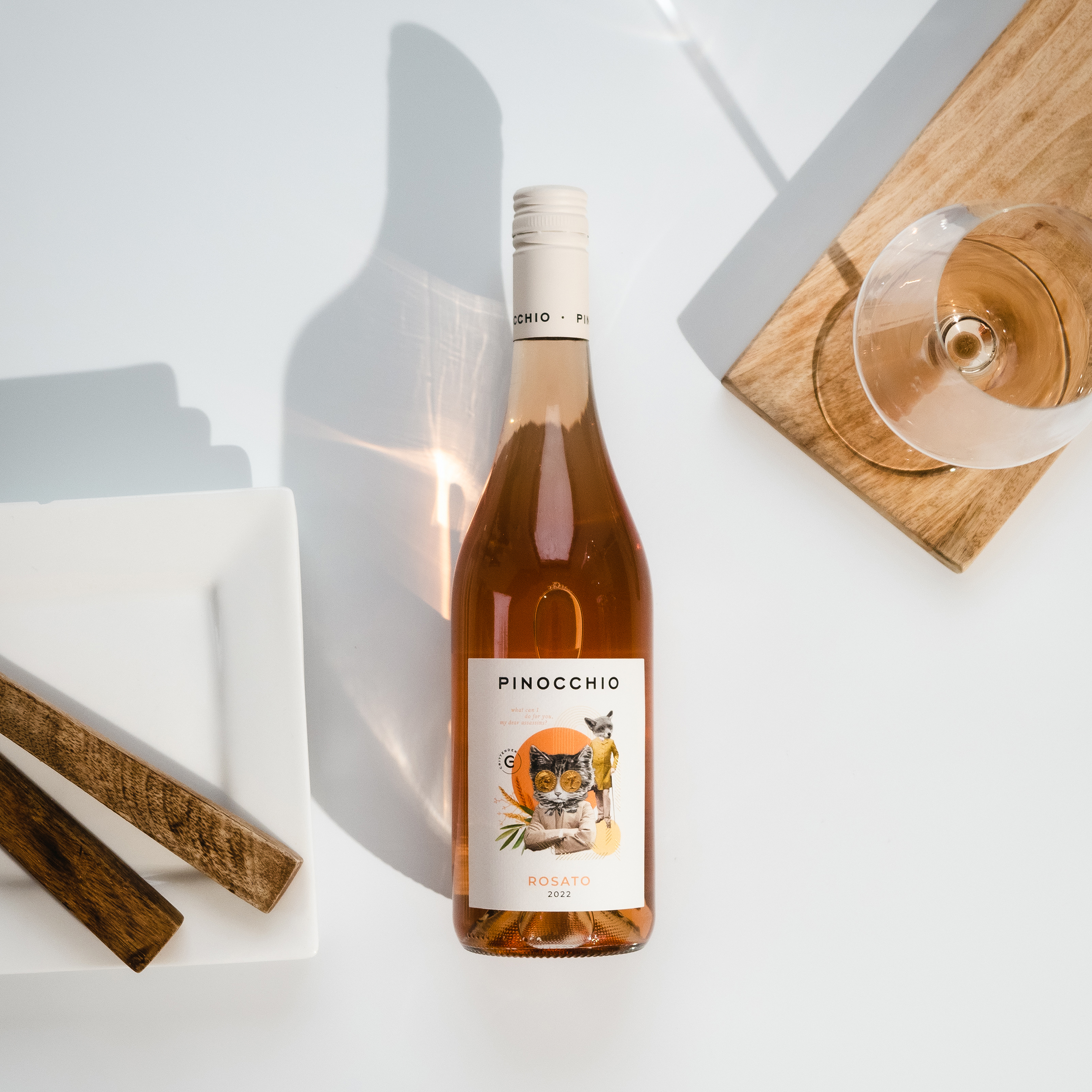
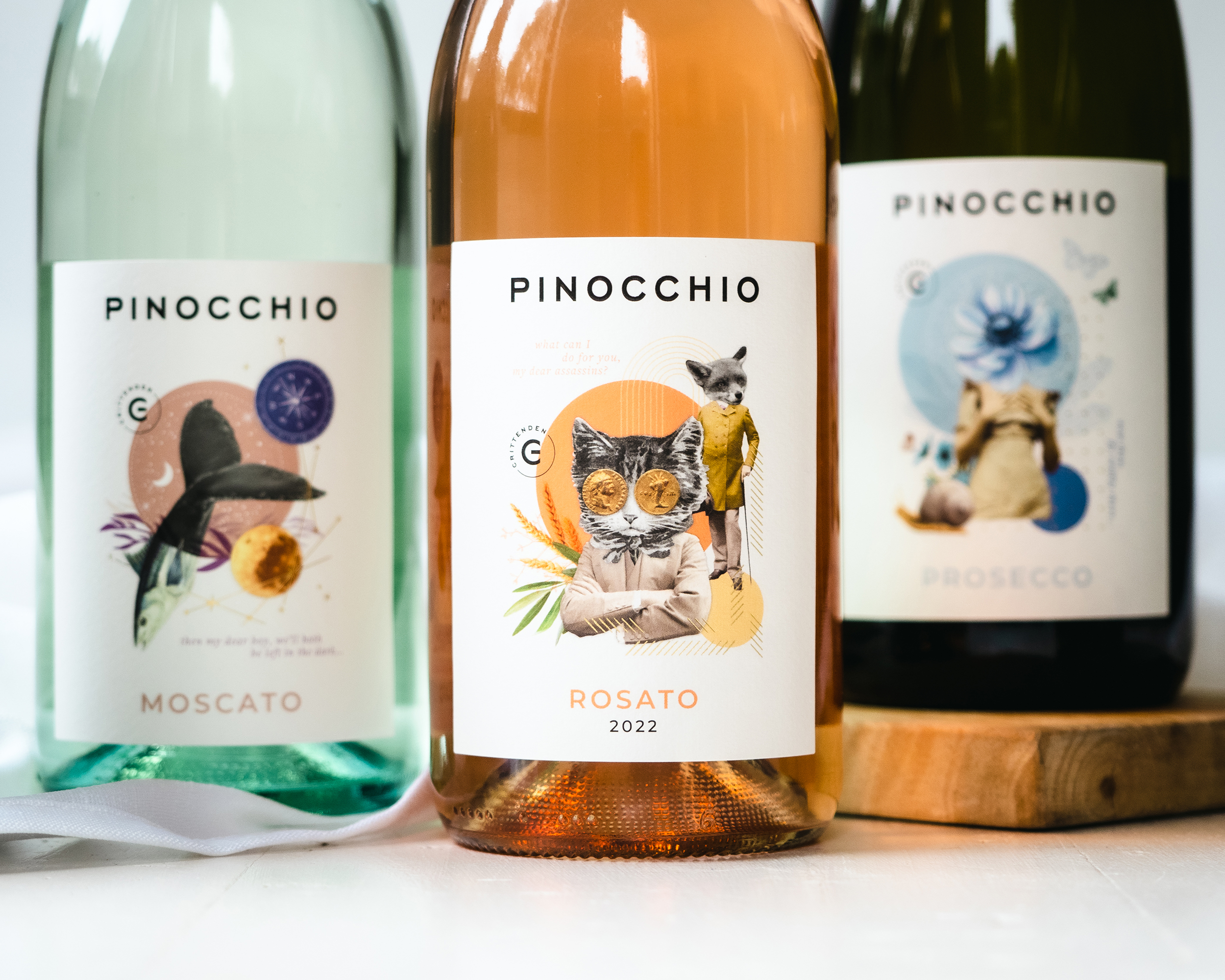
There are five wines in the Pinocchio series: Pinocchio Pinot Grigio, Pinocchio Prosecco, Pinocchio Rosato, Pinocchio Sangiovese and Pinocchio Moscato.

Entry Introduction
Crittenden’s Pinocchio wine range has a much-loved following with direct customers along with Crittenden’s wholesale trade: bars, retailers and restaurants. Today, siblings Rollo and Zoe Crittenden have built a network of Pinocchio stockists and it is well established in markets that include: the Mornington Peninsula, Melbourne and regional Victoria, South Australia, Queensland and Western Australia. A fair chunk of the range is sold direct to the consumer via the Crittenden Wine Centre (Cellar Door) and online via the Crittenden website. The previous design for the Pinocchio wines was created in 2009 and was beginning to look tired and dated in today’s wine market. Each wine in the range had been initially released at a different time across the last 14 or so years, so the labels had been designed on an as needed basis. This had led to some inconsistency in the designs, with the Moscato and Prosecco being vastly different from the rest of the range (see attached imagery). We commissioned a new marketing consultant in 2022 and towards the end of the year, along with our graphic designer, we worked through a new direction for the Pinocchio wines which would bring a modern face to the range and give us the opportunity to expand the Pinocchio audience. The designer, local Peninsula resident Bek Thompson from Luui Design, has worked on many projects with Crittenden over the last six years but hadn’t taken on a wine label redesign before, so it was also an exciting opportunity for her.
Design Challenges
To create a new design we wanted to utilise the full story of Pinocchio, however we were very mindful it would be a challenge to do so without creating a children’s story book feel. We were also mindful of alienating the loyal following of Pinocchio customers if we didn’t get the look and feel of the package design right. An important goal of the redesign was to bring the series in together and present them in a tighter and more connected way. There was also some debate about the commercial and brand value of how to position the new Pinocchio range. The established design had a very small visual cue to indicate that the Pinocchio wines were a creation of Crittenden wines. The team explored numerous ideas about how or if we should make Crittenden more prominent. We were particularly mindful of our target audience for the Pinocchio wine range redesign. Typically, this audience is young to middle age women, who love wine but don’t take it too seriously. Therefore we wanted to achieve a sense of fun and familiarity with the Pinocchio wine label design. The wines retail for $26 to $28 per bottle. They are accessible and enjoyable to drink on any occasion.
Design Solution
By revisiting the original 19th Century story of Pinocchio we identified the darker more macabre elements overlooked by the fairytale Disney version. We felt this was an interesting component to the story that many aren’t familiar with and opened up a number of creative possibilities. It also allowed us to avoid any confusion about the nature and target markets for Crittenden’s Pinocchio wines. Bek from Luui Design skilfully assigned characters and story lines from the Pinocchio book to each variety and crafted an intriguing design with a select quote from the story, fashioned for adult appeal. “Spiteful wooden eyes, why are you looking at me?” accompanies the design of Pinocchio transformed into a donkey. “What can I do for you my dear assassins?” accompanies a depiction of the Fox and the Cat and with the image of a fisherman, we have the quote “so much the better; I’ll eat you with more relish.” These three examples of quotes from the original story add both mystery and a mature edge to the artistic style of the labels. The characters, colour palettes and supporting visual elements have been carefully selected for each label to complement the wine variety along with some of the foods it could paired with and to appeal to their intended target audience. For example: The Prosecco, a wine that is light, bright and best suited to drinking on a summer’s afternoon, features flowers and butterflies, while the sweet and syrupy Moscato, a dessert wine, has the moon and elements of the evening. Sangiovese is a red wine that has wood and spice and this has been gently brought into its design. Pinot Grigio pairs well with seafood, so the use of fish and the ocean motifs here is very clear. Finally, the Rosato has a summer-inspired colour palette, as it is best drunk in the warmer weather, when we turn our attention to BBQs and gatherings that Rosato (a rose) is so well suited to. Through discussions with our sales team and select customers, we resolved that although the Crittenden name was important, the Pinocchio name had more prominence with consumers. Therefore, Pinocchio has maintained the headline position for this range, with the Crittenden logo mark applied strategically on the front label, and full company details listed on the back. To accomplish a full modern, contemporary impression of Pinocchio, we also reduced the copy of words and wine jargon on the back label and created short, punchy sentences to convey only the essential information people look for in an every-day wine. The ample space around the design elements centered on the label provide a timeless quality to the design. The use of subtle gold foiling on the labels increases appeal and heightens the design. The design process was to source, edit and present imagery in a way that felt as if pieces of the Pinocchio story line had been cut and pieced together. The final digital collages have a modern scrap book feel. At the forefront of our designer’s mind was to retain a vintage feel to tie it back to the original 19th Century Pinocchio story, whilst combining modern elements to bring it into the current world. A premium, off-white, textured and uncoated stock was selected for the labels – reminiscent of the pages of an antique story book. The resulting designs are something that fit comfortably in both the old and new world. The creative mind and artistic skill of the designer is obvious at first glance, and her background as an illustrative artist has been a clear asset when dealing with such a whimsical story.
Design Impact
We released the Pinocchio Prosecco, Pinocchio Pinot Grigio and the Pinocchio Moscato publicly to trade in February 2023 however the full range won’t be officially launched until June 2023. To test the appeal and pitch of the new designs, we presented them to various trade and internal customers to understand if the new direction would be well received and if it would have any negative impact on our established customers. The overwhelming response was amazingly positive from both trade and our own retail consumers. Many indicated to us they loved them so much more and revealed this change was well overdue. “The labels have been so well received by the Crittenden trade customers who are so excited and curious about the fresh designs when we present them. They also love to hear that they have been created by a local designer.” Caroline Lee, Distributor Crittenden Wines “Wow – the new labels are clear and bright and really depict the quality of the wine in the bottle. The white label also allows the contents of the bottle to feature. They’re great!” Jon Slingsby, Crittenden Wine Alliance Member

People’s choice voting has now closed