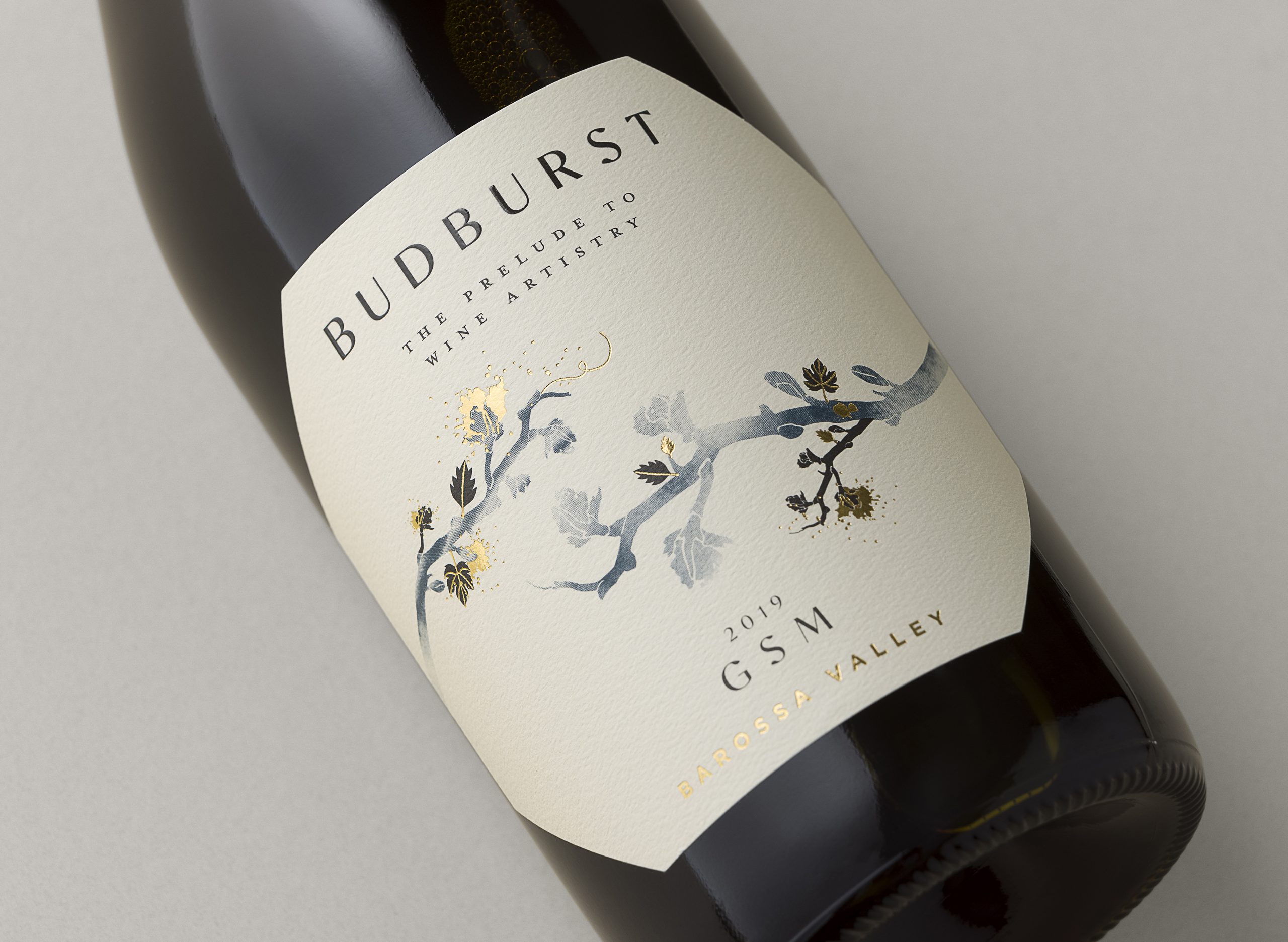
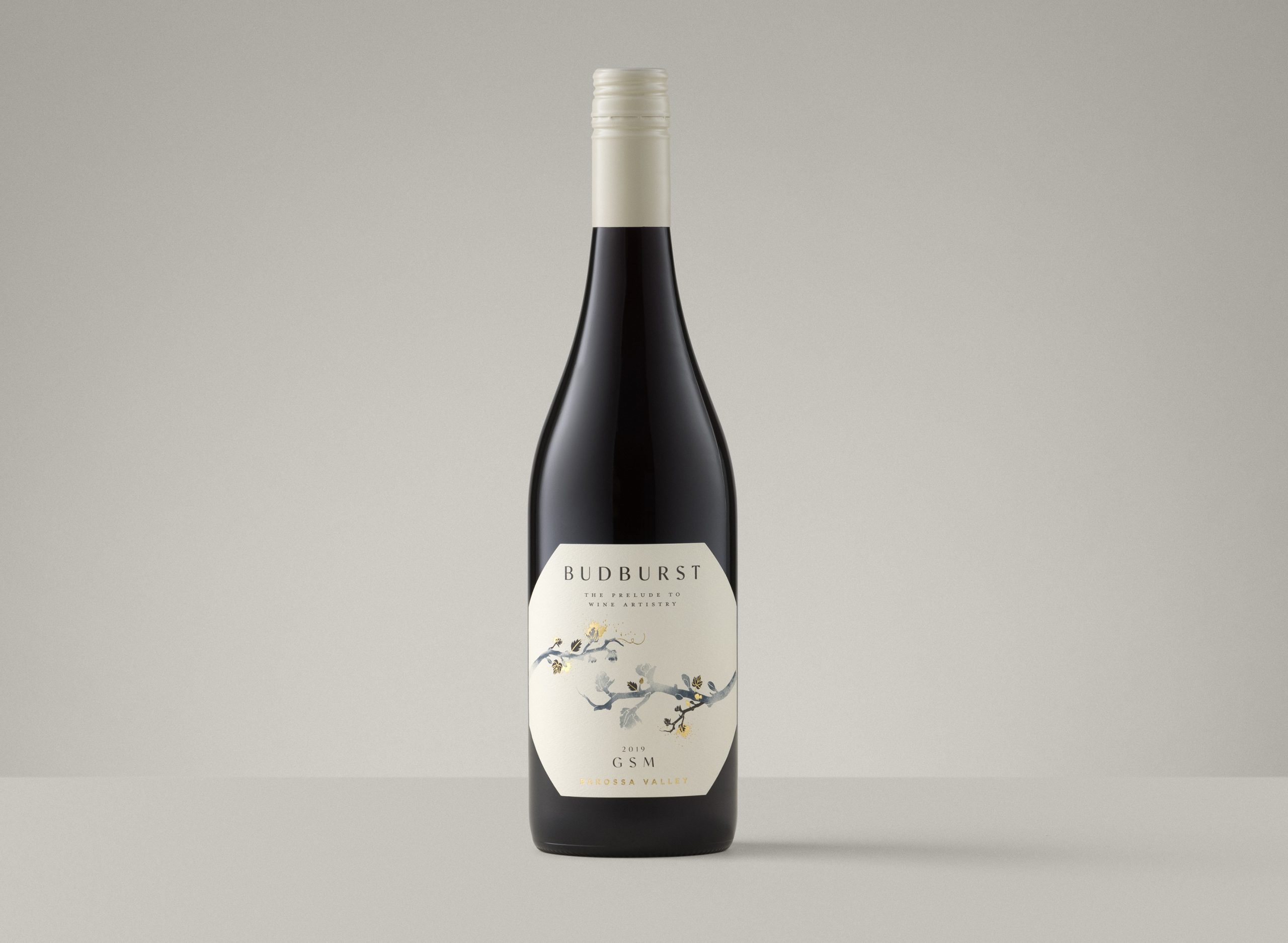
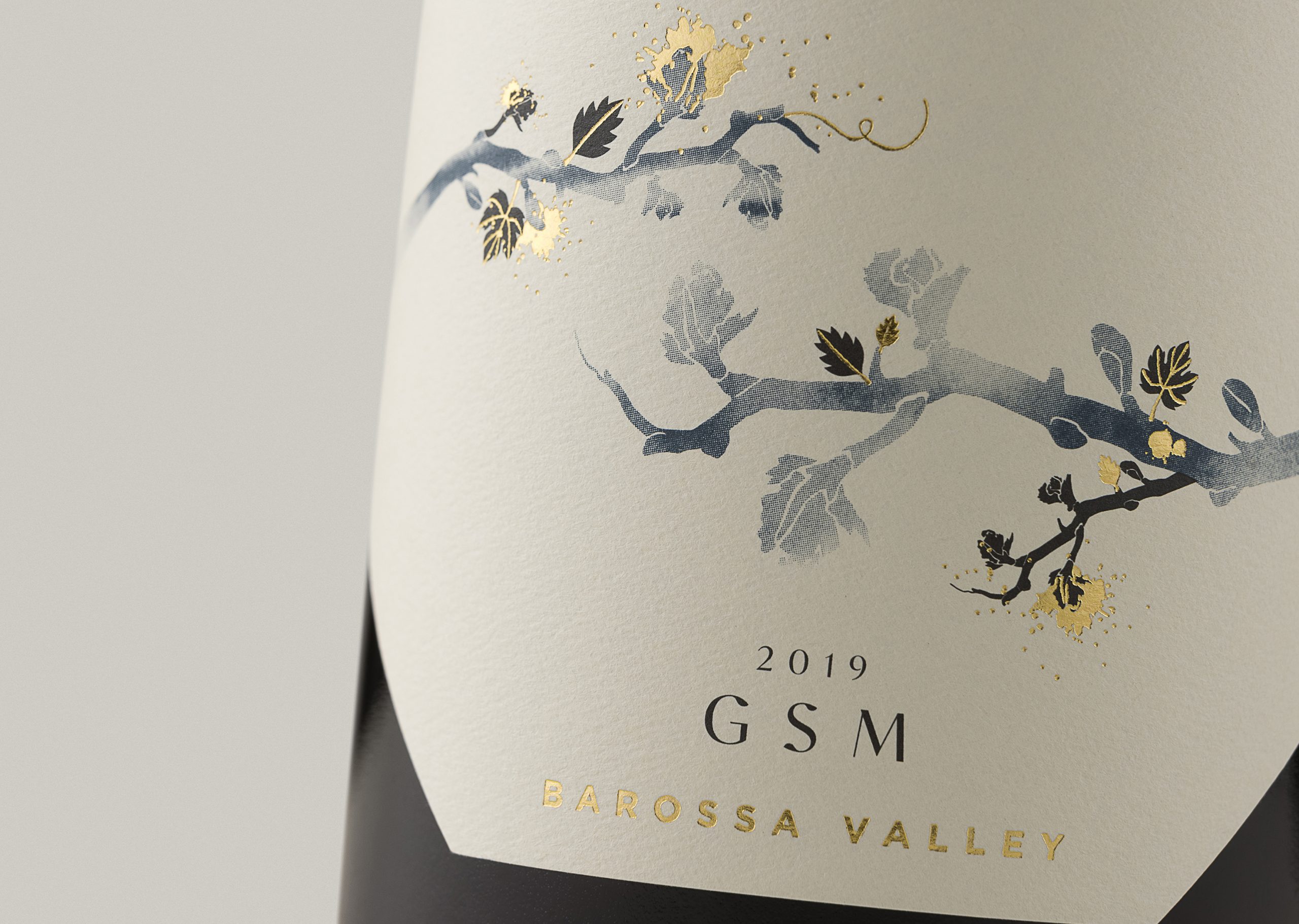
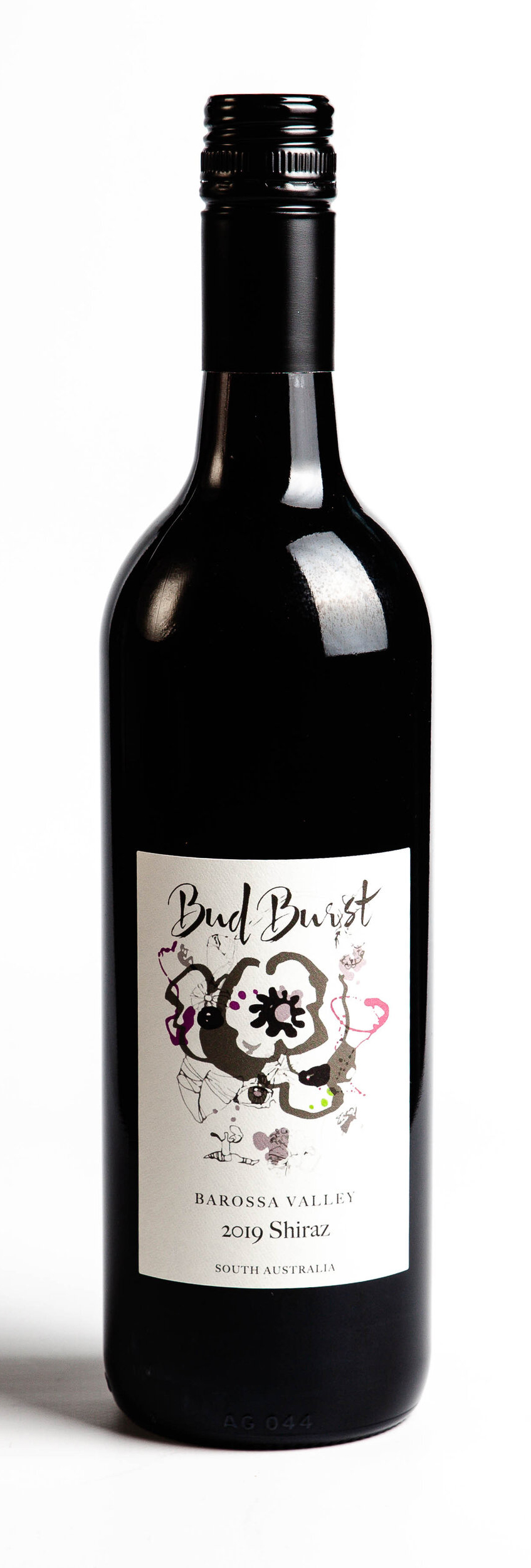
We first started with changing the name to a single word to strengthen the brand. We wanted to evoke the emotion and excitement of seeing the new buds come to life each season. The addition of a tagline on the label adds to the story but creates a poised elegance, giving the brand a personality.
The textural stock and flecks of foil add to the tactile experience for the consumer. The unusual label shape creates a point-of-difference giving this elegant label a modern edge.
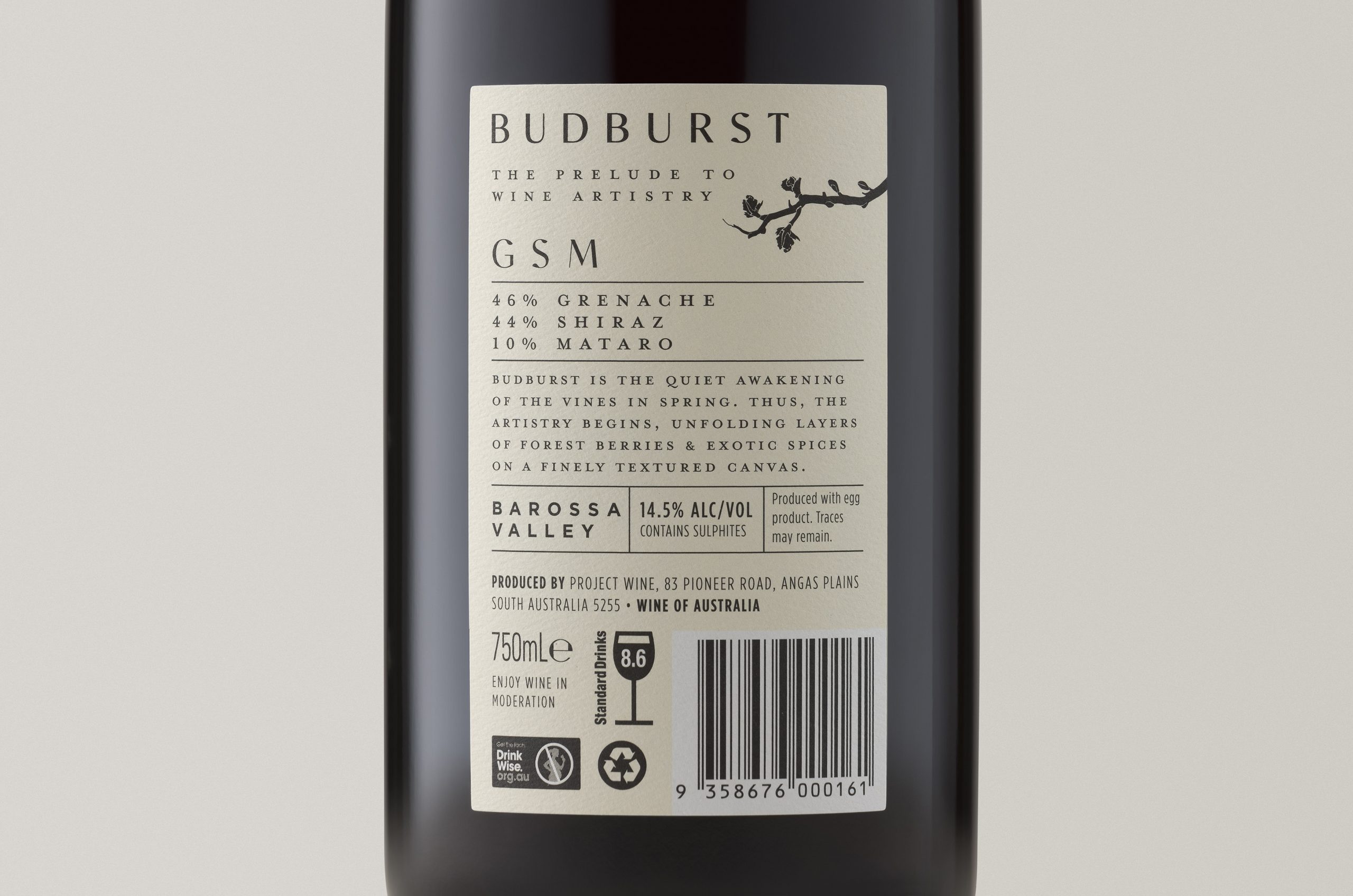
The back label design has also been consider to reinforce the quality of the product.
The client has found engagement with the brand has increased resulting in a dramatic increase in sales from the previous branding. It has also opened up new opportunities with trade and venues who have previously not been interested.