Entry Introduction
For the last decade, Monterra has created high-end wines born from idyllic vineyards in South Australia. In recent times, the brand has expanded their product offering and steered towards a more sustainable and vegan focus. A review of the core range was required to celebrate these values visually and to create an appropriate differentiation against the premium ranges that sit above.
Design Challenges
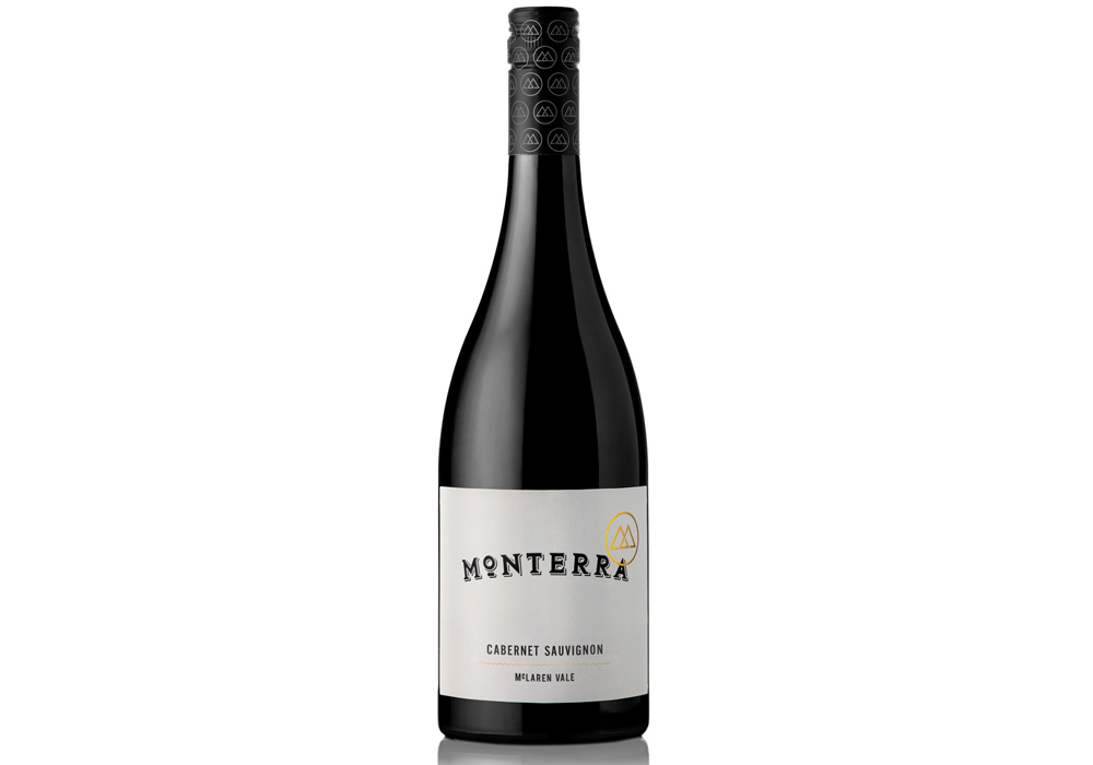
Monterra's core range has always featured a traditional and minimalist white-label design that had become familiar to their customers. However, to stay relevant and attract new consumers, it was clear that a modernised label was necessary. To do this, we needed to update their look without alienating their loyal following. The new direction needed to open up new opportunities for the brand and appeal to adventurous but budget-conscious consumers.
Design Solution
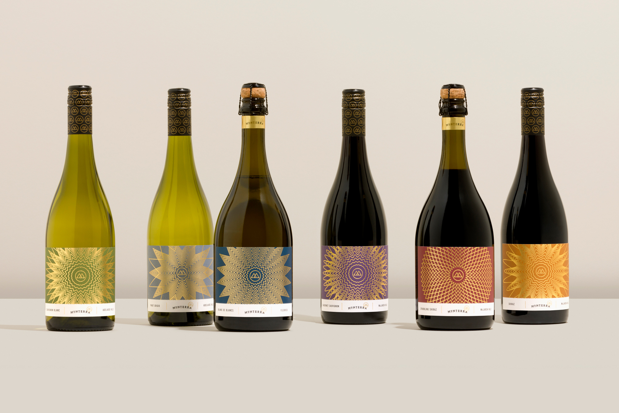
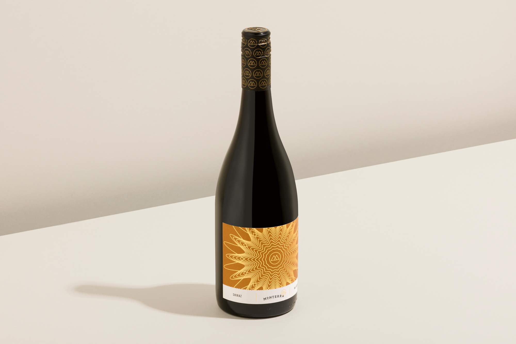
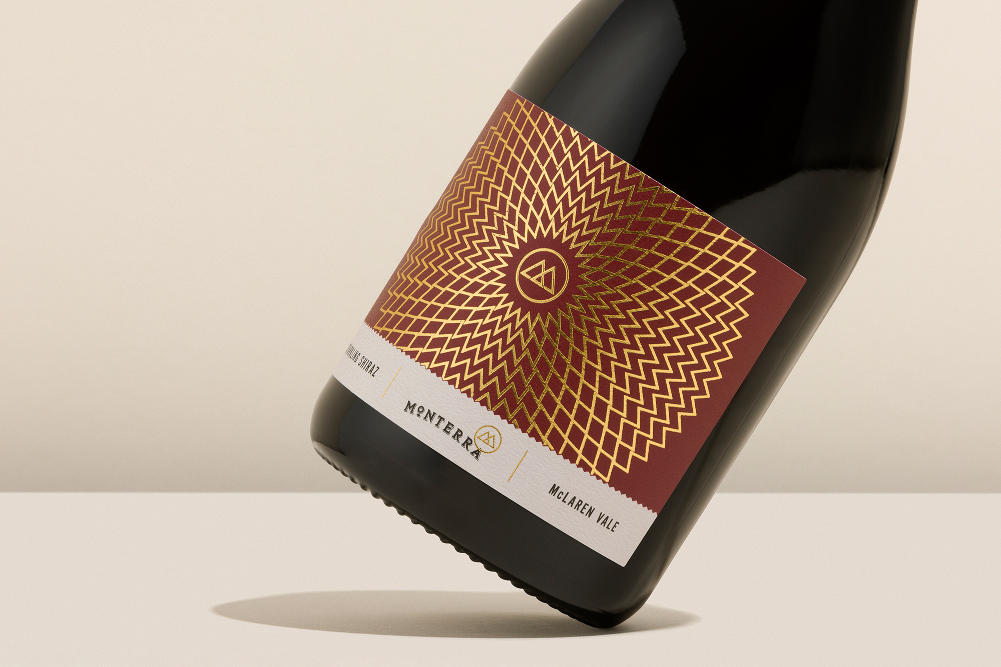
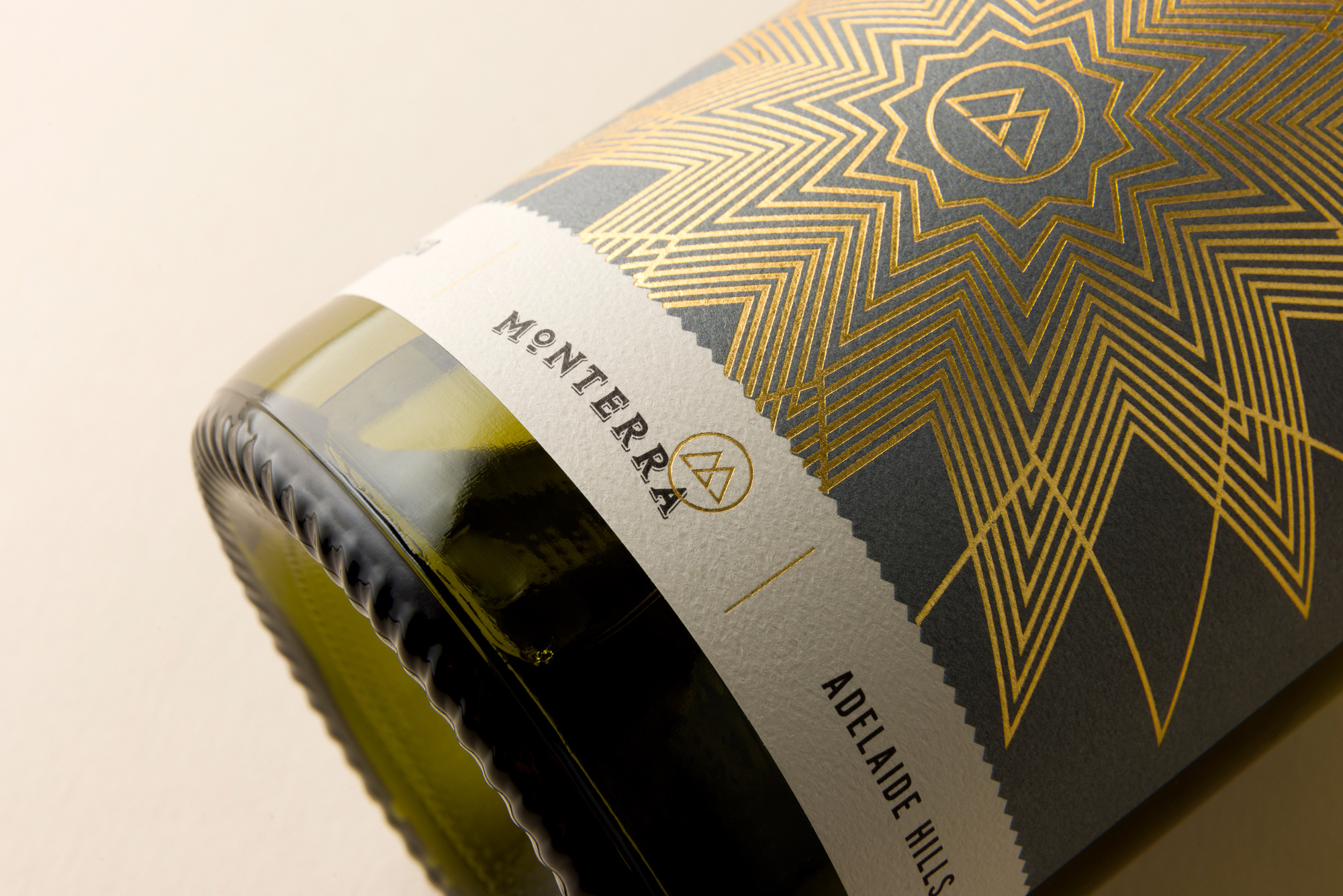
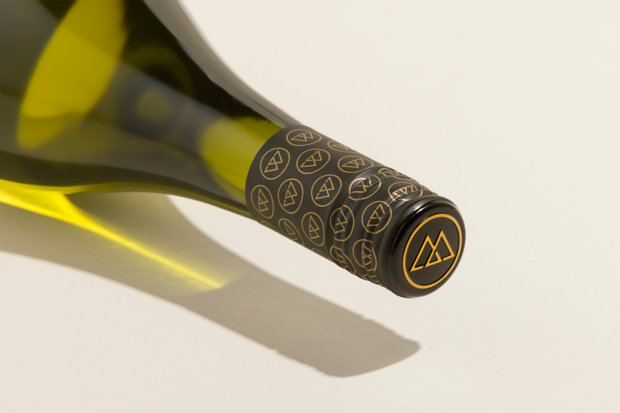
The unique characteristics and flavour profile of each wine were celebrated through differing label tones and organically inspired artwork. Evolving from the brand’s gold logo-mark itself, a spirograph-styled pattern radiates from the centre of the label. Each label now becomes an abstract depiction of the wine’s tasting structure and length.
Design Impact
The outcome is a distinctive and alluring update to the packaging that confidently sets Monterra apart within their industry, while also reflecting a more fitting progression into their premium product lines. In addition, the brand's recent emphasis on eco-friendliness is highlighted through the use of 100% recycled material for the labels and compostable ink for printing. These environmentally conscious choices further enhance the appeal for consumers who prioritise ethically-made products.