Best Luxury Package Design

Fernfield Wines Gold Leaf Reserve Shiraz

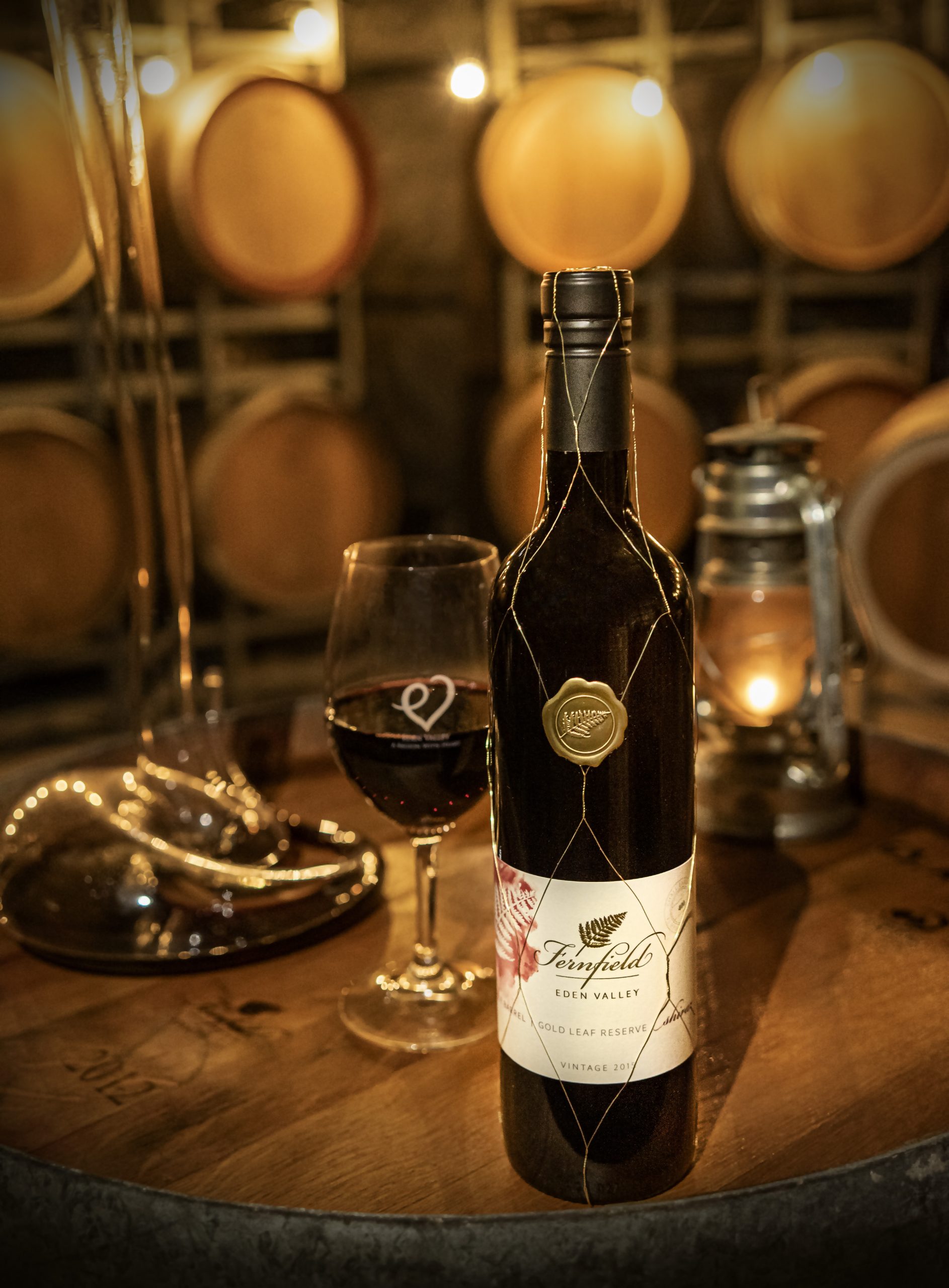
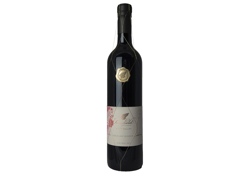
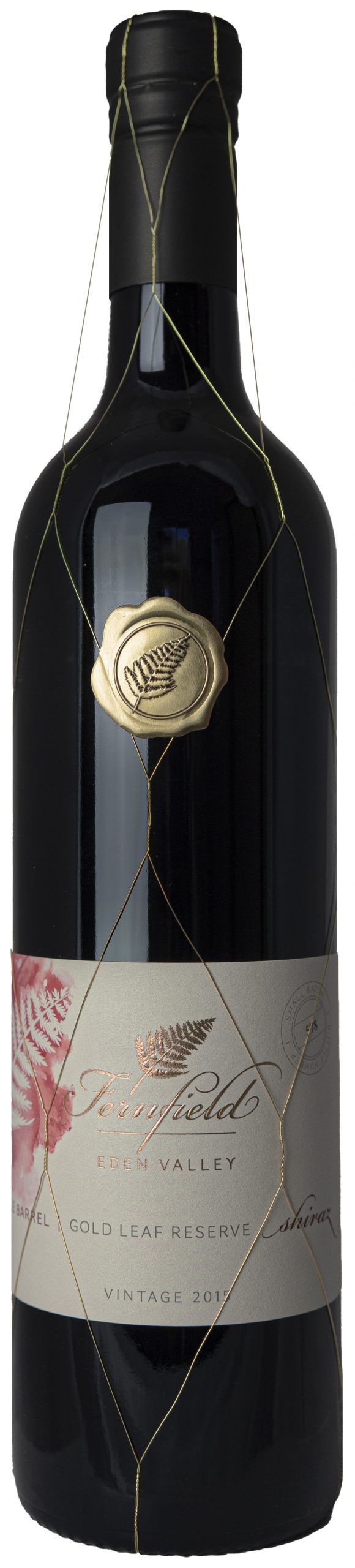
This wine, from 2015, was grown using organic methods in Eden Valley, Barossa. We kept things gentle for this small parcel of wine with handpicking, hand plunging and basket pressing all done to compliment the wine. Two barrels were chosen for the final wine, one new American oak imparting rounded vanilla and complex spice, and one aged barrel to maintain the classic black forest fruits, and imparting some softening.

Entry Introduction
Our Gold Leaf Reserve collection boasts limited quantities of the finest fruit handpicked by our expert winemakers. When it came to designing the packaging for our 2015 Gold Leaf Reserve Shiraz, we aimed to craft something that would immediately grab the attention of discerning wine enthusiasts and communicate elegance while staying true to our brand identity. The label's design, as well as the bottle embellishments, were both strategically created to align with these values. We wanted the label to be visually striking and easily recognizable in a fine wine shop, while still exuding an understated elegance. Every detail, from the font selection to the use of white space, was thoughtfully considered to ensure that the packaging embodied the high quality of the wine inside. The bottle embellishments were chosen to further reinforce the wine's premium status. These design elements were carefully selected to accentuate the bottle's curves, providing a tactile experience that immediately communicates the wine's quality.
Design Challenges
The Gold Leaf Reserve Shiraz, our flagship wine, required a packaging design that could effectively showcase its premium quality and unique character, while still aligning with our brand identity. With a production run of fewer than 1000 bottles, the packaging presented an opportunity to add a personalized touch to the wine and distinguish it from mass-produced alternatives.
Design Solution
Amy from Splitpants Productions, our talented graphic designer, conceptualized a label that perfectly complements the tasting notes of the wine. Using a colored watercolor, the label harmoniously integrates our fern imagery in relief, with a sculptured emboss that adds depth and dimension to the design. The bottle number is displayed on the right side, further emphasizing the limited production and boutique nature of our wine. To enhance the packaging's appeal, we added a wire mesh over the sleek WAK cap, a design element that has been used since the 19th century to indicate high-quality wines. This detail is a clear indication that our wine is a truly boutique product. Finally, we completed the packaging with a golden metal stamp featuring our fern logo, adding a final touch of luxury to the design.
Design Impact
Our packaging design features both eye-catching embellishments and understated elegance, carefully balanced to appeal to our customers. The glitz and glitter of our mesh and stamp serve to catch the eye of our customers, while the more understated elegence of the underlying label provide cues to the premium wine style inside. Our design has proven successful, having won a prestigious gold medal at the Australian and New Zealand Wine Label Awards. This recognition is a testament to the careful attention to detail and meticulous craftsmanship that went into creating the packaging for our premium Gold Leaf Reserve Shiraz.

People’s choice voting has now closed