We are the newest wine brand in the Hunter Valley based out of Pokolbin.
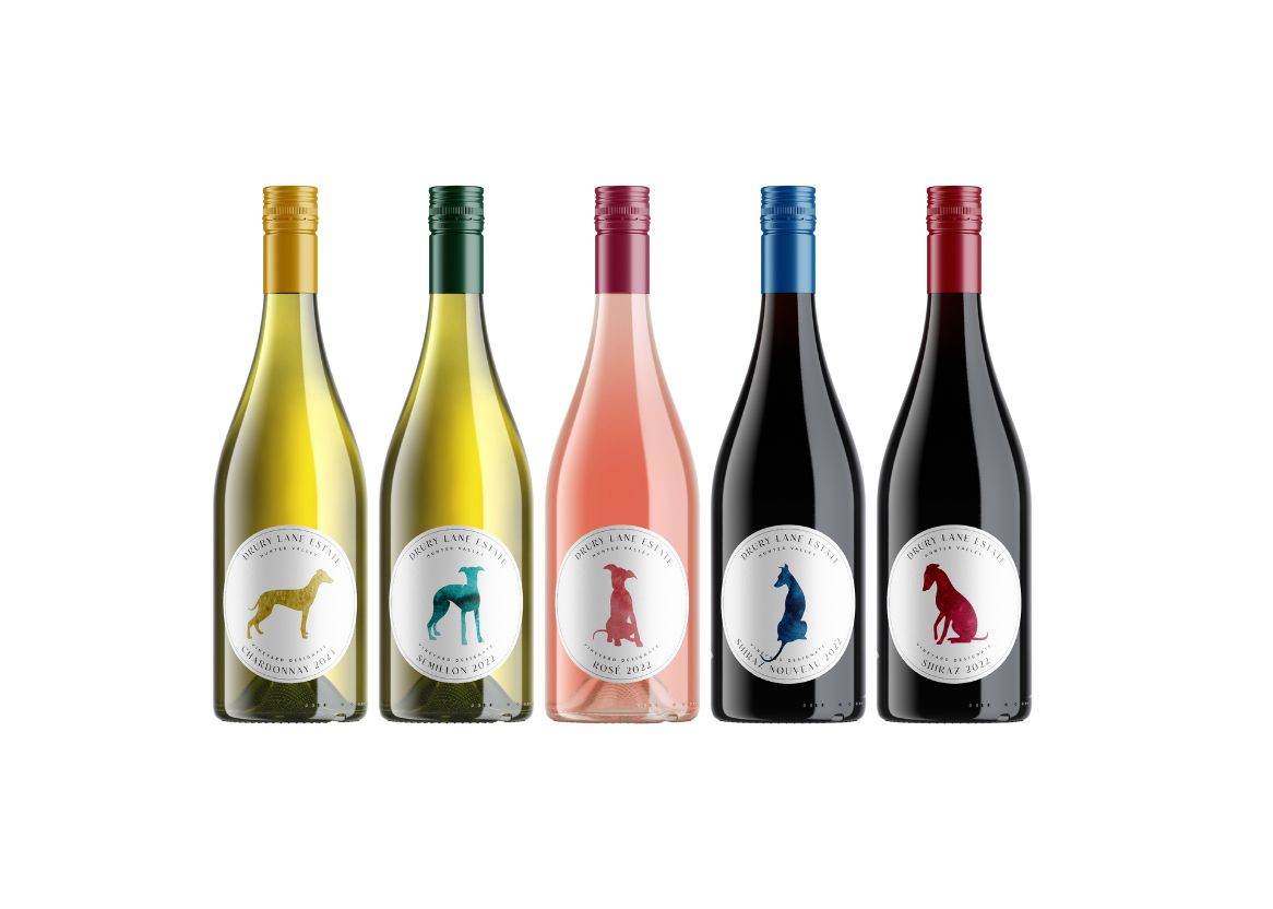
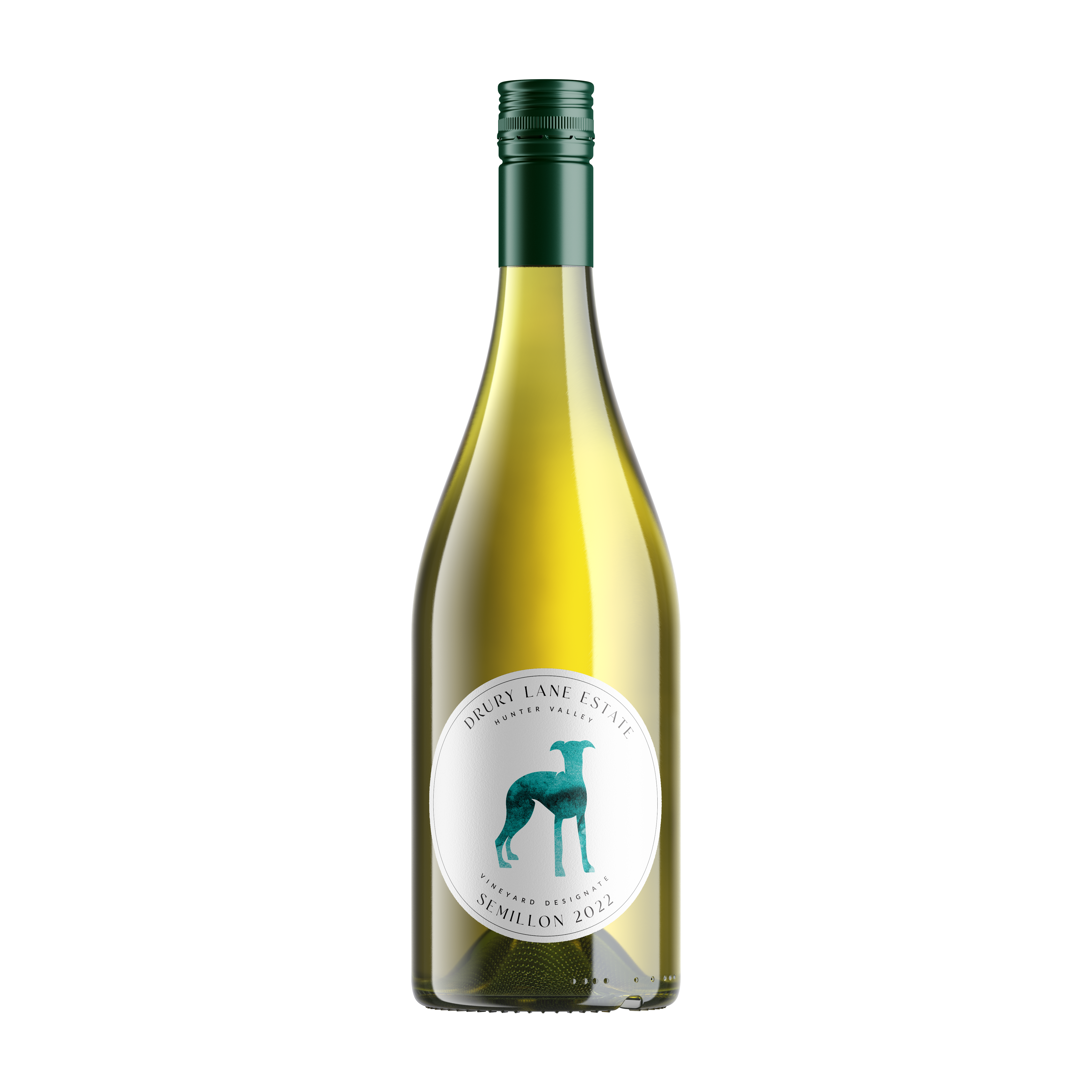
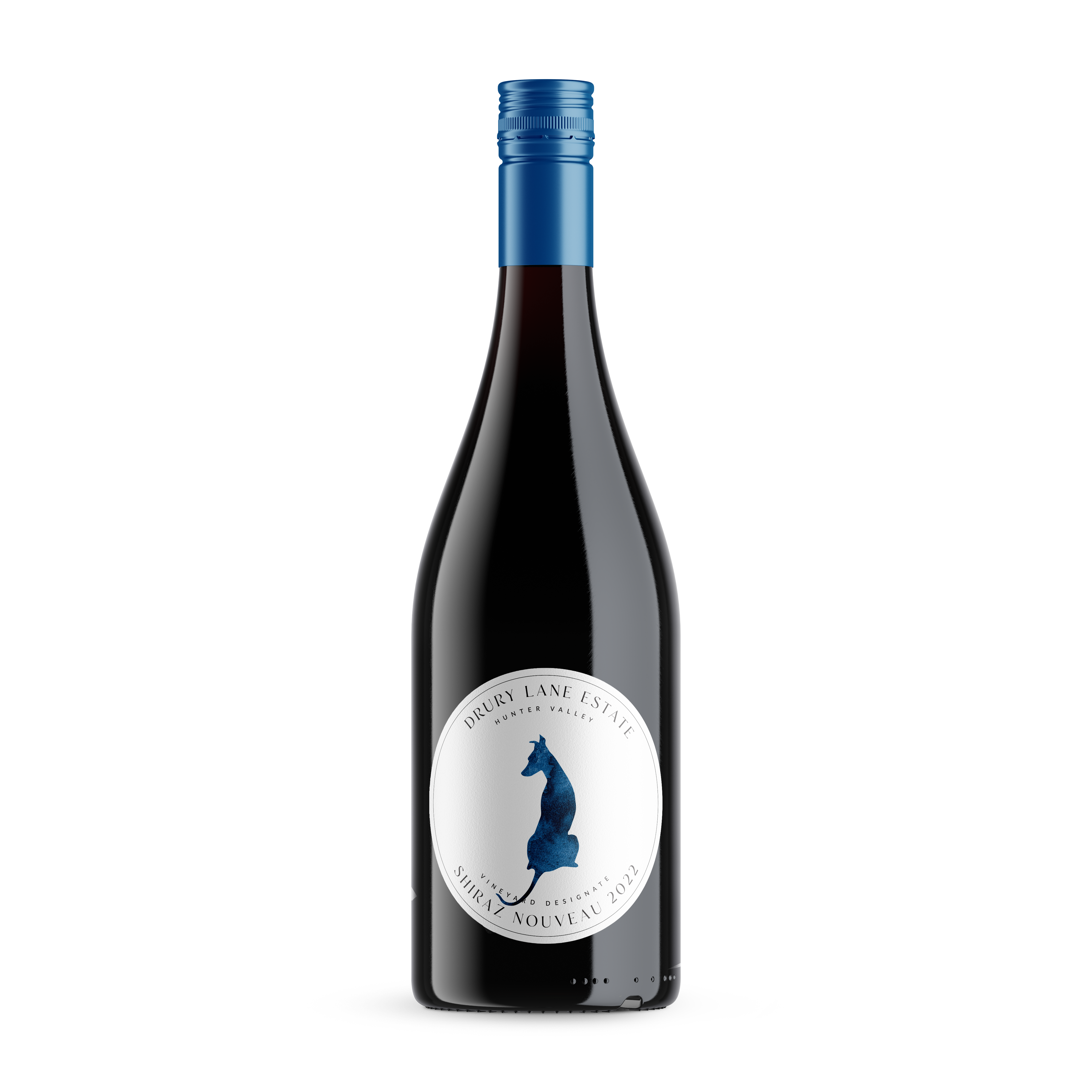
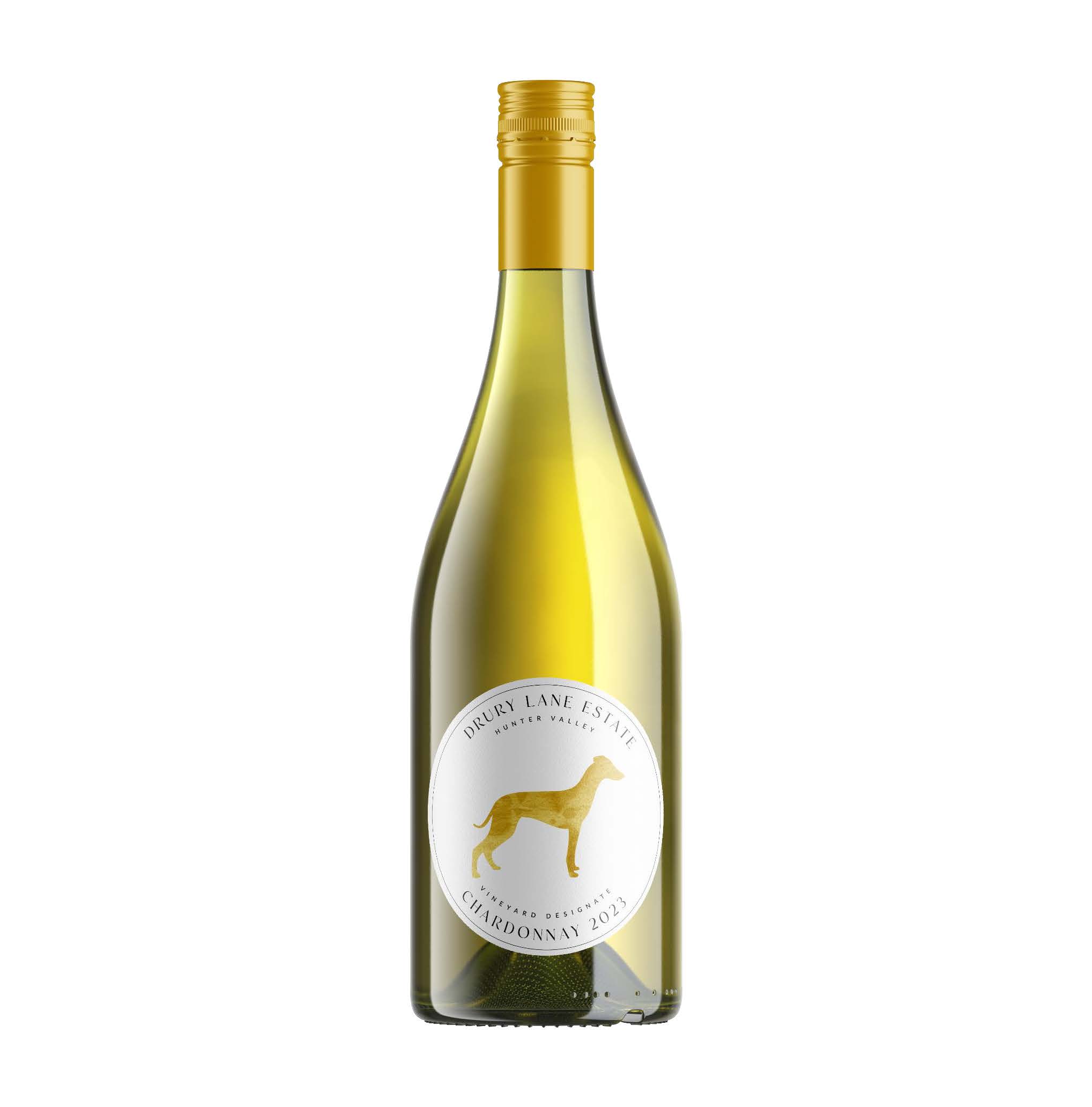
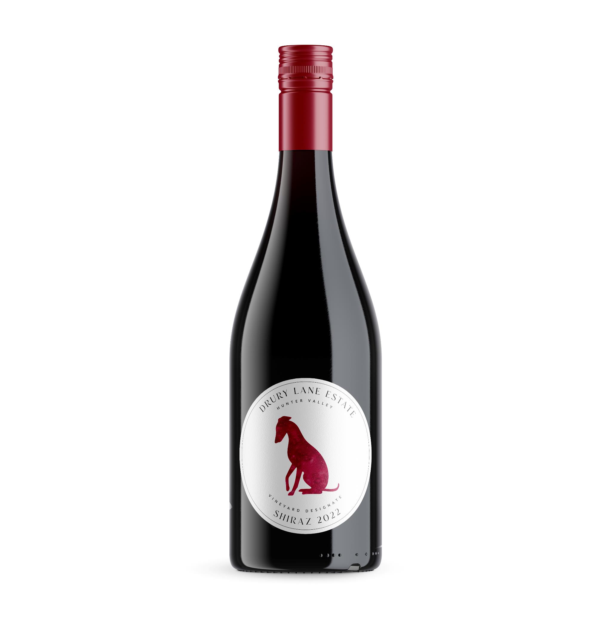
After conducting a full brand / identity exercise our designer Nick helped us identify our key clientele and develop a brand identity with wine labels to appeal to that clientele.
We wanted a flexible and striking design concept that would stand out in a saturated market and could easily be built upon as our product offerings increased. ie. New wine varietals and also plans to add a beef label in the future.
We did not want to appear to elitist, as that is not the clientele, or price point we are aiming to attract. We also saw a lot of old-school labels with family names and crests which we felt did not match the youth and vibrancy of our brand, nor the younger clientele we were trying to attract. It is such a saturated market that it is hard to stand out. And as mentioned above we needed a design concept that was flexible enough that it could grow uniformly with us as our product offerings increased with new wine labels and into beef.
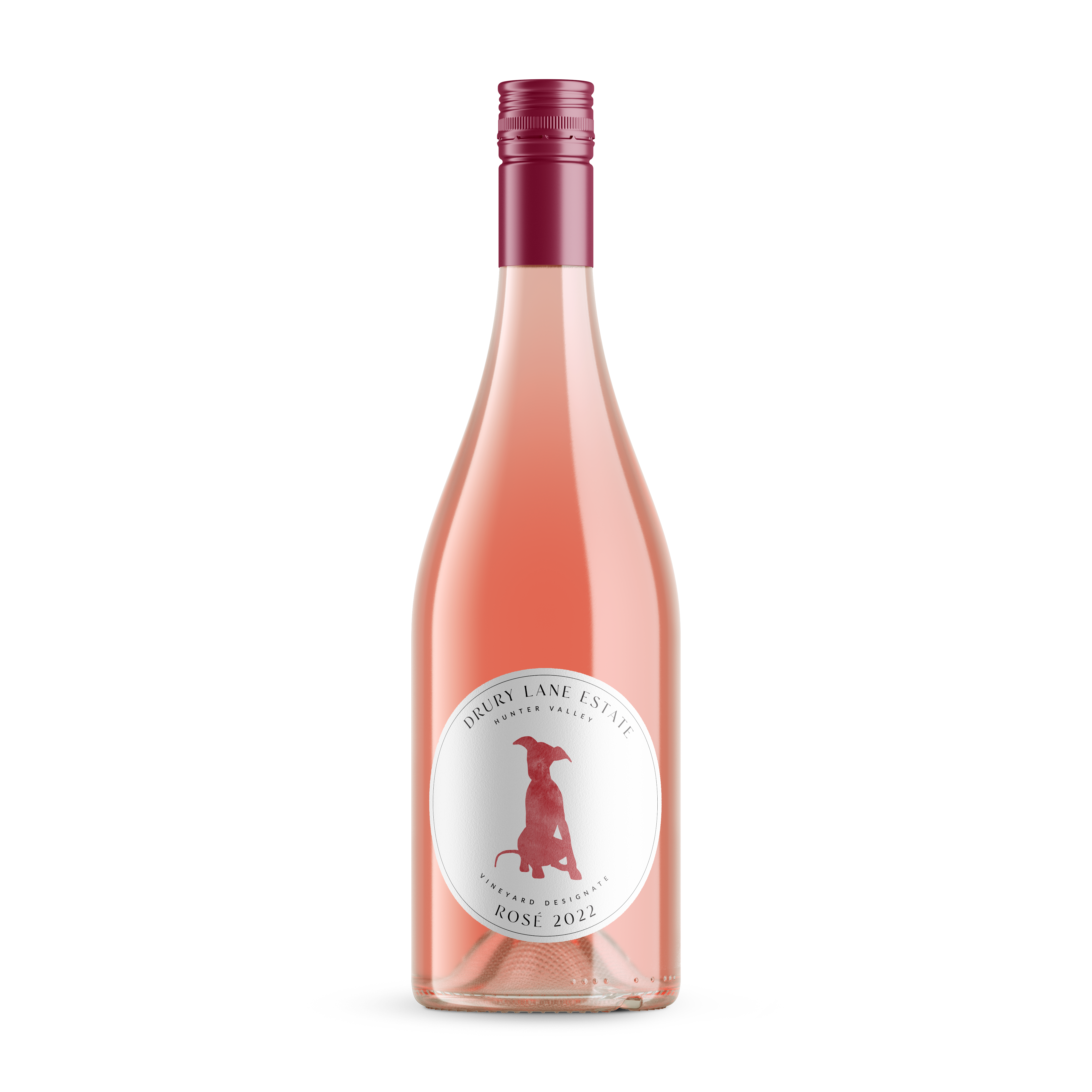
We aimed to attract an emotive response from our target customer base by using the Whippet dog element that features on the Drury Family Crest. We elected to use colour both in our design and in our bottle caps to create a point of difference in an otherwise saturated market.