BEST PACKAGE REDESIGN


Michael Hope Signature Series Shiraz 2017
This wine is simply a combination of intense berry fruit, velvety tannins, a balanced acidity and light toasty oak from French and American barrel maturation and an overall flavour that lingers.
- Year wine was released to market: 2021
- Retail Price: $50 AUD
- Designed by:Larissa Cluff - Hope Estate in-house designer
- Designed for: Hope Estate
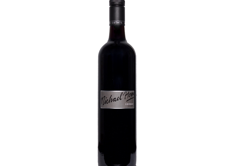
The Michael Hope Signature Series are wines from the exceptional vintages that are in our cellar. As Michael Hope (owner of Hope Estate) said, “I’m only prepared to put my signature to a wine that I feel is worthy.” With this sentiment in mind, the current label design did not reflect the high-quality product as best as it could. We wanted to refresh the label to give it a more luxurious, modern and intriguing design that elevated the product to the level it needed to be.
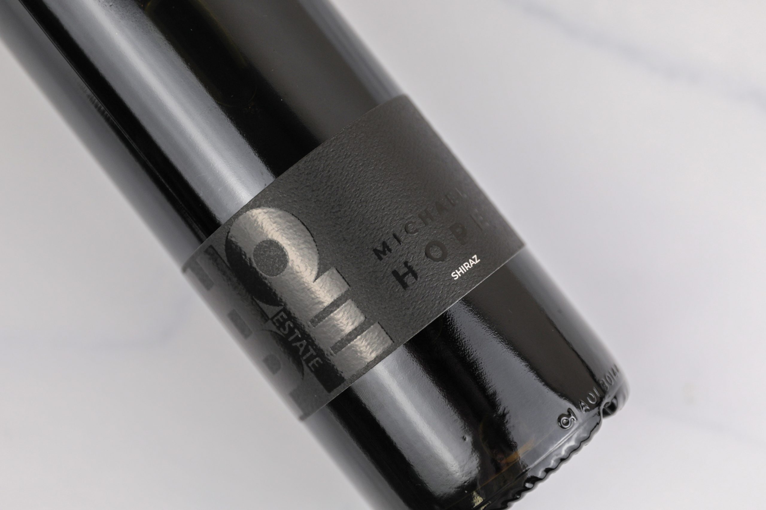
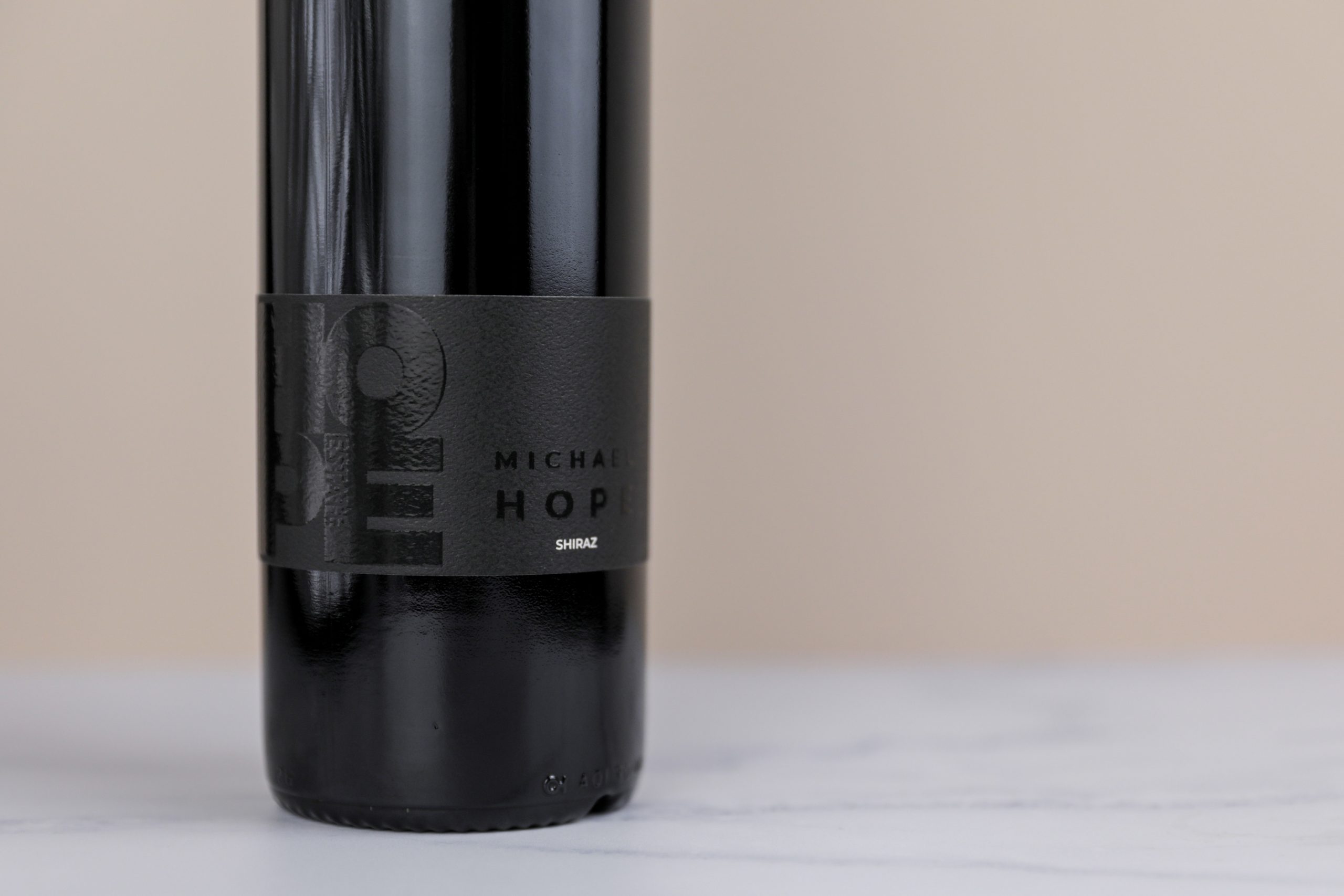
We faced many challenges to overcome with the redesign of this label. The key words we needed to achieve were: modern, luxurious, sophisticated and intriguing. The original label was very simple, un-modern, and didn’t tell the story of the product as well as it could. We wanted customers to be intrigued by the label and want to interact with the bottle. We decided to explore a “black on black” label design and execute through stock and finishes. This alone brought its own challenges to the label as we needed to consider the many spaces and lighting scenarios the wine would be in.
Extensive research was done into the stock and finishes needed to achieve the desired look. The “black on black” label design ticks all of the key boxes in the brief, and we were able to execute it with the conscious selection of materials. We went with an uncoated textured stock finished with a matte varnish to provide contrast to the hi-build gloss elements in order for the sophisticated “black on black” look to work. This luxurious look also intrigues the customer as the hi-build elements change depending on the space, viewpoint and lighting. We chose to put the variety “Shiraz” in white so to was able to stand out from a distance and contrast the black label in low-lit spaces. This also helps to provide interest and intrigues the customer to know more about the wine and pick up the bottle to explore. We have designed a wrap-around label to extend on this and also allow for space to tell the story of the wine and Signature Series in a sophisticated way. The combination of stock, label size, label positioning, finishes and monochrome colour scheme gives this design a modern edge and high level of sophistication.
We believe the redesign successfully achieves the brief and presents more of the story behind the Signature Series. The redesign better reflects the positioning of the wine in the market and our target audience. The label is modern, luxurious, sophisticated and intriguing through the conscious consideration of stock, finishes, label size, typography and colouration.


