BEST PACKAGE REDESIGN


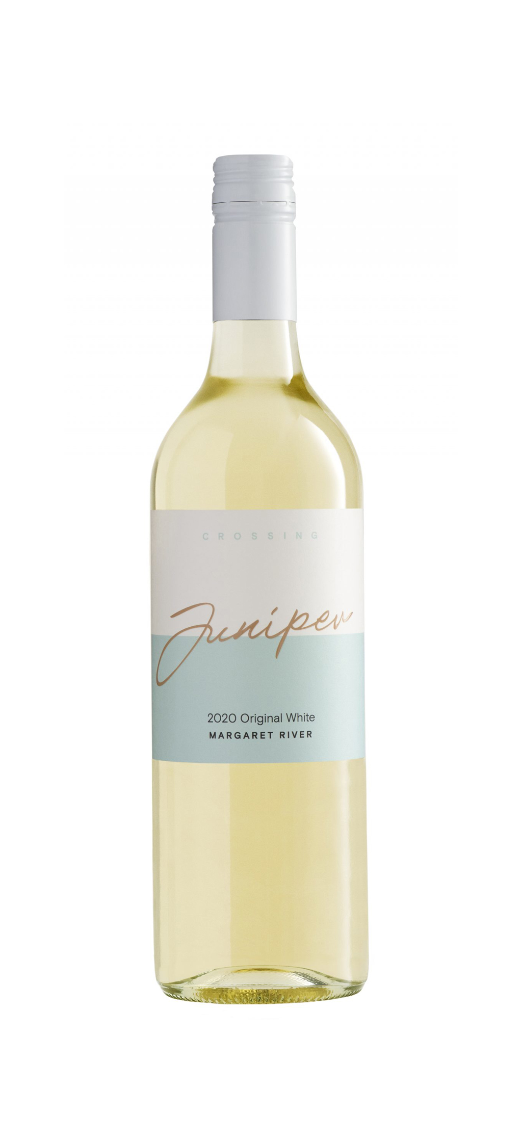
Juniper Crossing Original White
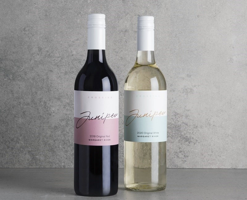
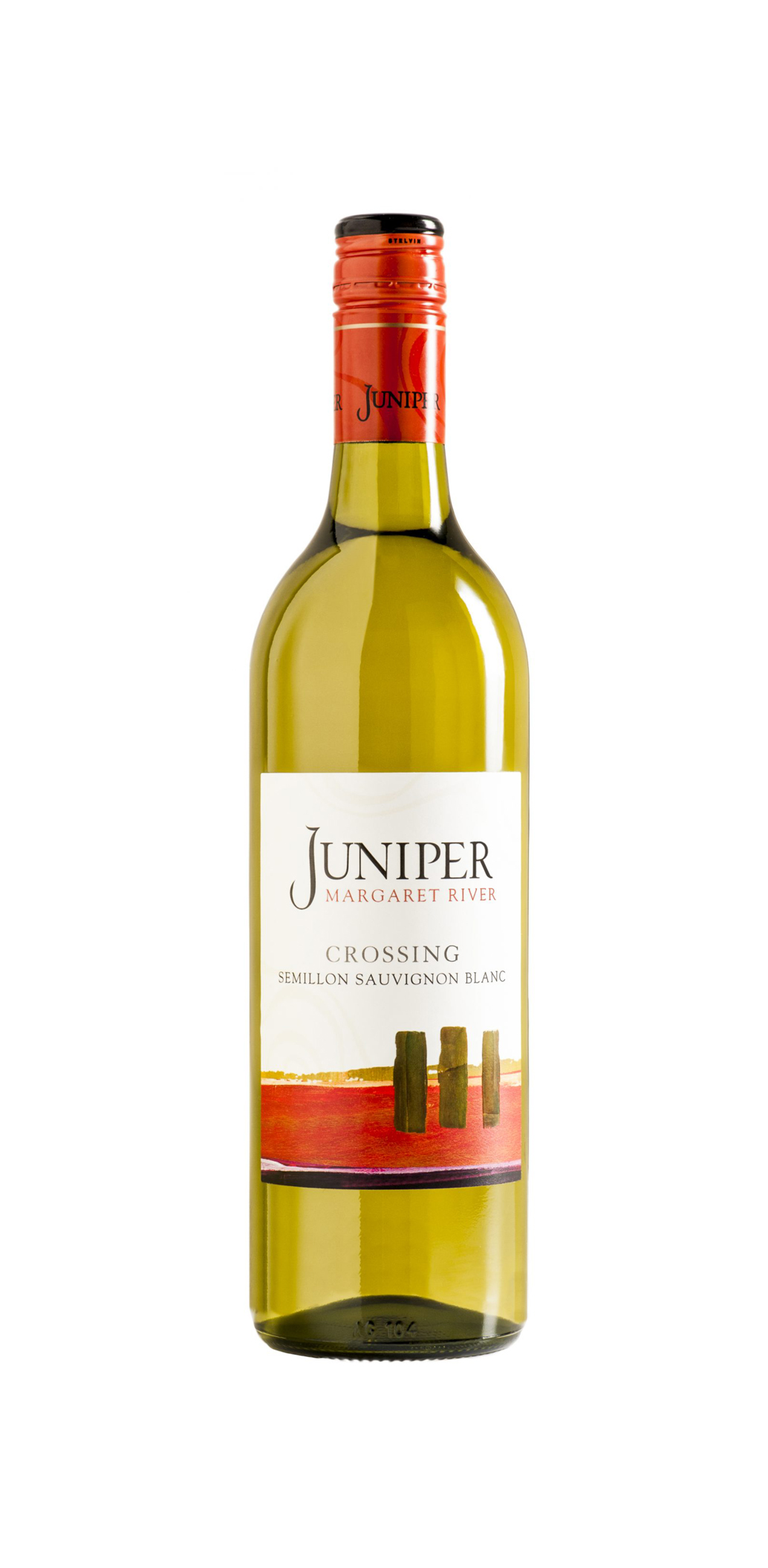
Juniper Crossing was the tier that launched the Juniper brand in 2000, with the Semillon Sauvignon Blanc becoming immensely successful in the following decade. Fashions change and so the focus of the Juniper Crossing range has been sharpened to our white (and red) blends, produced from fruit grown solely on Juniper vineyards and with a promise to overdeliver on quality. Renamed ‘Original White’ (and ‘Original Red’), these wines are intended to be marketed to promote regionality, marque and design with a reduced emphasis on varieties/blend.
- Year wine was released to market: 2020
- Retail Price: $18 AUD
- Designed by: TwofromTwo
- Designed for: Juniper Estate
With Juniper now well into its third decade of existence, and the foundations of the brand’s look and style being in essence almost entirely unchanged since 2000, an in-depth review and update of the brand itself, as well as the brand architecture, was undertaken. In carrying out this process, we held true to our core internal values of Authenticity, Heritage and Innovation - these frame our daily decision-making and have been defining tenets in all the changes made to this point.
We believe that this revitalization of the branding is consistent with Juniper’s status as a historic family-owned Margaret River winery, while also symbolizing our relevance and modernity under the guidance of Nick (CEO) and Tom Hill (Operations Manager).
The core design challenge in this packaging redesign was the large jump between old and new. The previous Crossing packaging had not been significantly updated in decades. The new label was charged with being very strongly grounded in the modern era, even progressive, in design. This large jump between where the label was and where it needed to be posed the biggest challenge for the design team.
Another secondary design challenge faced was the price point of the wine restricting the print treatments available for use. Being a budget offering from a well respected brand that has been perceived to be quite conservative in the past, balancing the expectation of luxurious tactile elements and budget constraints advised by ourselves was a concern for the design team.
The Crossing range is known for extraordinary quality wines at a highly affordable price. Taking this into consideration alongside the high proportion of on-premise sale for this product, a decision was made to set the crossing products apart from the rest of the Juniper range with a unique wordmark and design approach. This decision was guided by the understanding that the existing equity and perception of quality for the product came from the Juniper name/brand association, not any existing design feature on the labels. This understanding allowed the design to be entirely new and separate from what was done previously, guiding the design team toward a simple and youthful label with no fuss or labour on the history of the brand or previous labels. A casual and approachable handwritten style iteration of the Juniper Worldmark features, with the Crossing range name used as a bi-line. Colour is used in the label and bottle glass to indicate the product within.
Decisions around print treatment allowed the team to impart enough indication of quality and the premium status of the brand without allowing the print costs to get too high. High build varnish was used across the focus wordmark, highlighting the Juniper name which was identified as holding the most customer goodwill. Plain white stelvin closures were selected rather than an embossed or premium-finish closure, which lowered costs greatly while perfectly accompanying the clean, minimal and modern design of the label.
The Crossing Originals have seen extraordinary success since the label redesign was launched. Uptake through on-premise customers has been very positive, with the bottles being displayed centrally on wine shelves and bar displays throughout Western Australia. The label, particularly the colours, are bold and eye-catching in these locations, standing out from our peers and has sparked a great recognition for the wider brand.


