BEST PACKAGE REDESIGN


Grant Burge
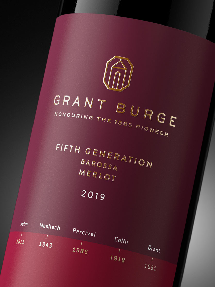
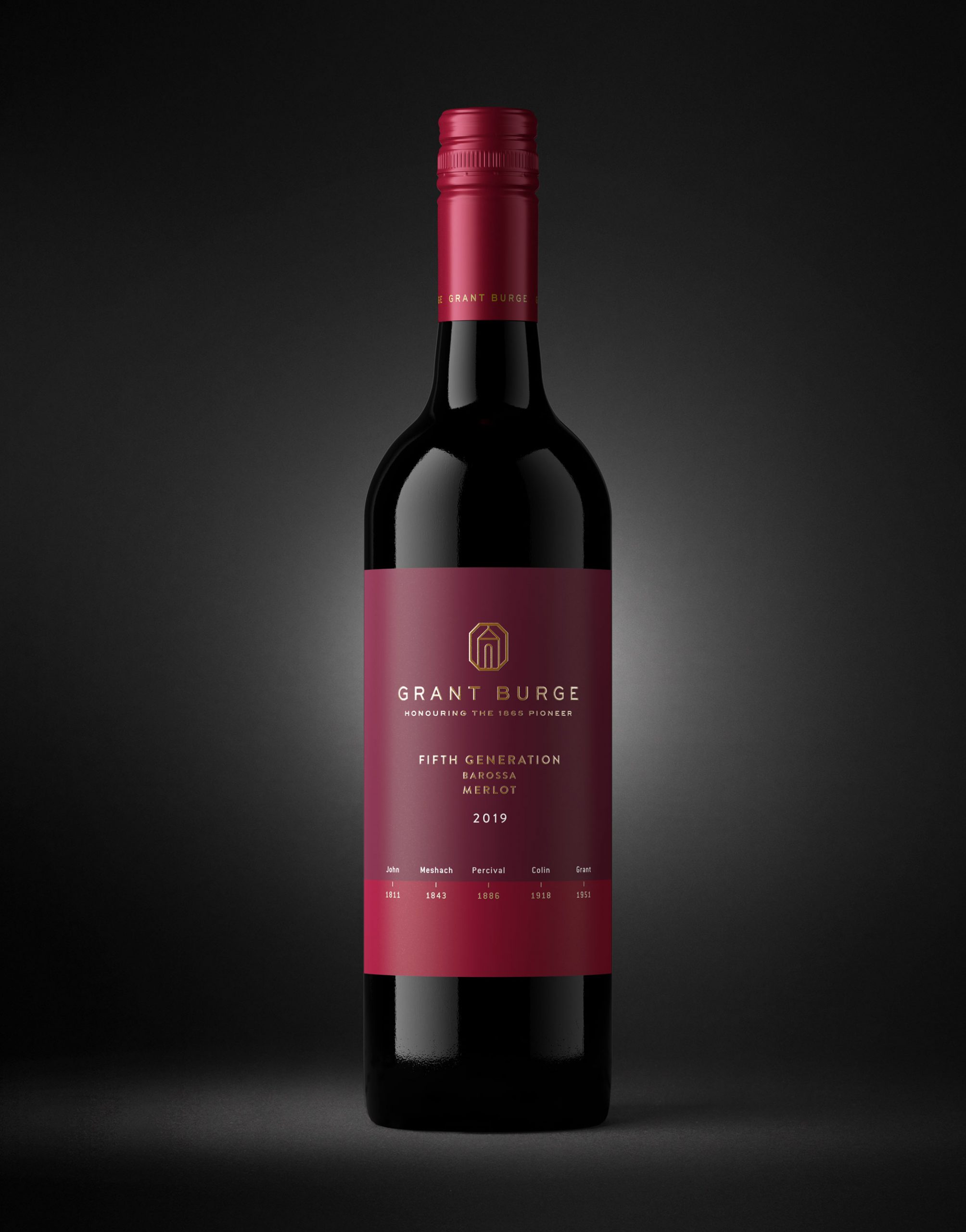
Grant Burge Filsell / Grant Burge Meshach / Grant Burge Fifth Generation
- Year wine was released to market: 2020
- Retail Price: $40 AUD
- Designed by: Denomination
- Designed for: Grantburge Wines
The Grant Burge brand was established in 1988 and is one of the largest wineries in the Barossa Valley. Accolade Wines had ambitious plans for Grant Burge to expand globally, and therefore needed to build brand awareness of Grant Burge as a premium winemaker in markets that it was unknown in. A memorable and easily identifiable brand identity would be key to this, as well as rejuvenated packaging that reflected this new positioning as a contemporary luxury player with an esteemed heritage.
The current identity was seen as being old fashioned, recessive and not distinctive. The brand was locked up with Barossa, and with the planned expansion of wine sourcing beyond Barossa, this was problematic. Additionally the Grant Burge part of the logotype was small and discrete, not proud and clearly legible. We needed to redesign the current identity to better reflect the heritage of the brand, whilst also reflect the new positioning for Grant Burge as a contemporary luxury player.
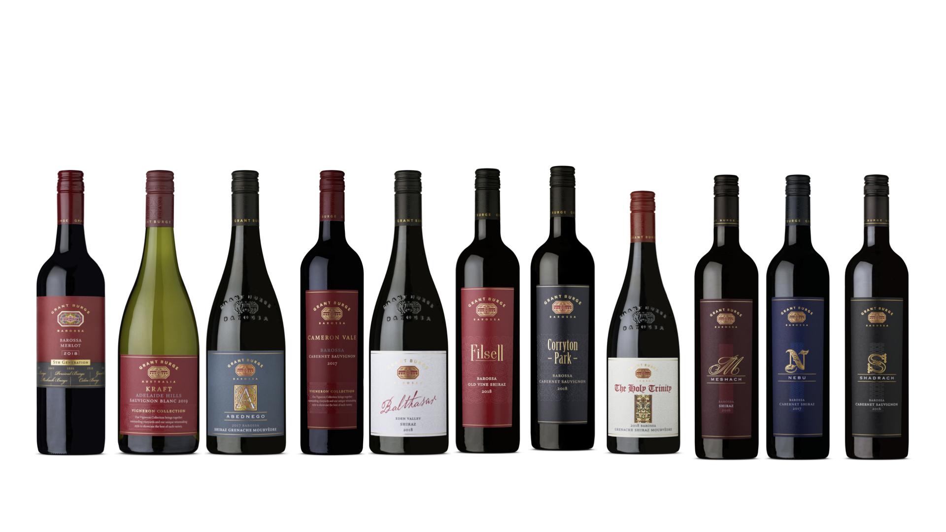
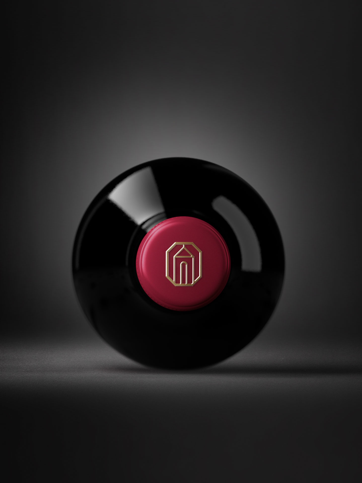
Our design solution was firstly to create a new identity which reflected the origins of Grant Burge, but in a less overtly religious manner, and in a simpler form that could be replicated easily. The logotype is a classic contemporary typeface that is 200% larger than the previous one, but still restrained, The chamfered corners of the identity were then used as a graphic device that could be used across packaging as well as key visuals and advertising: creating a distinctive brand asset. We retained the maroon colour palette that appeared on many of Grant Burge wines, but changed the tone to be more regal and contemporary, and also used it consistently across the majority of the table wines, again creating another DBA.
For heritage brands such as Filsell that have a loyal consumer following, we retained the unusual typography to give consumers a connection to the previous label, whilst radically redesigning the rest of the brand. The icon wines of Meshach, Nobu and Shadrach have the DBAs treated creatively. The background has a textured high build of the logomark as a wallpaper across the entire label. The chamfered edges are repeated around the wine name and the gold foiled signet at the base.
In the words of our client, Sandy Mayo, CMO Accolade Wines, the results of the redesign are “spectacular”. Sales have increased by 19% globally from the release of the new packaging.
