BEST CLASSIC FORMAT PACKAGE DESIGN


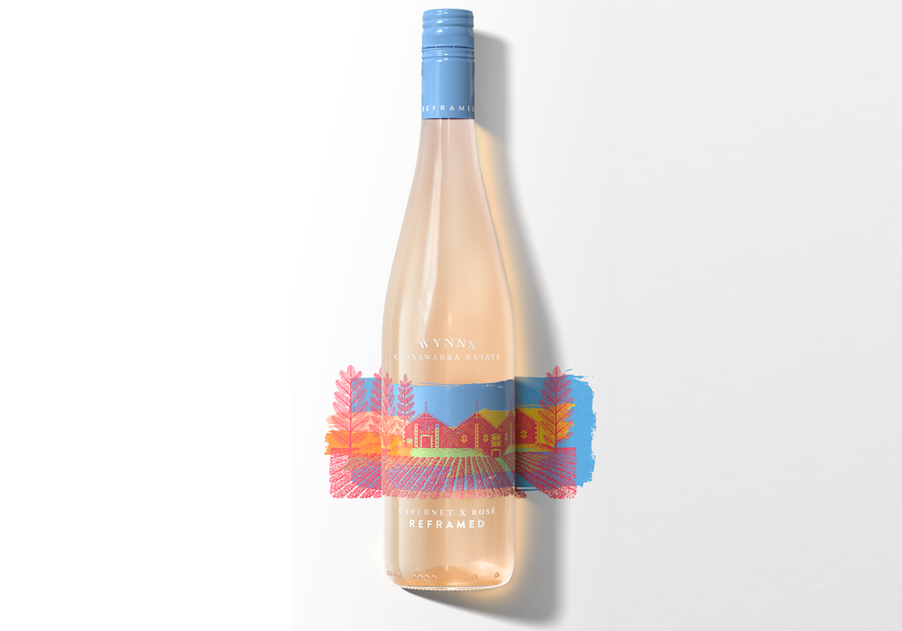
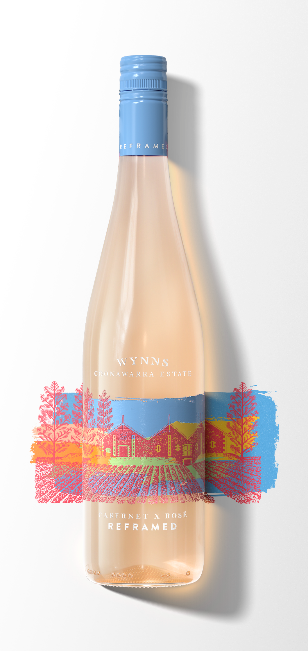
Wynns Reframe Cabernet x Rose
A classic Coonawarra reframed, Cabernet creatively untamed. A rosé-tinted view, Where old meets new. Wynns treasured Cabernet vines bring a sophisticated subtlety to our first Cabernet rosé. Bestowed with a refined acidity and hints of sweet fruit, this is a complex and refreshing drink to be enjoyed all year round.
- Year wine was released to market: 2021
- Retail Price: $24.99 AUD
- Designed by: Design Bridge SingaporeDesign
- Designed for: Wynns
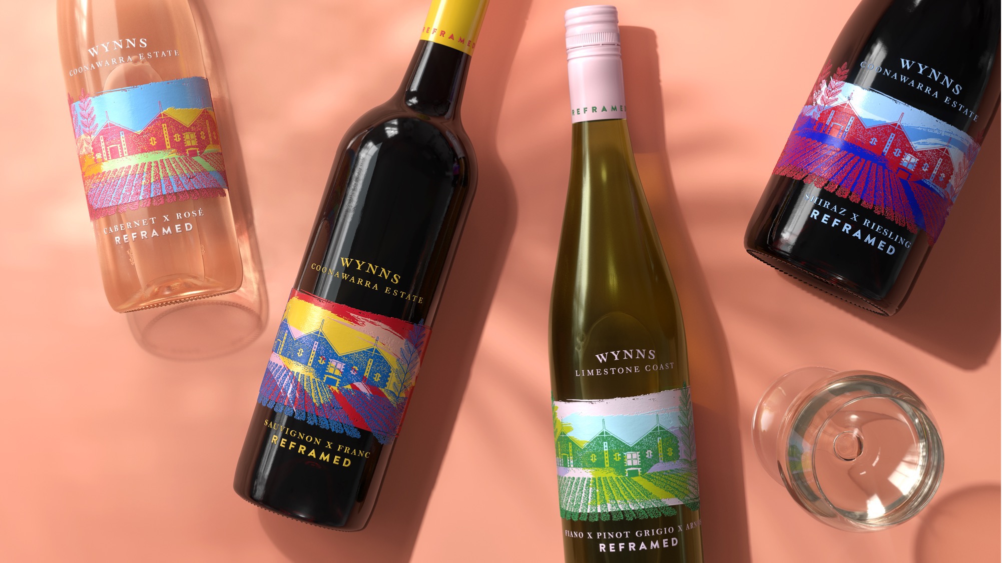
Introducing “Wynns Reframed”. A bottle design for a new collection from the classic cabernet brand Wynns. The Design Bridge team delivered an unexpected design execution for unexpected varietals. The bottle design boldly explores a contemporary look and feel, whilst remaining true to the classic Wynns identity. An icon reframed for a new generation.
The Wynns brand is typically portrayed in serious, dark, and traditional tones. Fit for a heritage brand renowned for its timeless cabernets, made to be cellared and savoured. However, when Wynns wanted to launch a new contemporary tier of wines for a fresh new audience, they needed to break free from the black and white. Introducing a world of full colour, that invites a reappraisal of the Wynns brand, varietals and occasions.
The solution was to reframe Wynns.
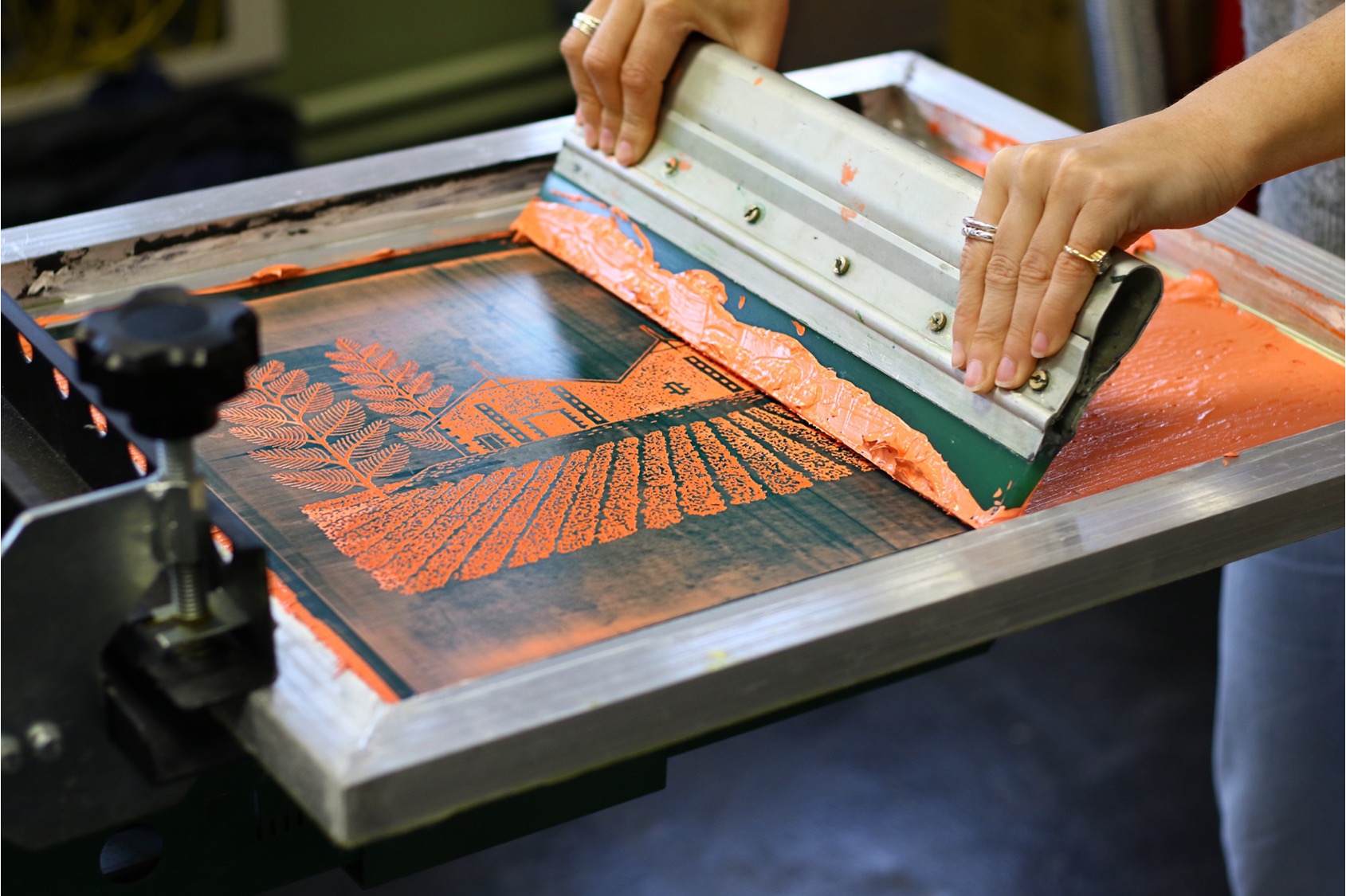
The iconic Richard Beck illustration sits at Wynns heart, carefully framed centre-stage on each pack. We chose to embrace the illustration but reframe its context. Working with artists, we created four unique pieces that have been screen-printed directly on to each classic bottle. Capturing the same sense of craft and tactility that has gone into each of the wines.
This clash of styles isn’t just for looks, but also acts as a metaphor for the wine inside. Collaborating closely with winemakers Sue Hodder and Sarah Pidgeon, who have put a modern twist on traditional winemaking practices by picking earlier for freshness and blending unexpected varietals. Wynns is famed for its Cabernets, so why not create a Cabernet Rosé?
This is Wynns Reframed. Made for a new audience, but still Wynns.
The impact is summarized by the Wynns brand manager in the following quote.
“The vibrant design has pushed the brand into a new contemporary space, and while the label design is vastly different and more progressive than the historic labels, it does not feel estranged or foreign to the Masterbrand. This is imperative to aid ‘safe discovery’ with consumers who are looking to try new varietals and styles but want to experience them through a trusted brand. Design Bridge translated this expertly into a tangible product that has resonated with our customers and consumers and resulted in real commercial success. Most notably, the bottle has received national ranging with Australia’s two leading retailers.”
Claire Yencken
Senior Brand Manager, TWE


