Best Classic Format Package Design

2021 Deadly by Peerick
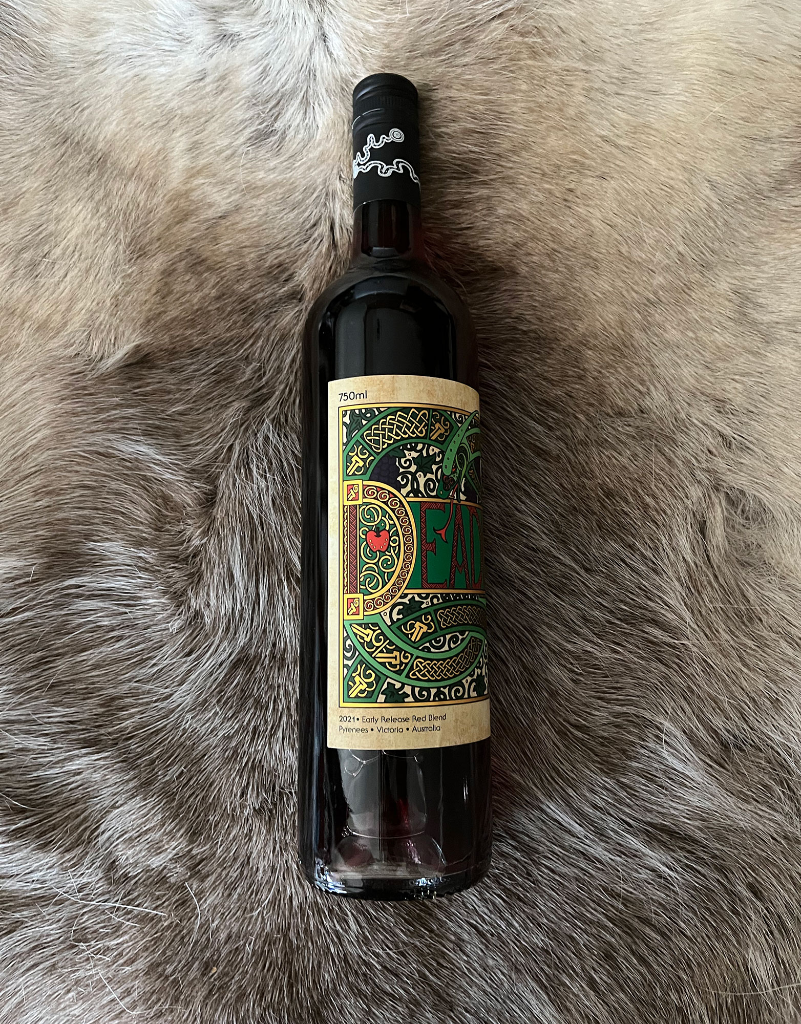
Deadly is a co-fermented field blend of Peerick's finest Shiraz and Merlot in an early release style, aromatic and delicious.
- Year wine was released to market: 2021
- Retail Price: $24.95AUD
- Designed by: The Starship
- Designed for: Peerick
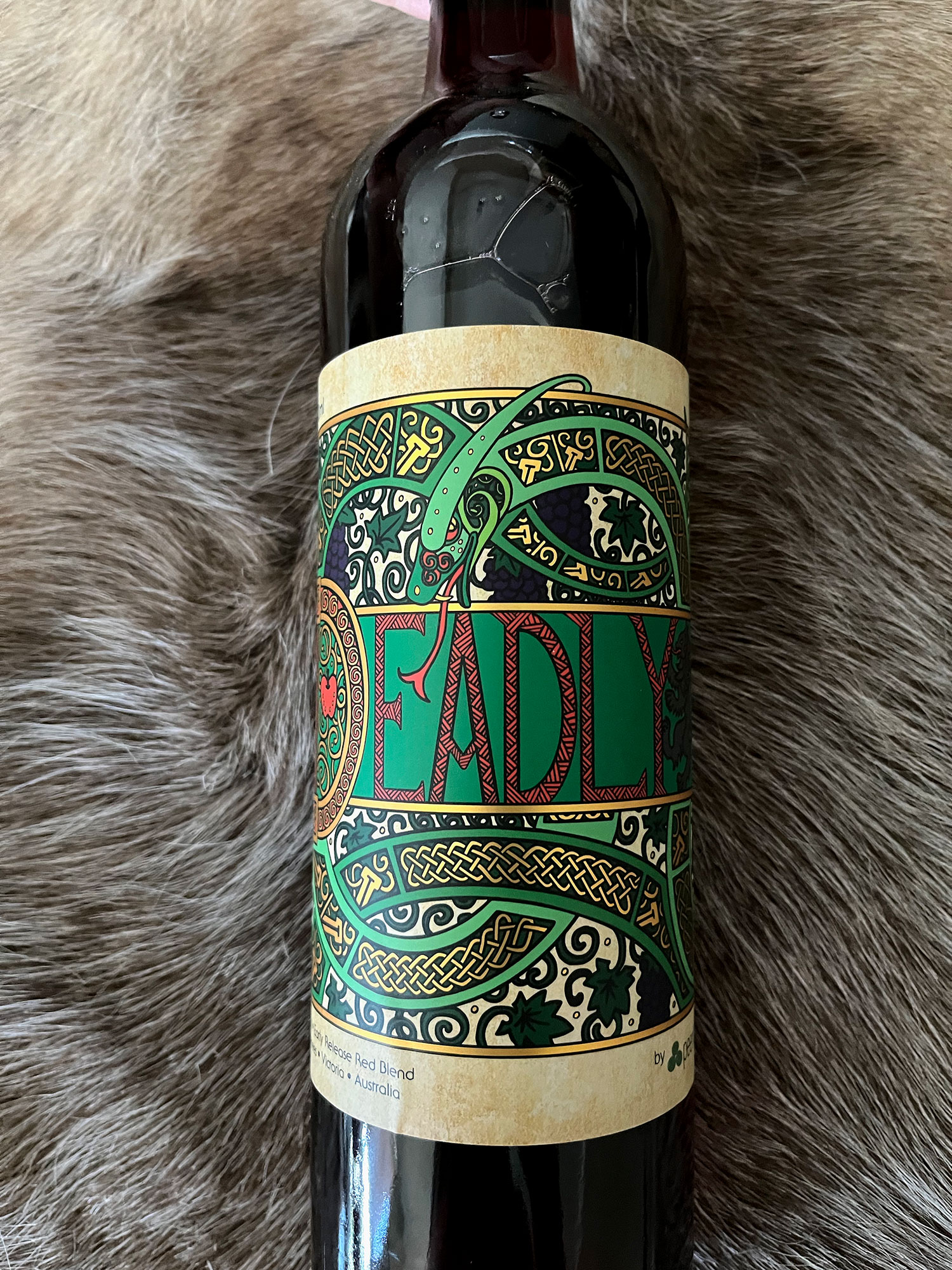
“Deadly” is not only Irish for brilliant, it also has a similar meaning in Australia. As the client, Peerick Wines, is owned and run by a family with Celtic ancestry living in the Pyrenees, Australia, the name was chosen as a reflection of their cultural history, background, and respect for the land. For the client's new Shiraz-Merlot brand, Starship was asked to create a label that encompasses this sentiment. Our design solution was a label inspired by illuminated manuscripts, tying in to the client's family history, creating a bottle that would stand out on the shelf.
Eye-catching and quirky labels are common in the wine category at the price point that Deadly would be released into, particularly in the specialty wine shops that are likely to carry the client's wines. Consumers shop with their eyes, and often like to read labels as they consider selections. The client was looking for a creative, contemporary design that would make possible consumers curious but that would also give the impression of quality.
Starship was also asked to create something that would not only be memorable, but also feed into the client's cultural background and the shared meaning of the word in Ireland and Australia. The label also had to appeal to a broad range of wine-drinkers, including people who might not be aware of the Pyrenees region. Further, as the client is committed to restoring biodiversity on their property and sustainable development, the wine label had to reflect a link to the land.
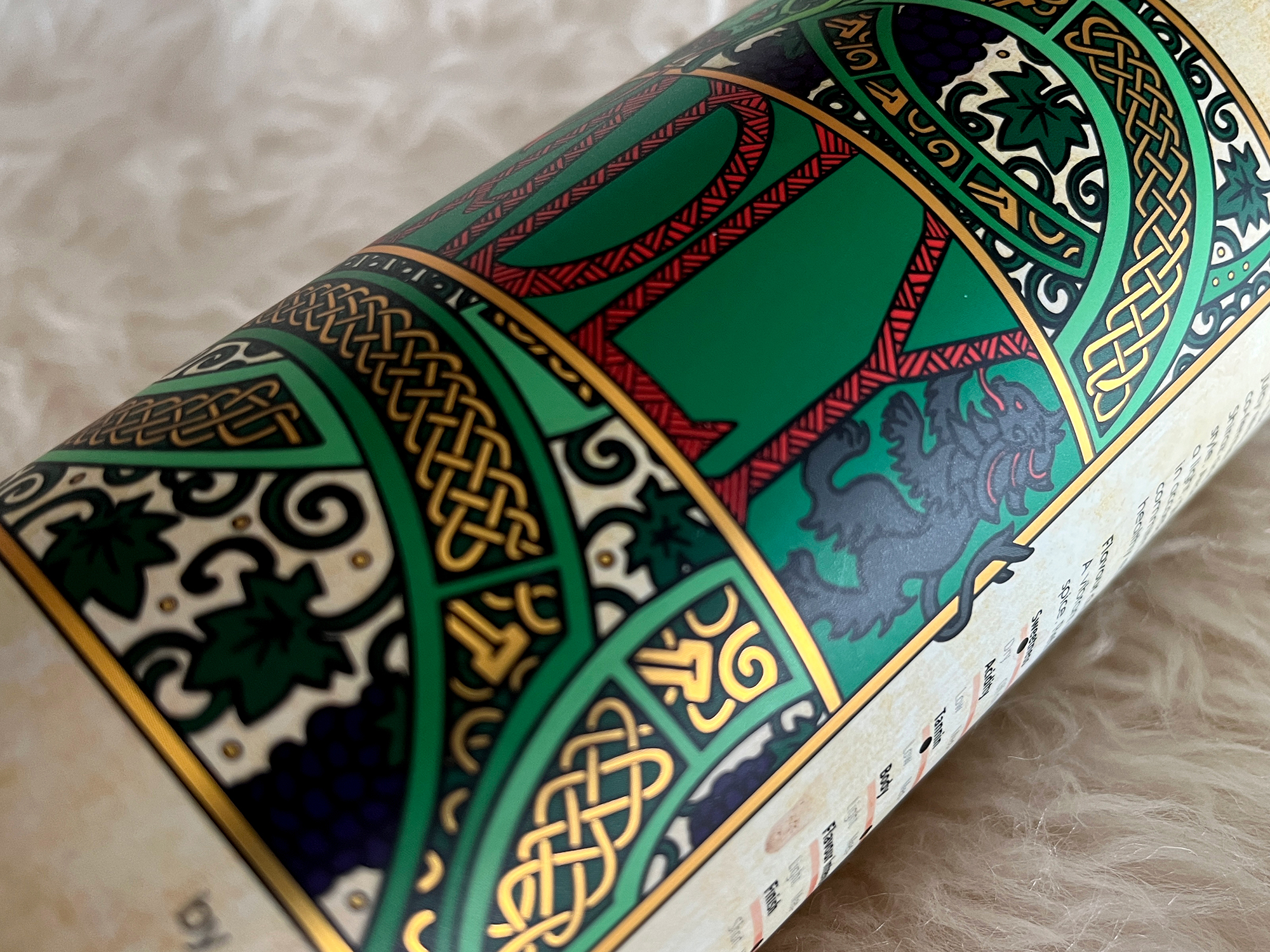
Starship was inspired by the Book of Kells, an illuminated gospel manuscript from Ireland/Scotland/England that would be familiar to many Irish people. The illustration was first hand-drawn and inked, then digitally rendered. It features the snake from the Adam & Eve story (for the 'Deadly' and 'juicy temptation' inspiration elements for the label), with the Celtic knot weave and typography inspired by art from the Book of Kells, and a more modern vine/grape motif as the background, with the Tree of Life at the back. The illustration incorporated the client's family coat of arms and colour scheme. The parchment look was a texture, with the whole design printed over silver paper so as to be able to give the 'gold' elements the illuminated manuscript look, yet with a contemporary riff.
Large and stretching slightly more than the width of the bottle when viewed head on, the intricate label invites consumers to pick up the bottle and turn it in their hands to take in the whole design. As with all Peerick bottles, the label also incorporated a short description of the winery, along with a set of sliders that would give potential consumers an immediate indication of the wine's sweetness, acidity, body, tannin, finish, and flavour intensity. This would help the wine appeal to a broader range of wine-drinkers, regardless of familiarity. Further, the label's stand-out look would make for a good gift – or something visually stunning when presented at a table by a restaurant.
Visually stunning and unusual on a shelf, Deadly was a hit with consumers with its creative and premium-looking label, with a large design that elicited both curiosity and a sense of mystery. The wine label also resonated with the client on a personal level, having incorporated elements both from the client's cultural and family history.

