Best Package Redesign

Rosalbòre – Cantine Sanpancrazio

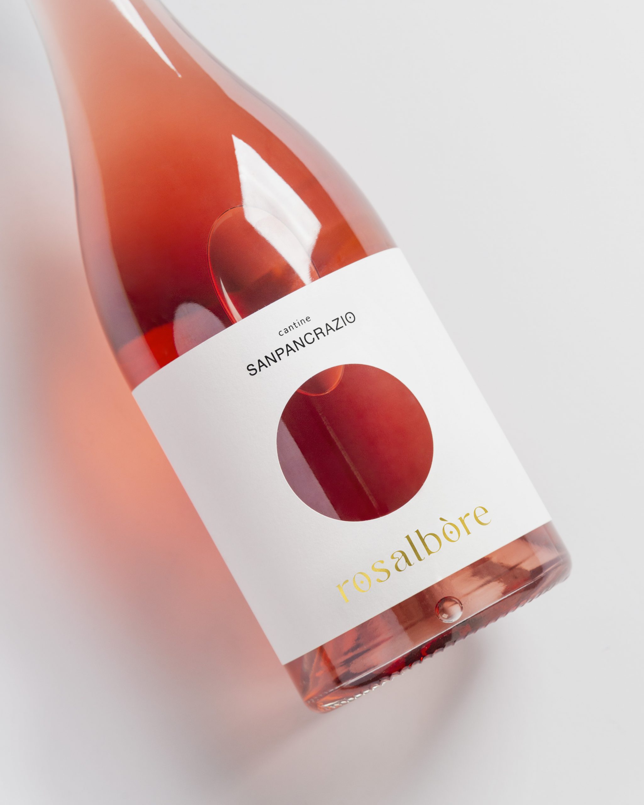
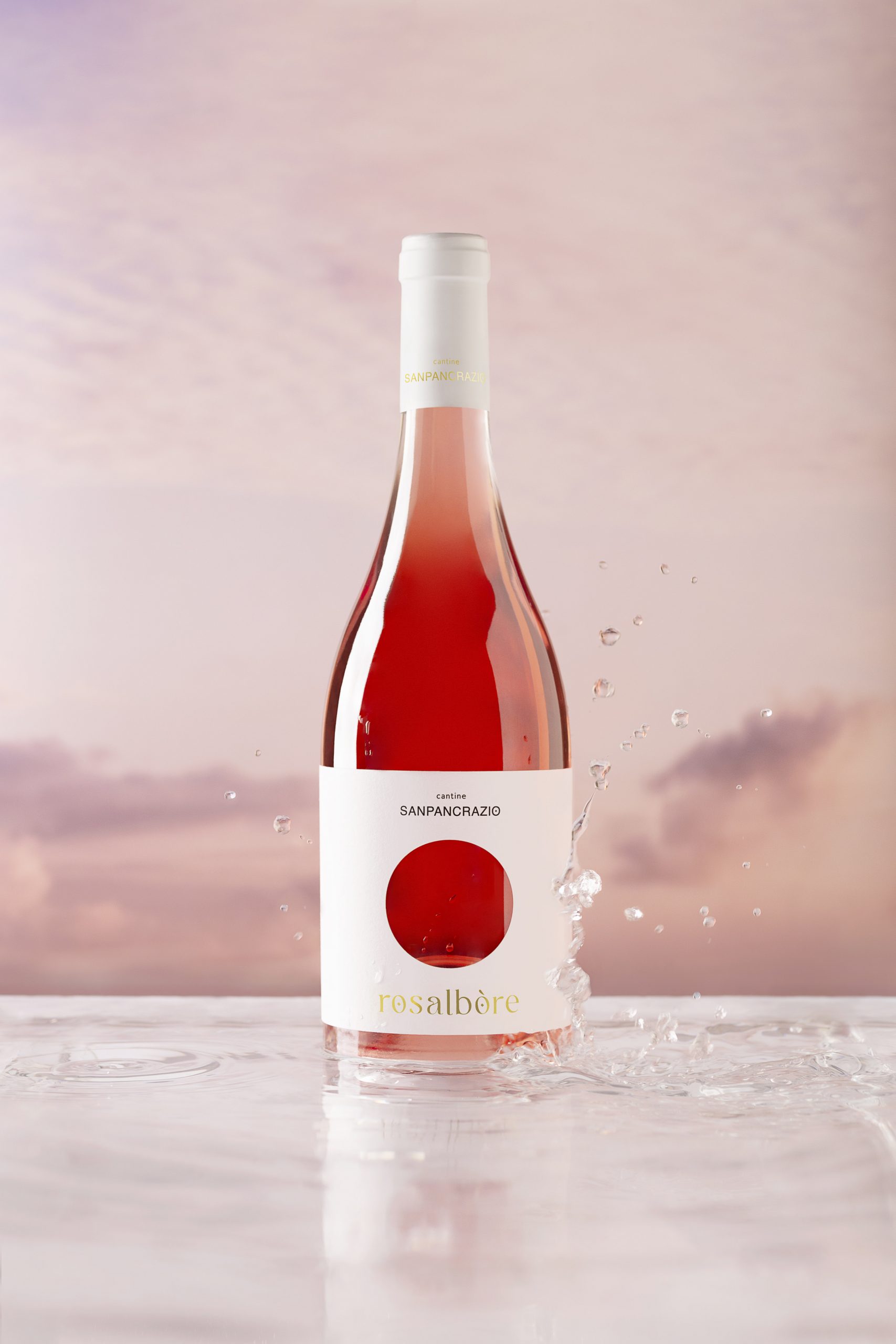
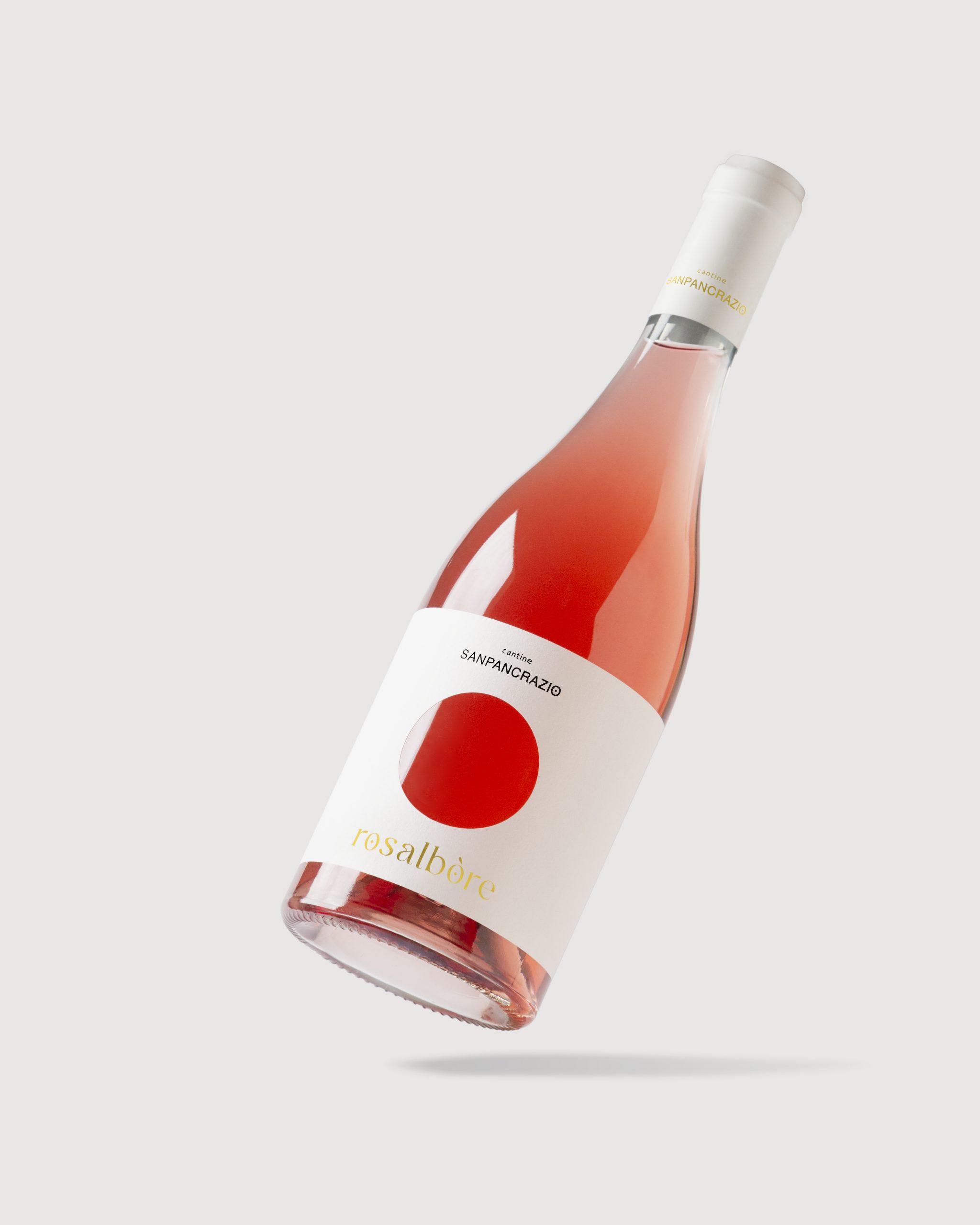
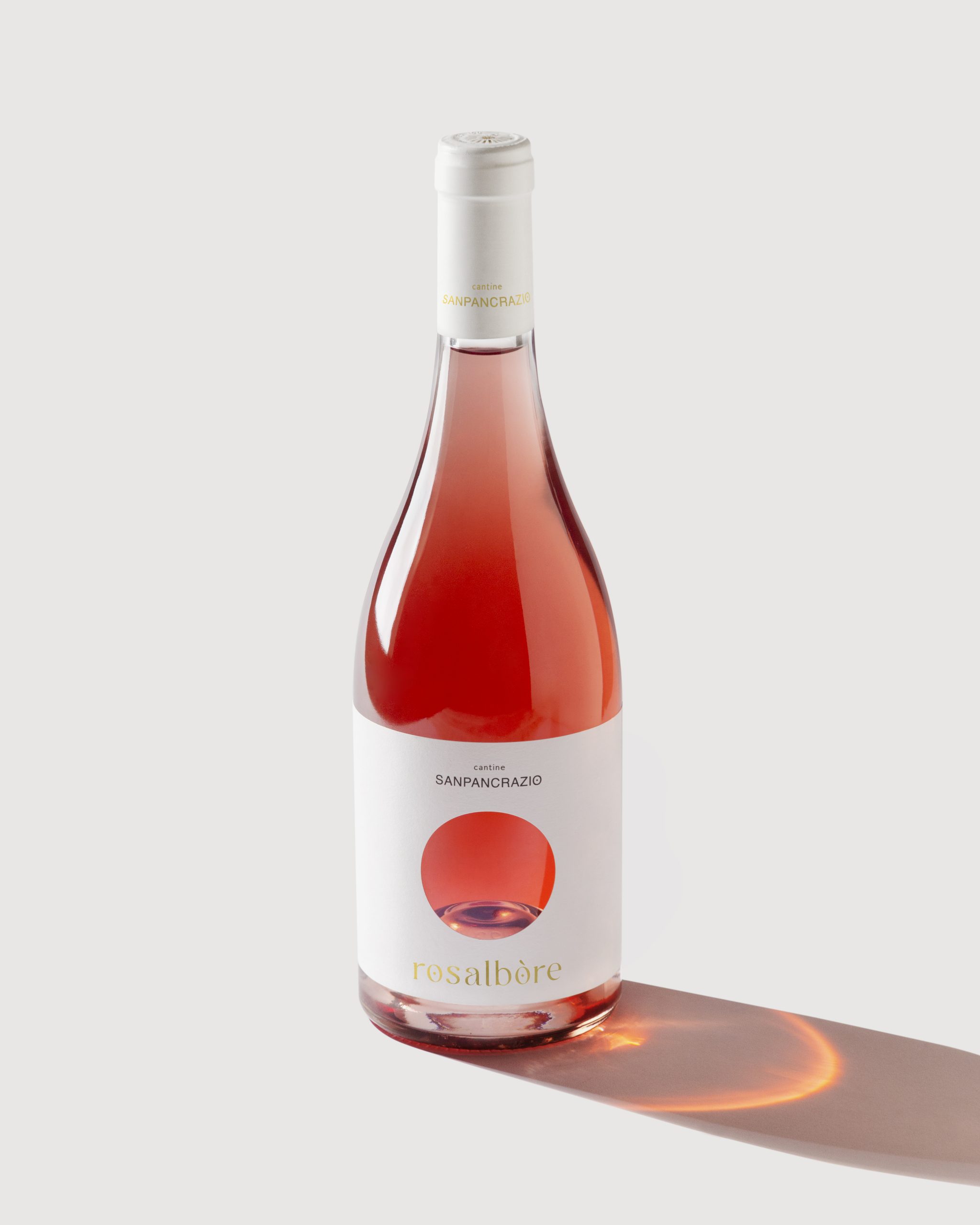
A super minimalistic and conceptual label designed x Rosalbòre rosè wine by Cantine Sanpancrazio. A white label with a round hole reveals the bright cherry color of the wine through the clear bottle glass. The concept and design are inspired by the soft pink sunrise light above the Apulian sea, representing the wine name itself, Rosalbòre, which means indeed “pink sunrise light”. Less is always more when shapes and colors come to help.

Entry Introduction
Rosalbòre is a rosè wine, Salice Salentino Negramaro Rosato produced in Puglia by Cantine Sanpancrazio winery. The wine has been on the market for a long time, becoming a leading product thanks to its quality. Nowadays, the label definitely needed a restyling.
Design Challenges
The apulian rosè wine market is very saturated with a variety of labels from different wineries. With the restyling, Rosalbòre needed a strong change of image in order to get more appealing, contemporary yet timeless. The goal was to keep the old target, loyal to the product, but also gain other new.
Design Solution
The design approach was to start from zero. Forget about the old label and approach, and build a brand new identity, both for the winery logo and for Rosalbòre label at the same time, in order to achieve a more consistent style. The name of the wine itself was the best inspiration to imagine a new concept and a new label. Rosalbòre means "pink light of the sunrise", so the idea was to reproduce this idea of the shy morning sun and its bright pink light, rising above the apulian sea.
Design Impact
A white label with a round hole cut into it reveals the bright cherry color of the wine through the clear bottle glass. A natural materic white paper label, with gold foil and glossy braille details. Less is always more when shapes and colors come to help.

People’s choice voting has now closed