Best Package Redesign

MadFish Prosecco

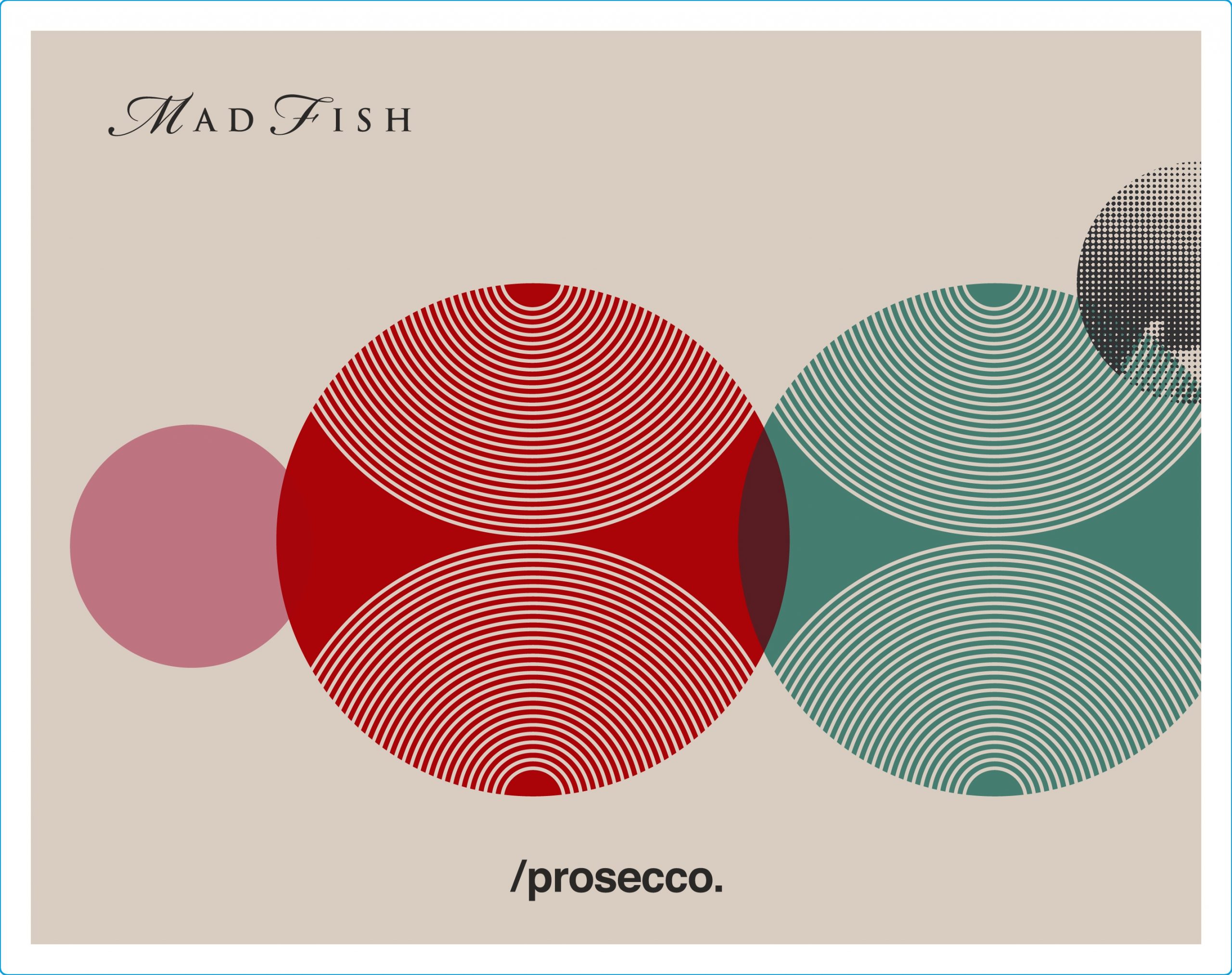
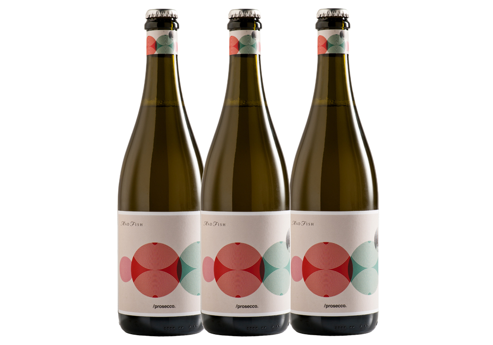
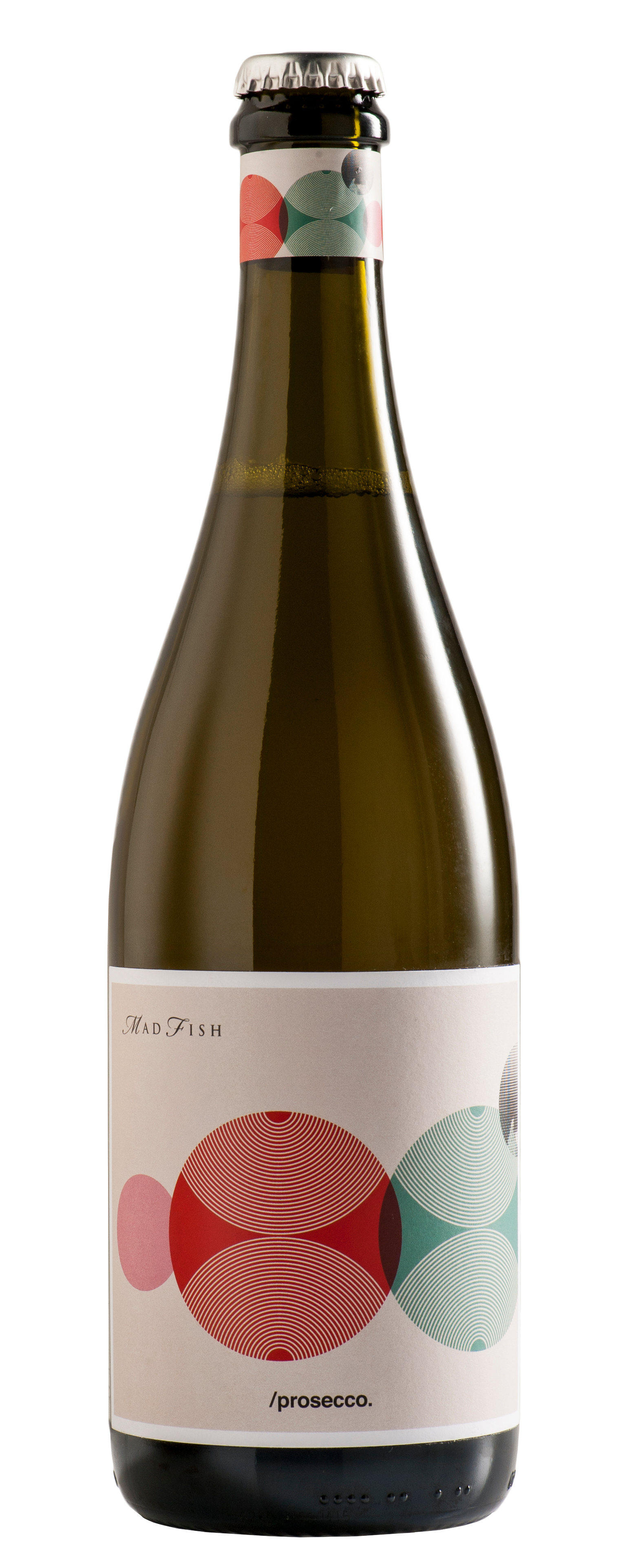
A refreshingly uncomplicated, yet stylish fizz that doesn’t need a special occasion to enjoy. Premium Prosecco grapes from Australia’s finest wine growing regions have been blended to create MadFish Prosecco. This lively sparkling pays homage to Old World tradition while showcasing the vibrancy and freshness of New World terroir.

Entry Introduction
The brief was to update the existing packaging to reflect the region of Western Australia, and to stand apart from existing Prosecco brands on the shelves.
Design Challenges
In the sparkling category there are countless numbers of labels that all look the same. They rely on design tropes from European sparkling brands with decades of history. There are layers and layers of typographic detail, filigree and ornate details. In Western Australia we do not have this tradition, so there is really no need to follow their lead when it comes to label design. So we set out to create a label that has its own style and character, referencing our story and our unique location.
Design Solution
Our design solutions are simple, typographic labels that spell out PROSECCO or CUVEE BLANC clearly so that it they are easily identified on the shelf. The typography is wrapped in number of delicate native flowers giving the label a sense of place and drawing attention to the floral palette of the wine. The delicate design is appealing to a mostly female market and is something that drinkers are producing to have on their table. Printed on beautiful textured paper and varnished with a gloss UV finish, the labels stand out because of their simplicity. When every other brand is zigging, the Madfish sparkling labels are zagging. There are no script fonts, no ‘ye olde’ crests or drop shadows. This is Western Australia in a bottle.

People’s choice voting has now closed