Best Package Series Design

A GROWERS TOUCH – ‘Birthed From The Earth. Raised By The Hand.’

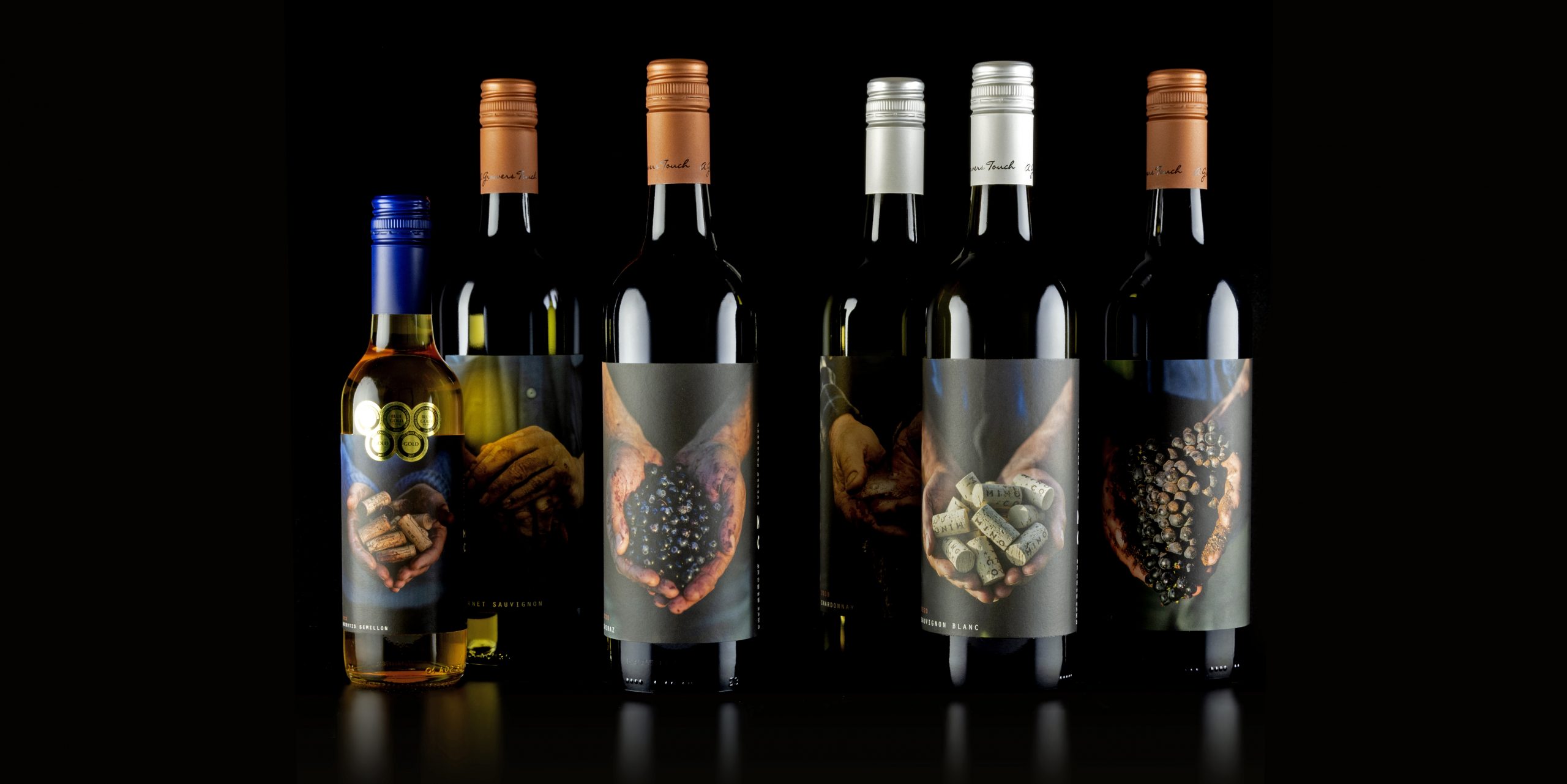
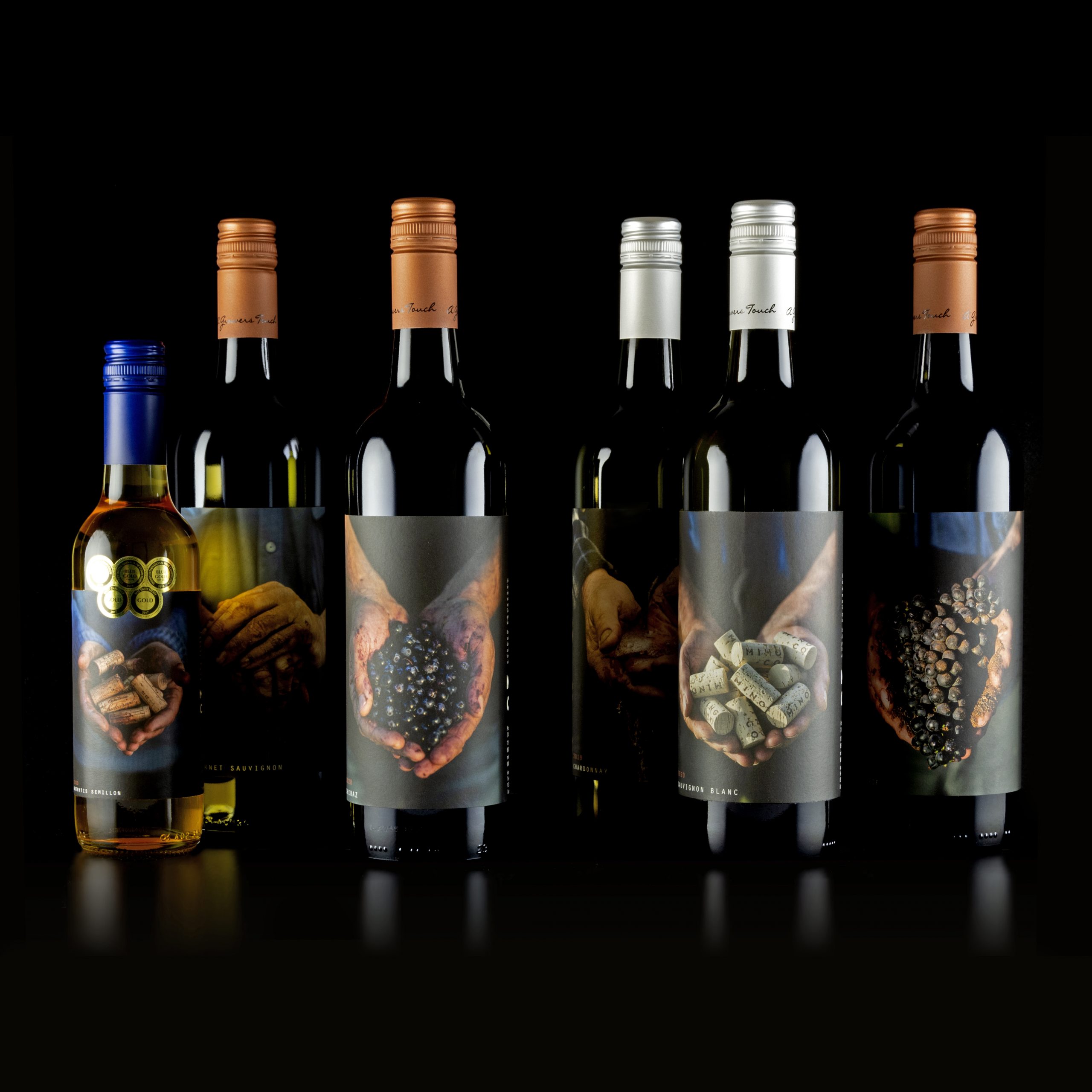
A series of wine labels dedicated to showcasing our local regions fruits and the hard labour that goes into farming it. We pay homage to the farmers/growers who grow the grapes by featuring images of each growers hands on the front of the label.

Entry Introduction
A Growers Touch focuses on the production of more traditional varietals, all grown locally out of the Riverina by farmers who have worked this land for decades. The label offers credit to the hard-working hands that have cared for the vines and nurtured their fruit, helping them to the pinnacle of their potential. A Growers Touch is a love letter to the grit and passion that every great wine demands.
Design Challenges
The challenge was to create a range of wines that stood up well together, were visually appealing on the shelf and varied enough to tell the difference between varietals without using too much text.
Design Solution
Our solution was to photograph our growers hands, berries and face and align them with the varietal of grape they grew. e.g., Sid grew our Shiraz grape and therefore an image of his hands, holding the Shiraz grapes feature on the front of our Shiraz. A small portrait shot and profile is also featured on the back of the label. Each varietal features a different grower with the exception of 2 that grow more than 1 varietal, however the image is different for each varietal.
Design Impact
The design impact was the shelf presence the labels had. Further, we found that once a consumer was engaged in the label, they would then grab the bottle and spin it around to find out more information, further physically engaging. The labels have also been very social media friendly and we have found that people actually hold onto the bottles, striving to collect all the labels for their collective visual impact.

People’s choice voting has now closed