BEST PACKAGE REDESIGN


Bunnamagoo
- Year wine was released to market: 2022
- Retail Price: $28 AUD
- Designed by: Denomination
- Designed for: Bunnamagoo Wines
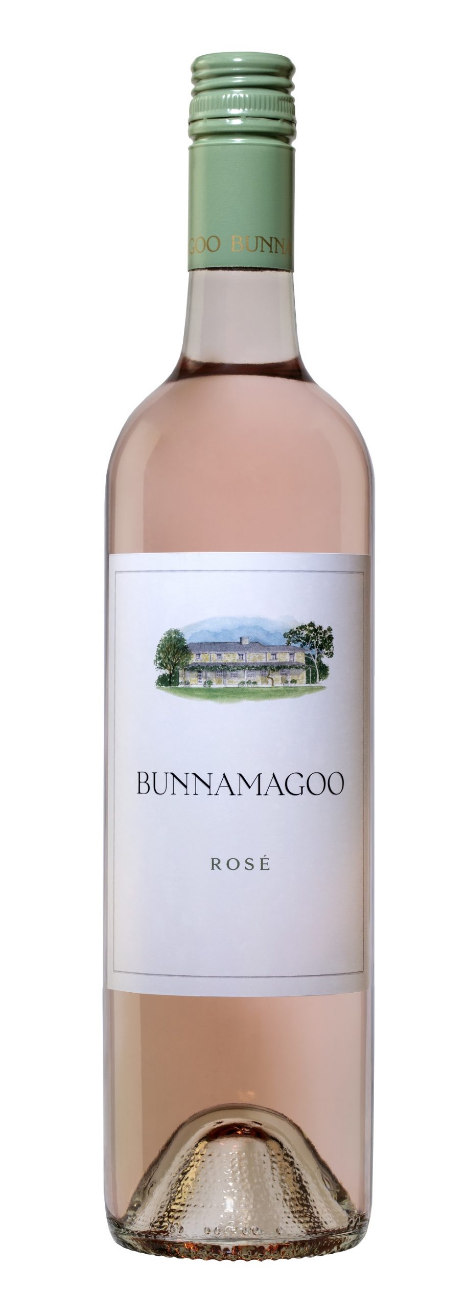
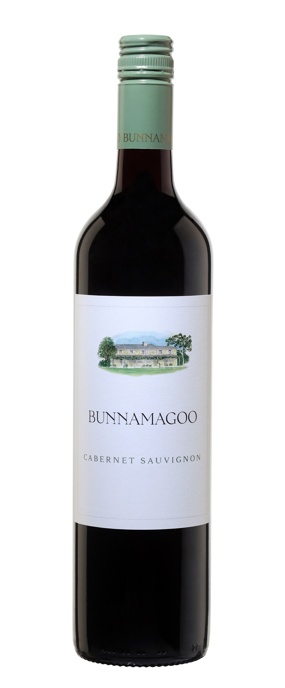
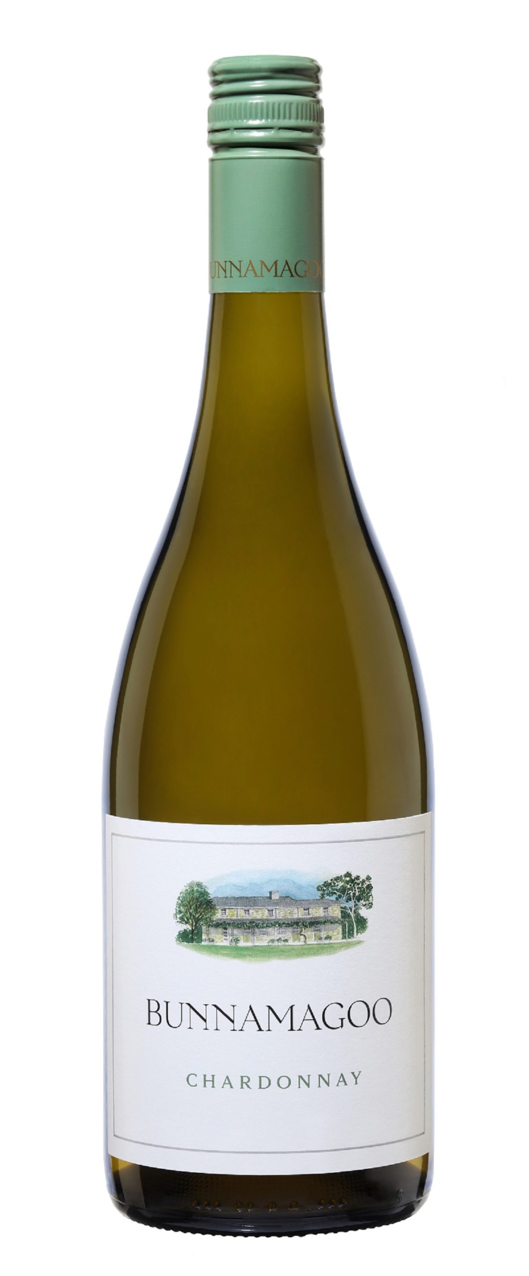
Bunnamagoo Wines partnered with design agency Denomination to reinvigorate and modernise the Bunnamagoo label.
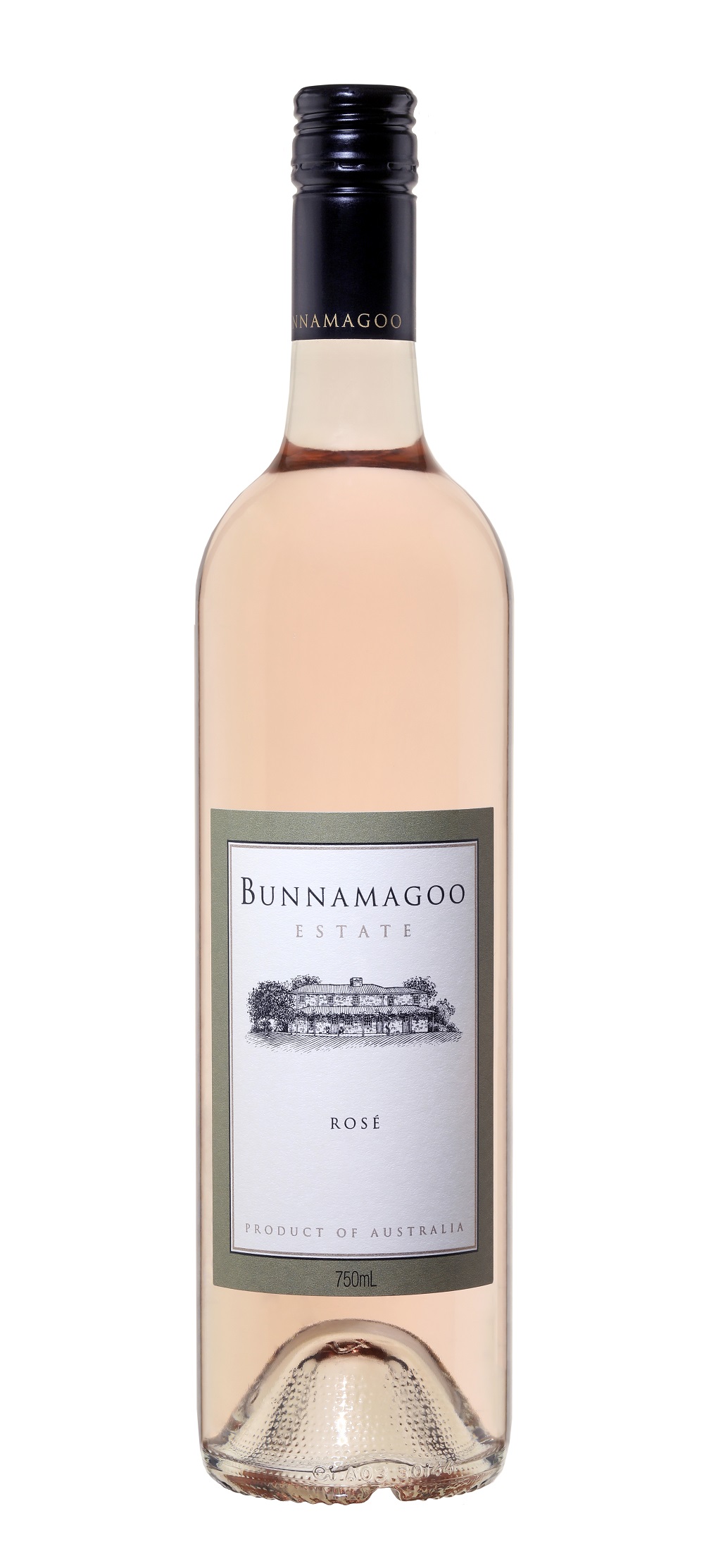
The major design challenge was to modernise the exisiting Bunnamagoo label, being careful not to alter the brand positioning. Research conducted by our sales representatives of their retailers, by and large echoed a sentiment only enhance the label, not change it.
The solution was to clarify the brand foundation and identity. The Bunnamagoo homestead and wordmark were identified as the central elements of the brand's meaning. In maintaining these heritage elements, the designer employed colour to enhance the label and deliver a distinctive appearance. The bespoke screw-cap is reminiscent of Australian gum trees, reflective of our properties surroundings, while the watercolour homestead, inspired by early travellers' journals, provides a softer and more welcoming 'homely' image. Hence the brand mantra 'make it feel like home with Bunnamagoo'.
The key design impact is a simplification and modernisation of the brand elements. These elements are visually enhanced in colour on a white peper stock. While retaining the key brand elements, the change is dramatic though remains recognisable to our loyal customers.


