BEST LUXURY PACKAGE DESIGN


Hanging Rock 2019 Heathcote Shiraz
Hanging Rock Heathcote Shiraz is a flagship for the brand, representing the trailblazing role of founder John Ellis in developing Heathcote as an iconic Shiraz region. The Shiraz is from 'Athols Paddock' originally planted by Athol Guy of The Seekers fame who has been part of the Hanging Rock brand since inception.
- Year wine was released to market: 2021
- Retail Price: $75 AUD
- Designed by: Keith Smith from Studiosmith
- Designed for: Hanging Rock
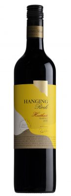
Forming part of a complete design refresh in 2021 for Hanging Rock Winery by Studiosmith, Hanging Rock Heathcote Shiraz is a flagship for the brand, representing the trailblazing role of founder John Ellis in developing Heathcote as an iconic Shiraz region. The new label design features a return to the original inspiration for the brand in the early 1980s, which was an abstract interpretation of the nearby namesake and natural icon Hanging Rock, originally designed by Brian Sadgrove. The 'Hanging Rock' graphic icon now stands as a highly visible emblem complementing the distinctive yellow label. Positioned at the luxury tier price point, Hanging Rock Heathcote Shiraz continues the winery's proud heritage of winemaking involvement in Heathcote region.
Hanging Rock Heathcote Shiraz forms part of the luxury tier in the brands livery. The redesign needed to reflect a more premium positioning than the current label to reflect the $75 price point. It also had to be considered as part of the entire brand wine range redesign to clearly signify and differentiate from the other tiers.
Most importantly this Flagship tier and the higher Reserve range had to communicate the new brand positioning - which is based on repositioning the brand to achieve better visibility and recognition, confirming the brands status as one of the pioneers of cool climate wine in Australia.
The label design is based on recapturing the spirit of the original founding look from the early 1980s - featuring the iconic natural wonder 'Hanging Rock,' whilst also presenting a new considered and contemporary look and feel. The abstract curved 'Rock' graphic forms both the central motif and background label shape, supported by a combination of elegant and modern typography. This was all about re-establishing a uniques sense of ownership and place for the brand, designed to flow through the entire brand range. The distinctive yellow core of the label was retained from the existing design to keep a link with the past and individual focus for this tier.
The result is a beautiful blend of past and present, staying true to the brand heritage while presenting a new modern and sophisticated presence for Hanging Rock Winery overall. Instant and clear recognition of the relationship between the new Hanging Rock label and the rock itself is immediately obvious to visitors to the cellar door enjoying the wine and the view across the Hesket Valley to the Macedon Ranges massif.


