BEST LUXURY PACKAGE DESIGN

Fowles Upton Run
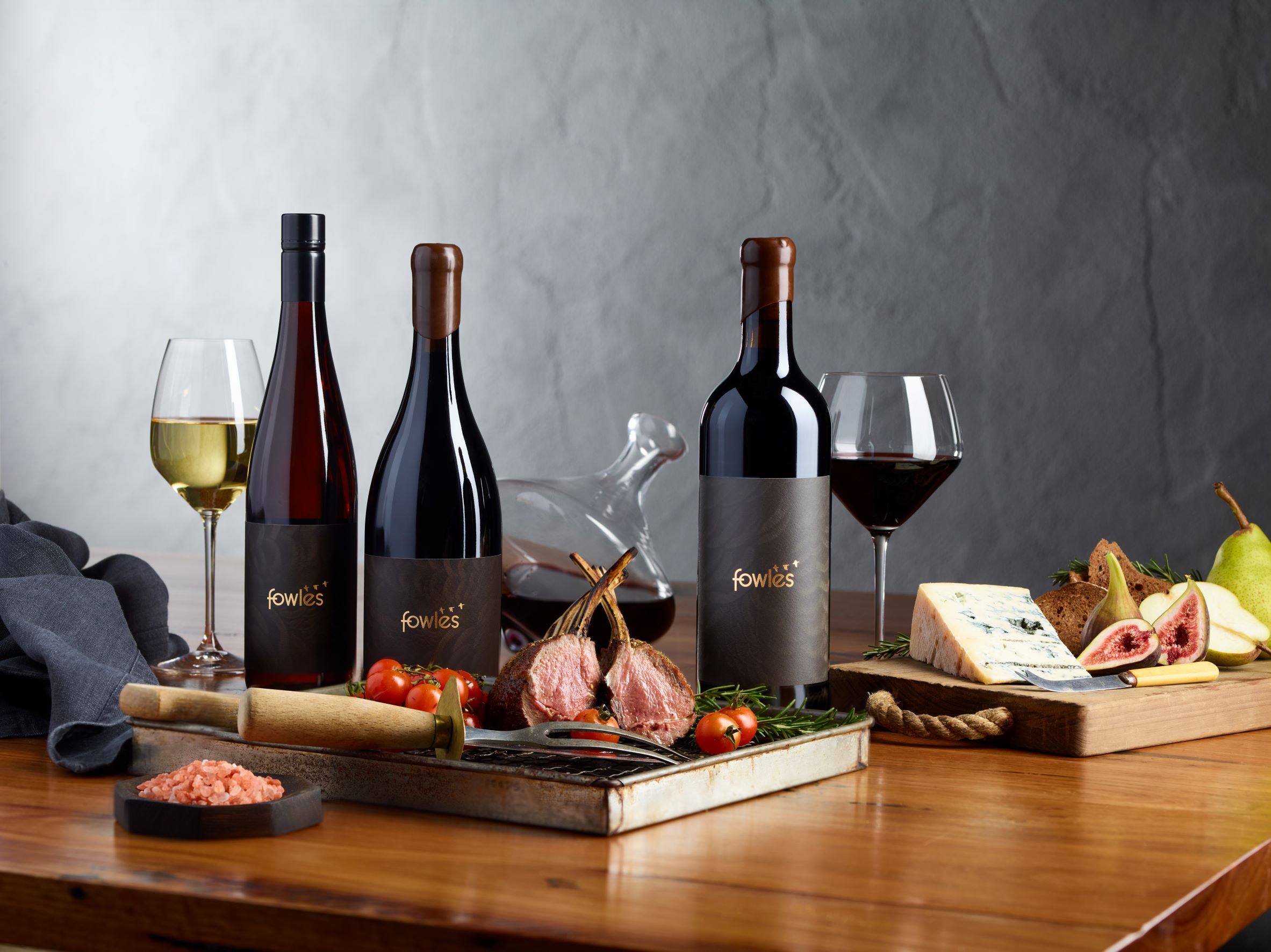
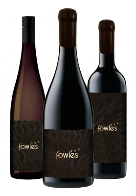
Upton Run by Fowles Wine are ultra-premium small batch, single vineyard wines, crafted from the best fruit from the best rows each vintage. They exemplify purity and complexity with a rugged elegance befitting their Strathbogie Ranges provenance. The Upton Run wine range consists of a Cabernet Sauvignon and Shiraz (RRP $125) and Riesling (RRP $50). These wines are crafted to be cellared and enjoyed as a museum release, to be sold on premise, fine wine venues and in the Cellar Door.
- Year wine was released to market: 2020
- Retail Price: $125AUD
- Designed by: Denomination Design
- Designed for: Fowles Wine
Fowles Wine is a family owned winery located in the ancient granite landscape of the high altitude Strathbogie Ranges in Victoria, and crafts some of Australia’s finest cool climate wines.
With a rich generational history of working the land, farming is in the blood and we work with the seasons, vines and soil to unlock the essence of our vineyards. Upton Run are premium, small batch, single vineyard wines made from our best fruit. The Fowles wine brands all embody the Fowles family values and philosophy of connecting people to the “whole natural world”; the cyclical journey and symbiotic relationship between land, animals, food and humans.
In 2019, Fowles updated their Masterbrand. The Fowles ‘ducks’, found on their property and in the local area, were incorporated into this new brand identity to reflect their philosophy and way of life, as well as encompass the three core brand and winemaking pillars of vigneron, hunter, farmer. Around the same time, construction began on a new, contemporary Cellar Door and Restaurant in the Strathbogie Ranges using natural materials primarily from the farm, vineyard and local area to tie in with ‘of the land’ approach.
In line with these other projects, Fowles worked with Denomination Design to radically redesign the Upton Run packaging. The main objectives were to create striking and unique, luxury wine packaging to leverage Upton Run’s brand status as the epitome of cool climate winemaking and retain the essence of their Natural World philosophy and Strathbogie provenance, yet communicate the honest and real personality of the Fowles family.
The main challenges involved in the creation of the new, luxury Upton Run packaging were restructuring the label’s look and hierarchy in order to inject and be led by the Fowles Masterbrand, reflect the modern personality of Fowles and the family’s Natural World approach, yet still communicate the wines’ ultra-premium quality and price point.
Another significant challenge was achieving stand out in a competitive environment, and as a small and younger player in a big market, it was important that Fowles and Upton Run packaging be disruptive in standing out as a credible contemporary, luxury Australian wine to both trade and consumers.
To achieve the desired packaging result for Upton Run, Fowles focused on their new Masterbrand identity and reverted to their Natural World values for inspiration.
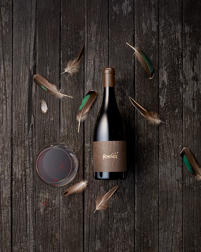
In the first round of creative concepts, Denomination introduced a label design which reflected the look and feel of wild duck feathers. This served to incorporate the Fowles ‘ducks’ used in their Masterbrand logo, as well as subtly encapsulate the essence of nature, animals and food, all strongly connected to the surrounding region and vineyards. The extraordinary detail in duck feathers in the natural world mirrors the detailed approach we take making these wines.
To achieve premium winemaking cues and deliver a luxury look and feel, labels were printed on Manter Cotone Bianco Ultra-premium stock. Quality embellishments included simple but strong gold foiling on the front label and a very fine micro emboss to symbolise and emphasise the texture of the duck feathers. The micro emboss was something that our printer, CCL, was able to produce, however not every printer can achieve this level detail. Heavy weight Saverglass bottles were chosen and a bespoke wax closure that featured a duck emboss on the top of the wax seal was also used to match and complement the label and convey the exclusiveness. All other information was also intentionally placed on the back label.
While many Australian wine brands at this ultra-premium price point utilise a lot of fonts and rely on quite a lot of wine information, gold foiling and medals to relay the luxury positioning of their brand, it was felt that the elegant simplicity of just the Fowles logo in gold foil on the front label still delivered a premium look and feel while achieving a unique presence which piques the consumer’s attention to encourages them to explore further. It also achieved the added bonus of keeping with the style and interiors of Fowles new Cellar Door.
With the Upton Run packaging, released in 2020, Fowles have been able to successfully symbolise their Masterbrand, retain the essence of their Natural World philosophy and the Strathbogie Ranges region, while elevating the perceived quality and ultimately creating a unique premium brand and luxury identity at a price point where conservative packaging is often the norm.


